Practical
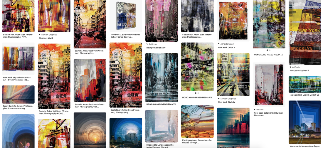
Throughout this section of work I will be focusing on the the different styles of landscape distortion focusing on how a photographer can use the idea of distortion and creates pieces of work that link to many different sub genres of work, for example taking the idea of landscape distortion and going deeper into the different types of distortion for example, manual or perspective distortion. My Pinterest examples below take on this concept focusing on many different types of distortion and are also images that really inspire and something I will be testing out through my many responses.
Fong Qi Wei
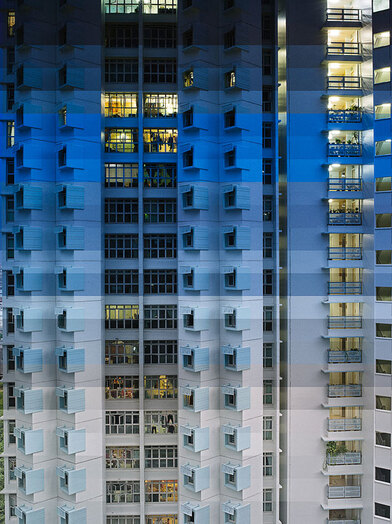
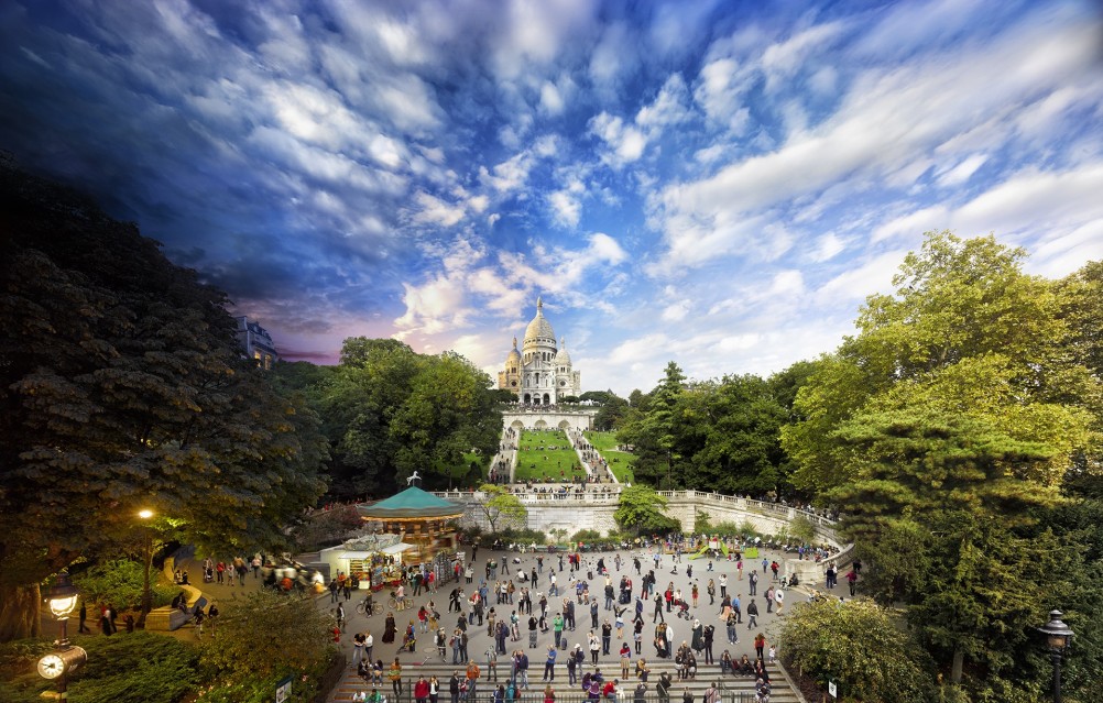
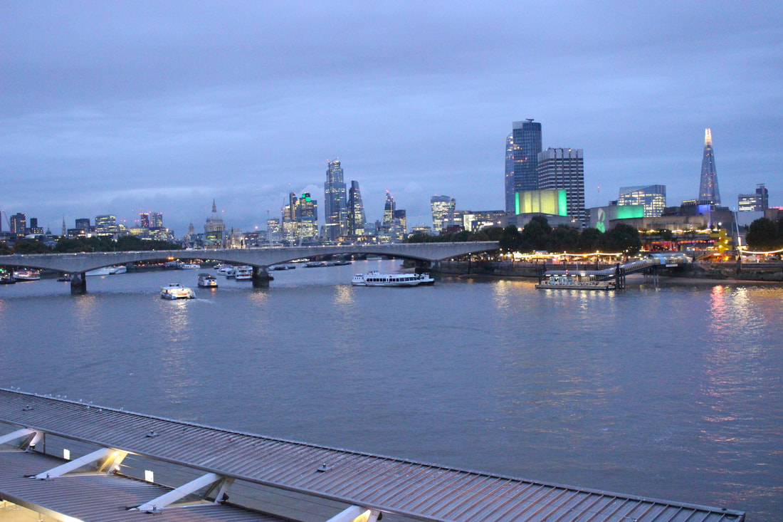
Born Singaporean, Fong Qi Wei is an artist who focuses on uses photography as a medium for expression allowing the audience to focus on the “thinking part” and the “feeling part” of themselves. From 2013 to 2017 in Singapore, Fong Qi Wei started his series ‘Time Paintings’ digitally photographing mostly landscapes, seascapes and cityscapes, creating combined still images made from sequences that span 2-4 hours, mostly of sunrises and sunsets. Each layer shows a different slice of time, creating a transition from daytime to night. The transition is gradual and noticeable in every piece, but would not be something you expect to see in a still image.

I find this piece very effective due to the composition, use of shapes, and order of layers. Wei uses a landscape that provides a mixture of both large buildings and small buildings. This is effective as he managed to get a strong comparison of both size and light from the buildings. Although they are larger buildings, there is still focus on the foreground of the image due to all city lights on the streets. Wei also uses the same shape throughout the image but each shape progressively becomes smaller as you reach the centre of the image. This is effective as it allows the viewer to focus on both large sections that may convey large sections of buildings and smaller details that have been singled out in each building. Lastly, the order of layers is in this specific example is done very well due to the fact that the majority of the image includes buildings so having the image start with a night foundation allows the image to capture when the city comes to life through all the city lights. Each of these techniques are very inspiring which will push me to try and use these techniques to create my own piece.
|
|
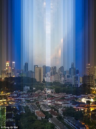
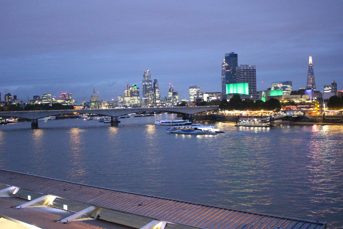
I also find this piece effective mainly for the order of layers. Although the image starts with a night foundation, the use of having both ends of the image start with night and both reaching the middle getting lighter and lighter allows the viewer to get an idea of what the landscape looks like from more points of view at night. The shapes used this time also allow more detail in each slice of time as there is more space to show what is going on. This again allows the viewer to identify more parts of the image discovering new things. The image would not be as effective without the city and big buildings so using this as inspiration I want to capture famous parts of London using the straight lines technique as I feel I can capture more of what is going on.
|
Stephan Wilkes
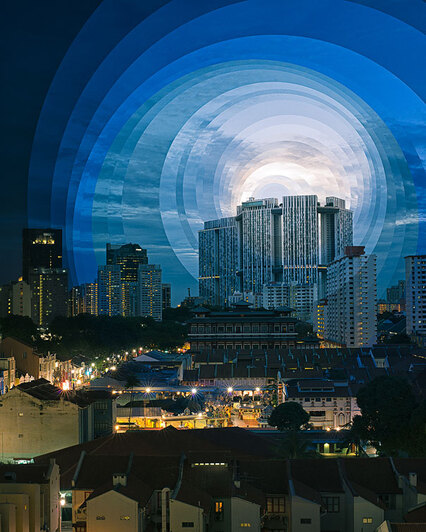
I also researched the“street photographer from 50ft in the air”, Stephan Wilkes as he leaps into the digital world of distortion through his work “Day To Night”. Similar to Wei, his project depicts what seems like a single moment in time, but is a lengthened process consisting of patience and accuracy. While creating his precise work, Wilkes photographs from a stationary position over the course of between 15 - 30 hours, capturing over 1500 images during the day and night and stitches them together digitally using Adobe Photoshop to create one cohesive panorama. He accurately edits the images based on the “time vector, which can be on an X, Y or Z axis, and the final photo is created along that axis. Once the images are captured, he states, “Once I’m back at my studio, the editing process can take months”. But through the elongated repetitive process of editing each one of the thousands of pictures, the results capture a sense of place that can't be expressed by a single frame.
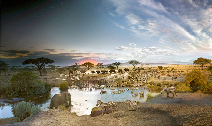
This piece “Serengeti National Park, Tanzania 2015”, explores how day and night editing can not only create an effective image visually but also by the message behind it. Wilkes captures the comparison of day to night with the representation of the Tanzanian animals and landscapes at its peak migration for 26 hours. The image demonstrates the wide range of animals that inhabit, or simply pass by the dry fields to attain this low amount of water, which is due to the drought. With this image in particular, Wilkes focused on capturing species endangered by climate change. Additionally, visually it works very well, especially the blend between day and night. He makes the sky seem natural and the different levels of light on the trees/bushes and surfaces in general through he's careful editing. I will use this as inspiration mostly from his perfect editing making it clear what areas of the image are day and night.
|
|
Comparison
I have chosen to research these two artists in particular as they create pieces of work that I want to progress with. Although they both convey the day and night theme, they finalise their images with different meanings behind each photo. I really like how Wei uses his work as a medium of expression creating the image to relate to your own ideas and what you as an audience think each slice means. This contrasts with Wilkes as he mostly gives the audience the meaning of the image, for example the drought due to climate change in the image to the left, so it is easier to create more creative imagery as he has only one definition of it and does not need to be abstract so there is not one definitive meaning. Both techniques work very well in creating the day and night technique but specifically with my work I will focus on conveying an expression like Wei's technique as I believe it is a very effective and better way of leaving the audience guessing to what the artist feels about it but also allows a discussion between multiple viewers as to what the image feels like to them.
|
|
|
Shoot Plan:
1. Concept - My images are going to consist of a landscape captured at different times of the day then collaged together into different slices getting darker or lighter each slice representing the time of the day.
2. Location - My first location will be on Creighton Avenue near the bottom of the hill looking up to get a wide shot of the sky and the buildings / My second location will be a wide shot of cold-fall woods making sure I get the sky, the trees and the field.
3. Models - No models
4. Clothing and accessories - None
5. Styling - None
6. Props - None
7. Lighting - Natural lighting at different times of the day consisting of both day and night time.
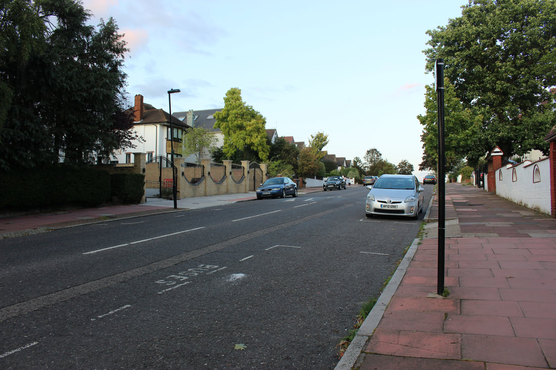
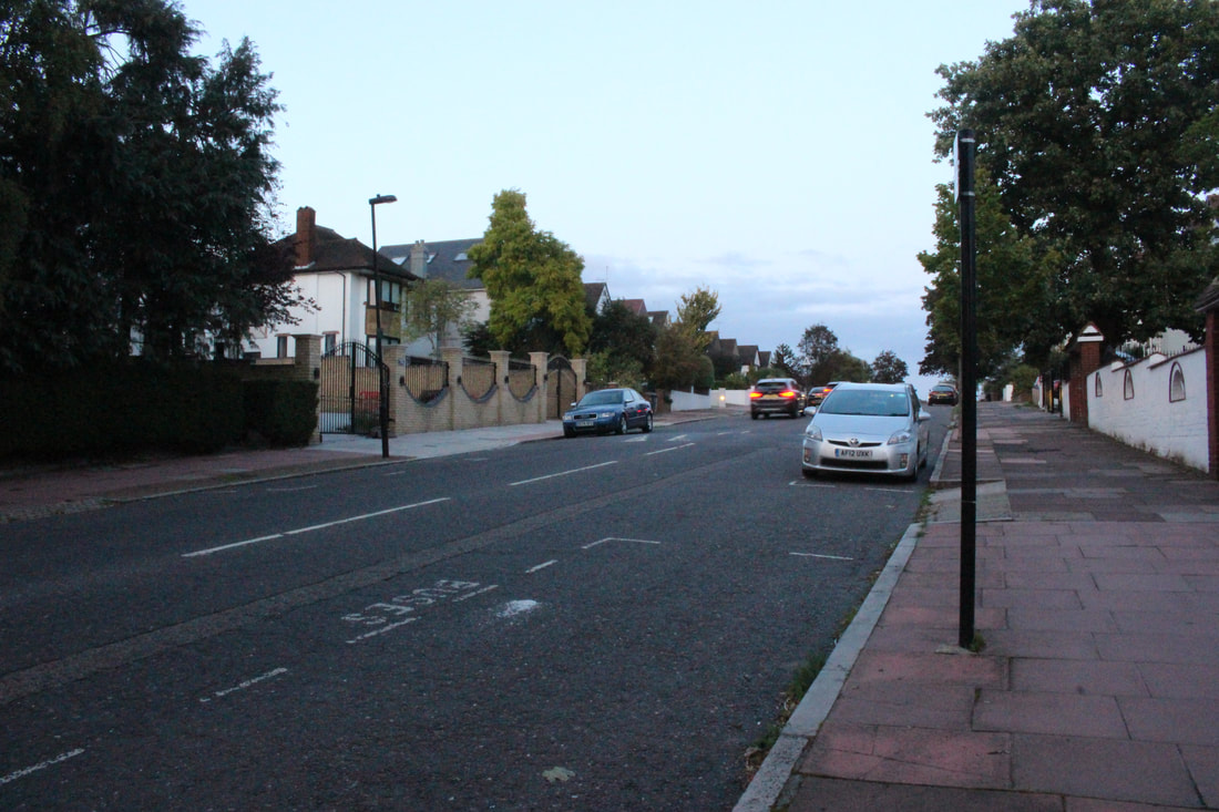
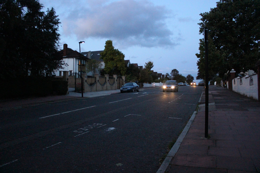
8. Timing - The best time to do this is from 7pm as the sun starts to set so you can achieve a clear sky and one with the sun setting, and continuing to 9pm capturing the day turning into night. To capture two separate images I will be going to shoot on Wednesday 4th September and Thursday 5th September as it cannot be done in one day. Both locations are at a walking distance so I will walk to both locations.
9. Equipment and materials - I will use a canon camera and a tripod.
10. List of items I need to bring to my shoot - Camera and tripod.
2. Location - My first location will be on Creighton Avenue near the bottom of the hill looking up to get a wide shot of the sky and the buildings / My second location will be a wide shot of cold-fall woods making sure I get the sky, the trees and the field.
3. Models - No models
4. Clothing and accessories - None
5. Styling - None
6. Props - None
7. Lighting - Natural lighting at different times of the day consisting of both day and night time.
8. Timing - The best time to do this is from 7pm as the sun starts to set so you can achieve a clear sky and one with the sun setting, and continuing to 9pm capturing the day turning into night. To capture two separate images I will be going to shoot on Wednesday 4th September and Thursday 5th September as it cannot be done in one day. Both locations are at a walking distance so I will walk to both locations.
9. Equipment and materials - I will use a canon camera and a tripod.
10. List of items I need to bring to my shoot - Camera and tripod.
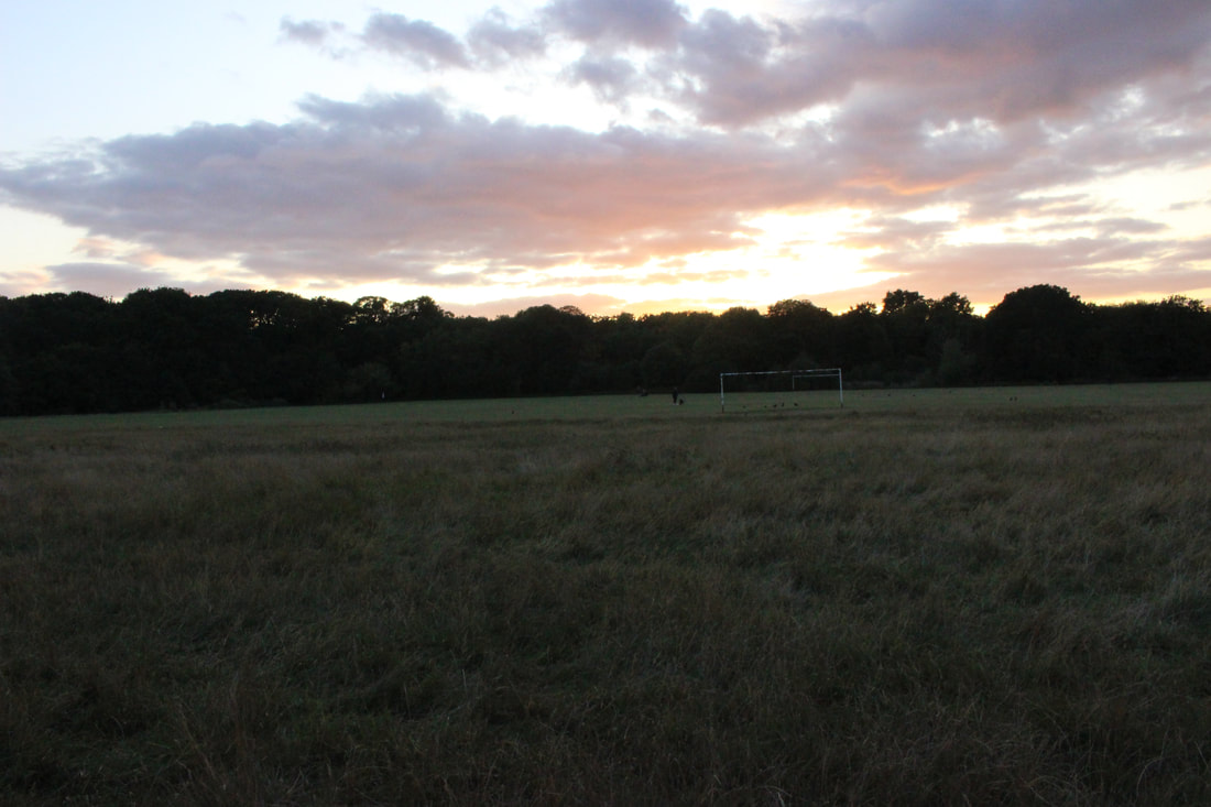
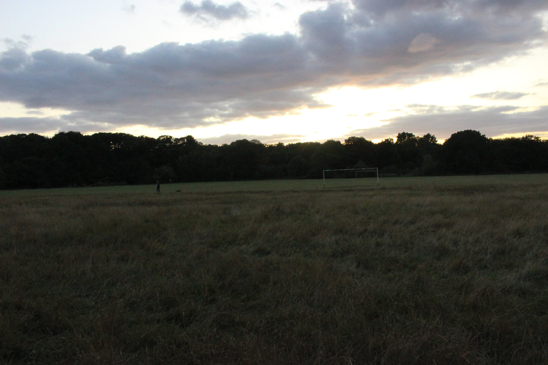
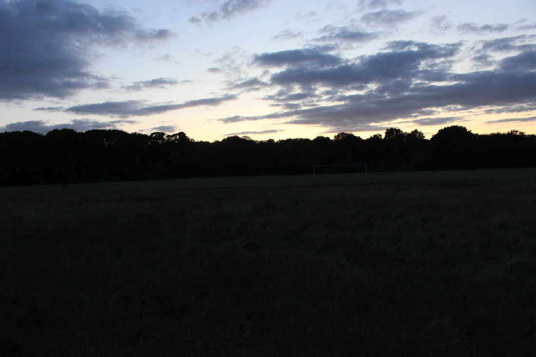
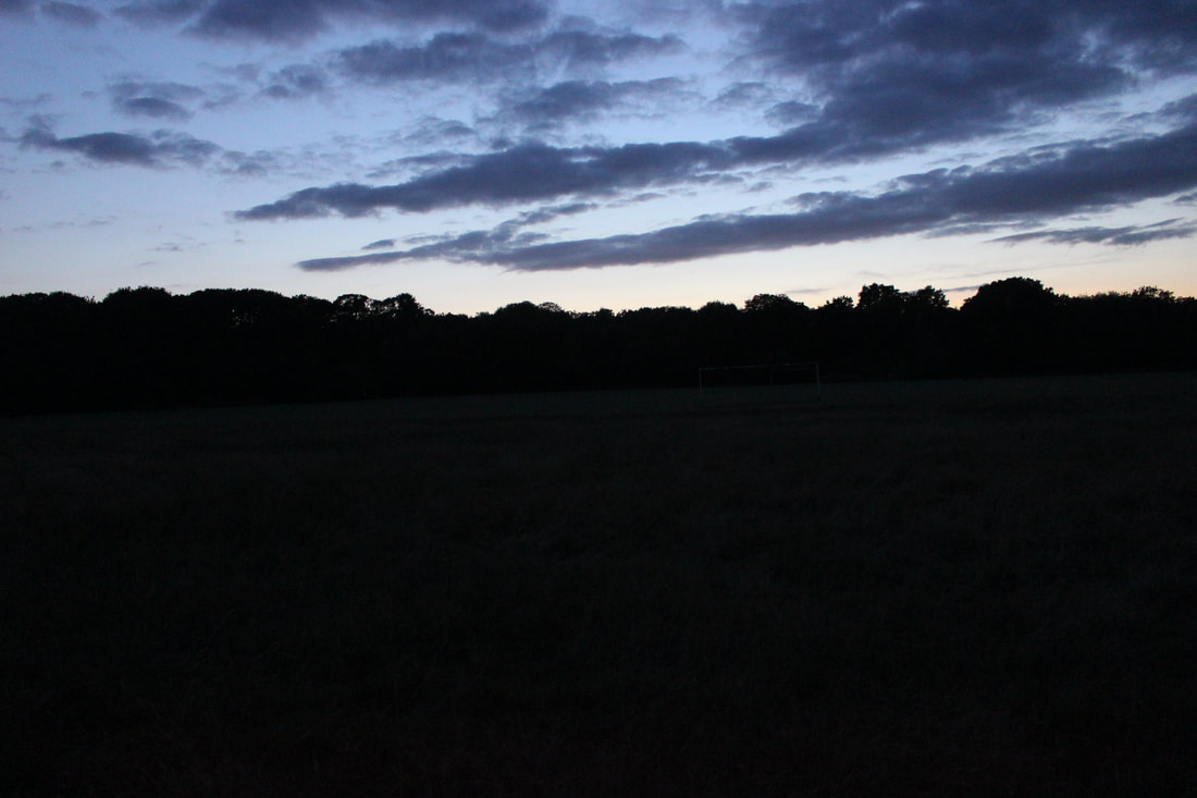
Distorted Day and Night
First Shoot
Muswell Hill Playing Fields
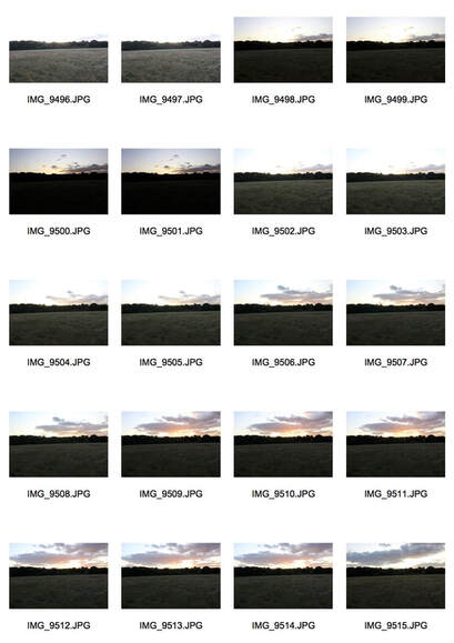
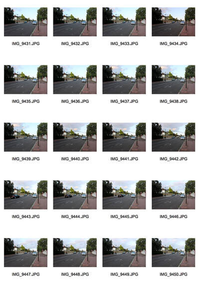
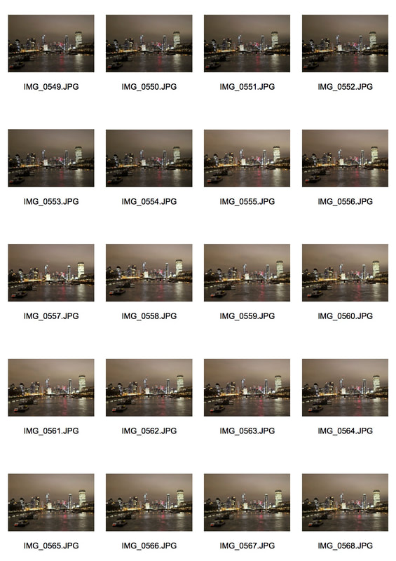
Contact sheet:
|
|
|
Original Images:
|
|
|
|
|
|
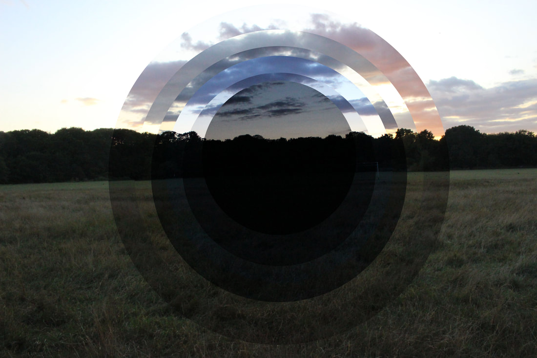
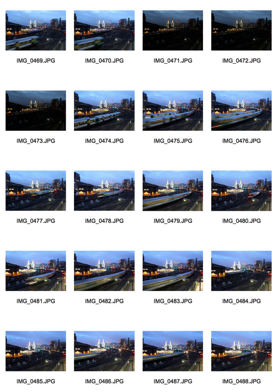
Following my work in my Curatorship task which focused on Landscape Distortion, I decided to conclude with looking at more artists rather than the six I chose to document. Doing so, I decided to follow the work of Fong Qi Wei as I was most inspired by the use of collaging different times of the day together to create one photo. I also like the comparison in light and colour you can create just from one image you can create a palette of many colours. Researching into him, I wanted to test his technique using a range of ways to create his work and use it within my work as evident in each of my responses to my first shoot.
First Response:
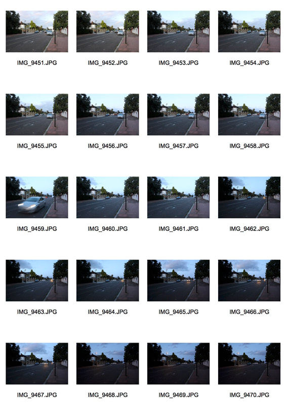
For my first response, I decided to create the effect of having both ends of the image start with the day light and both reach the middle of the image while getting darker allowing the viewer to get an idea of what the landscape looked like from more points of view. Doing so, I decided to go to Coldfall Park at 7:30PM, setting my tripod up and keeping my camera in the very same spot every image was taken. Throughout the 2 hour duration, I would capture images as soon as I saw a slight change of colour in the sky as it was becoming dark. I decided to use a low ISO as it was very bright and white at the beginning. The sky still remained bright so i adjusted the shutter speed making sure it was quicker so less light reached the lense. However, the final image still turned out bright so in my next response I will focus on capturing a night time image as the background image as it will be more visible to the viewer. In most of Wei's images, he tends to start with a night image and it turns out much more effective. Besides this, the use of the tripod really allowed me to accurately position each image in the correct place without any errors. Each image carefully becomes smaller and darker which was emphasised and done correctly. To further develop, I will experiment with using different shapes not having to be directly next to each other and try to create an effect from doing so.
Creighton Avenue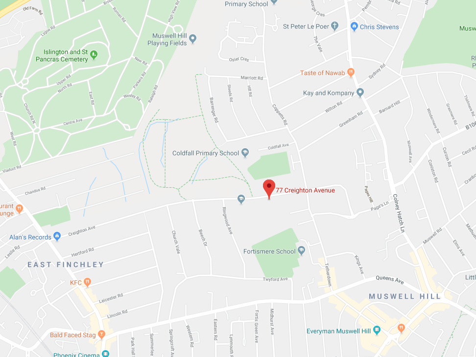
|
Muswell Hill Broadway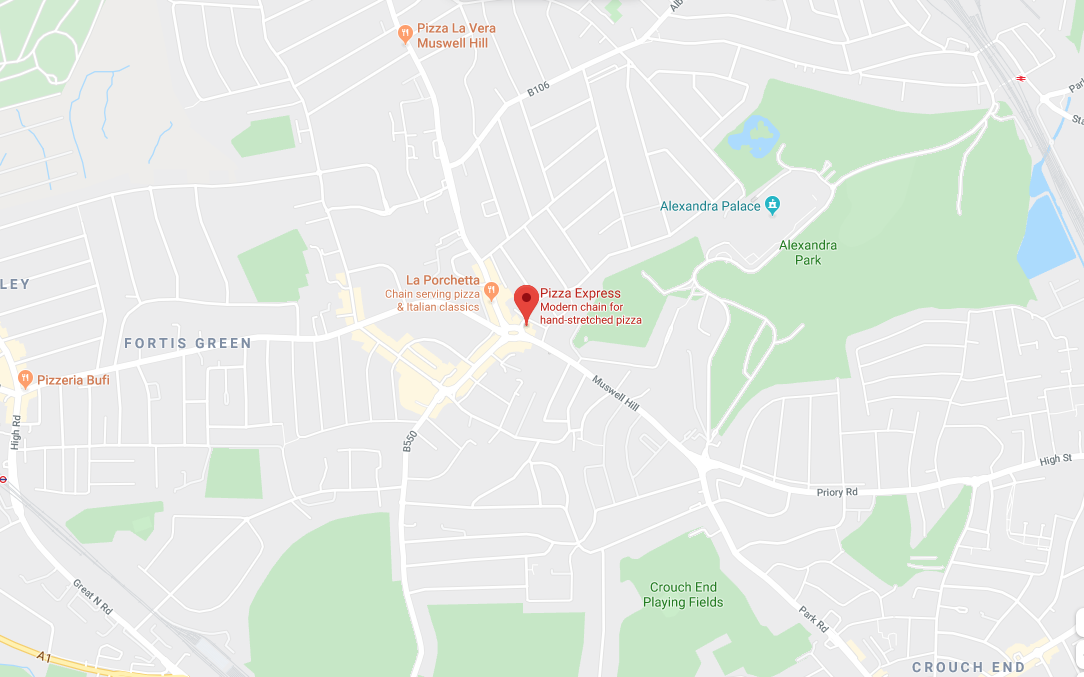
|
Contact sheet:
|
|
|
|
|
|
Original images:
|
|
|
|
|
|
|
|
|
Second Response:
Following my first response, I went out to Creighton Avenue and Muswell Hill Broadway and used both a night to day and day to night technique to see if using the night image as my background image so the whole picture is more dominant was more effective. However, this time I wanted to use different sized squares and randomly place them in different areas of the image to create a nice effect. Doing so, I placed my tripod in one position for the 2 hour duration and took pictures every time the colour of the scenery changed. This response worked better than the previous image due to how each part stands out. Every square allows the viewer to have an idea of what the area looks like all at different times of the day. Having some squares right next to each other or overlapping each other also adds to the effect of making it very clear that it was at different times of the day, which Wei cleverly does in each of his images. I included different vehicles, lights, houses, and people. This kept the image busy which as a result allows the viewer to constantly be revealed to new things. Both techniques worked effectively as each square does stand out without the background image being too bright as seen in my previou responses. This was due to the fact that the sky was more pink than white which benefited the overall outcome. This image does differ to how Wei pieces together his creations, so as a further development for my next response, I want to look into wide landscapes of a city focusing on putting slices of time next to each other while having the night image as the background.

|
|
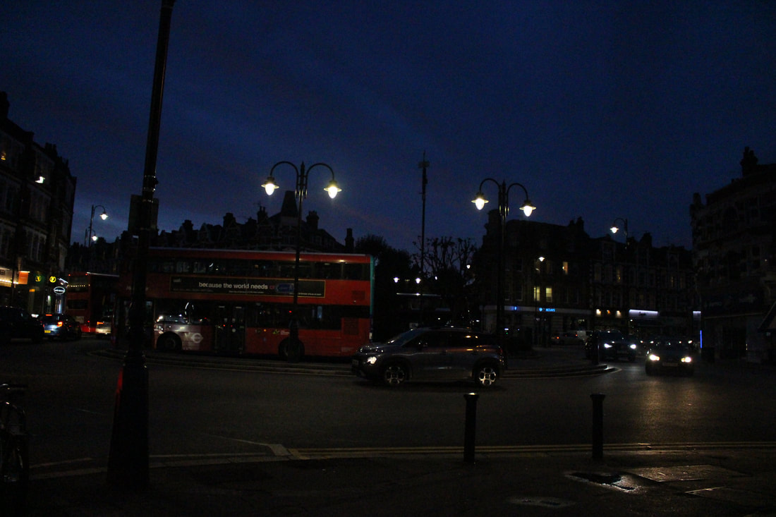
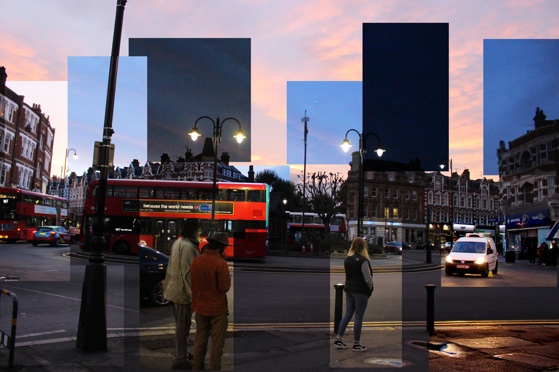
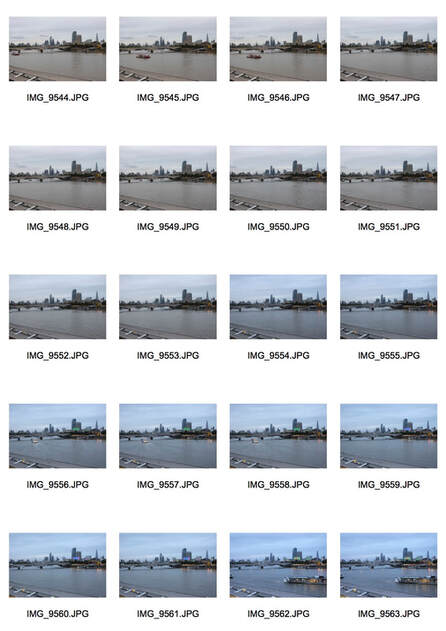
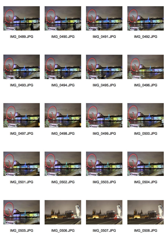
Hungerford Bridge and Golden Jubilee Bridges
Contact sheet:
|
|
|
Original Images:
|
|
|
|
|
|
Third Response:
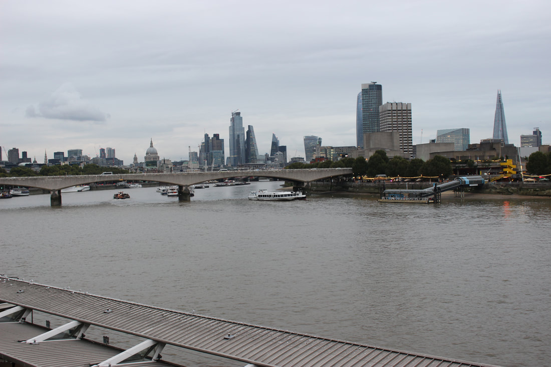
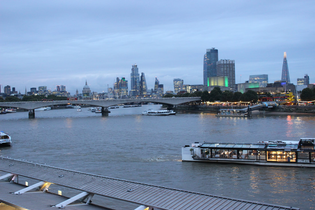
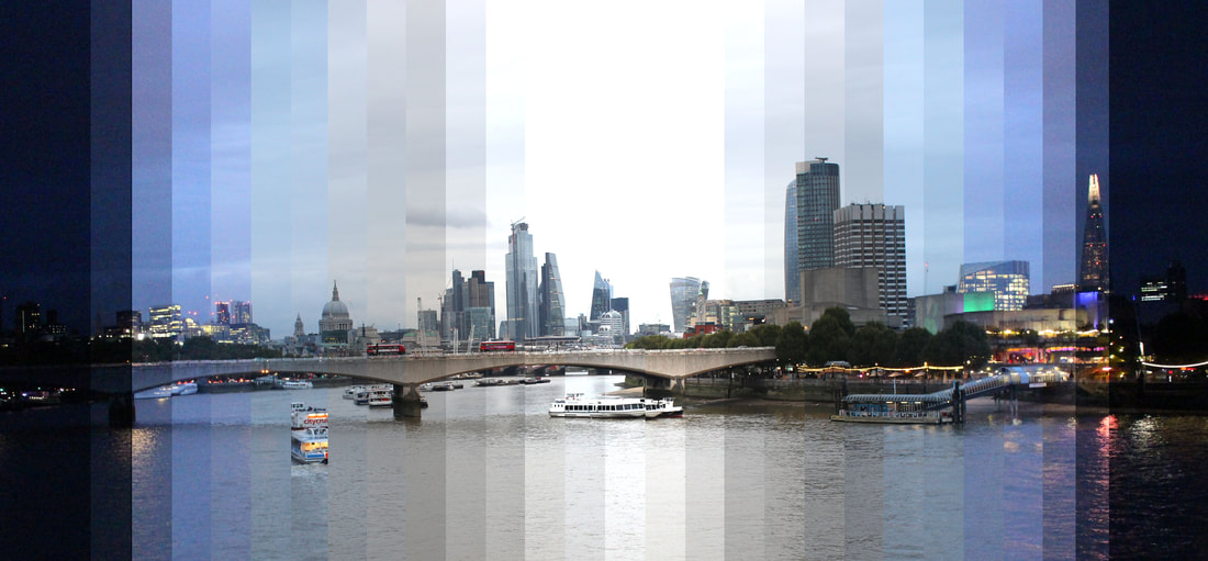
Following my previous response, I focused on capturing a wide shot of London's famous buildings in small slices of different times. I travelled to Embankment and placed my tripod in the same position for 2 hours. I struggled to capture the first couple of images due to the sky being too bright even while lowering the ISO and making the shutter speed faster which resulted in the middle of the image not being as effective as the rest of the image. I tried to make the images darker on Photoshop but that would mean I would have to alter each image and I wanted it to be accurate to the reality of how it looked so I did not change it. Besides that, I lined up each slice perfectly to make it seem like one image. While the boats may seem in the wrong position, they did move as slightly as time went on s it is still accurate. I am fascinated with how Wei uses a range of different building sizes in different positions to create a real separation of two different places put together through the use of lights and sizes which I adapted to and used to create a very effective image. However, I do believe if the night time stemmed from the middle outwards only for this instance due to it being a very wide shot and the issues I had with the brightness, I do believe with all the lights of the buildings it would have looked more clear as the middle does blend in with each other. So to further develop I need to choose carefully when to use night or day in what area of the image to produce the best image I can.
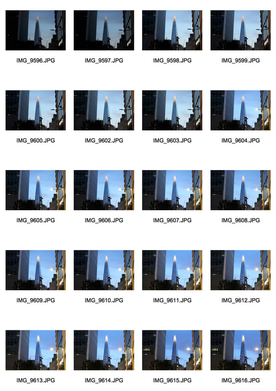
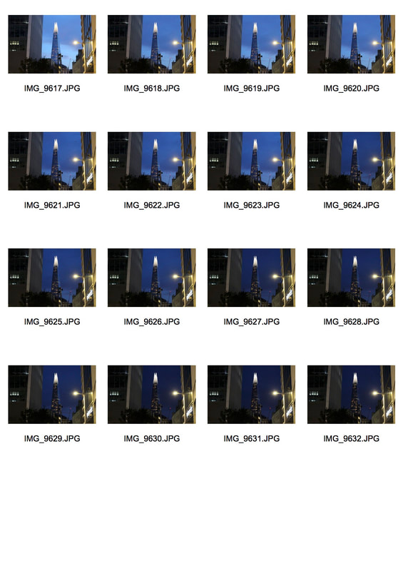
Lime Street
Contact sheet:
|
|
Original Images:
|
|
|
|
|
|
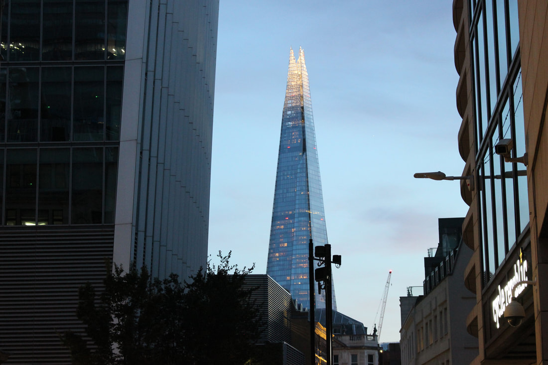
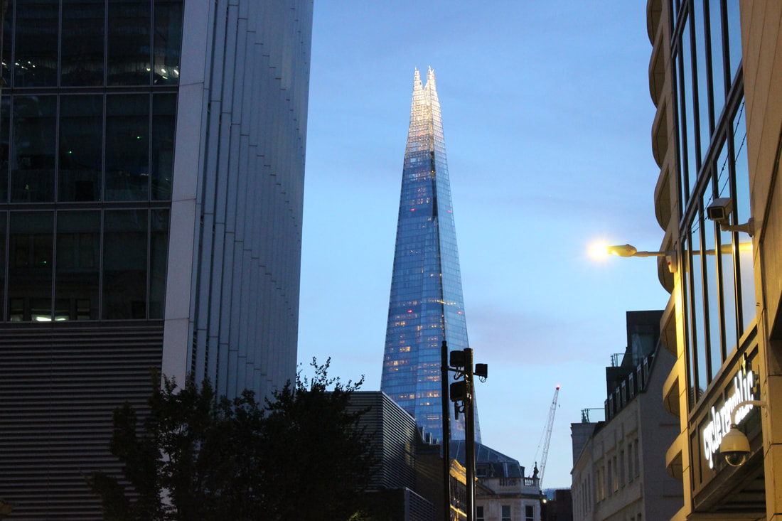
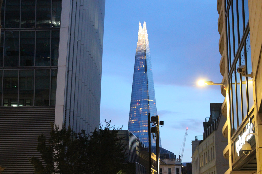
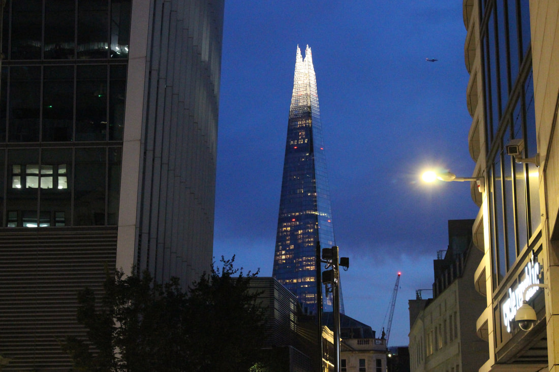
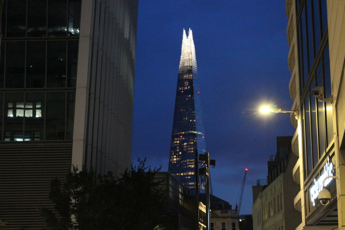
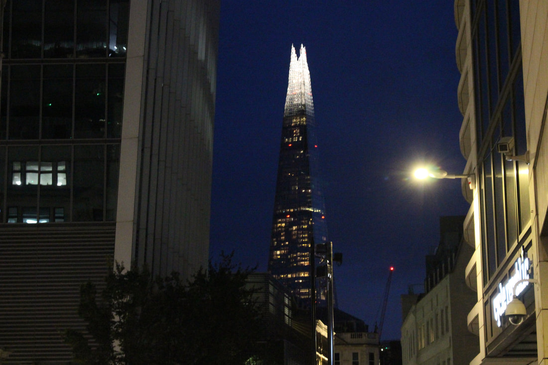
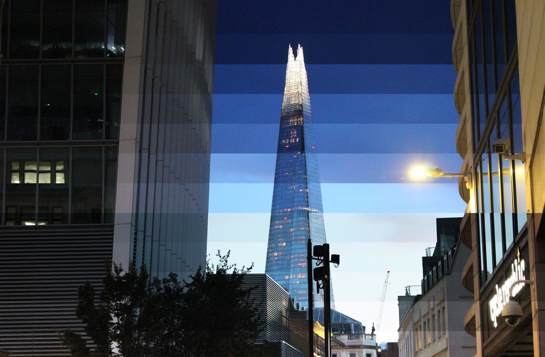
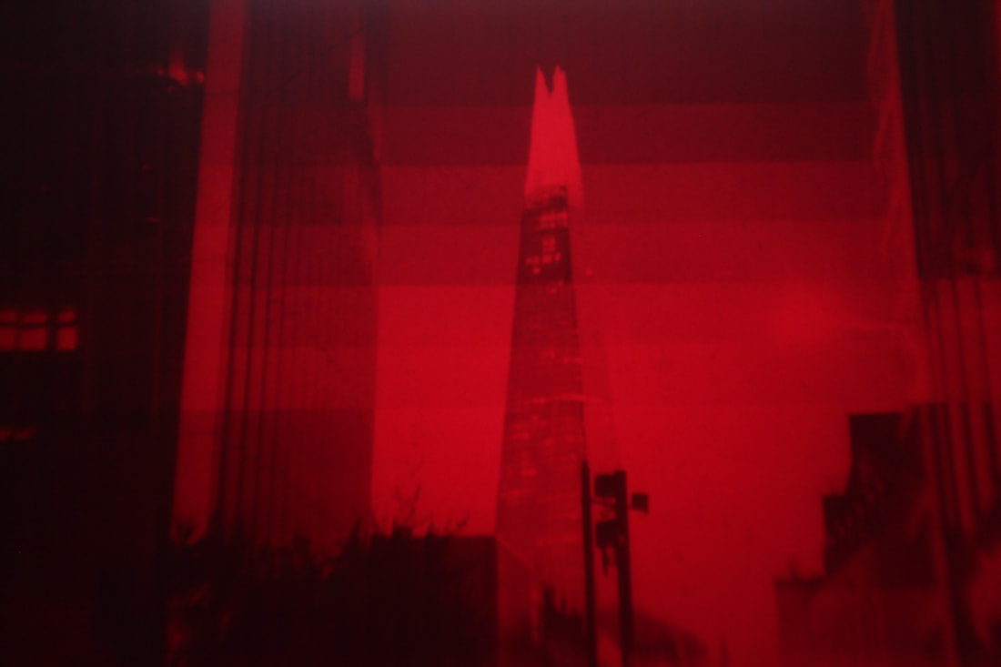
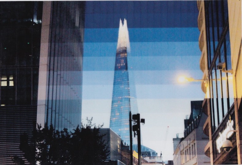
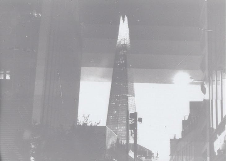
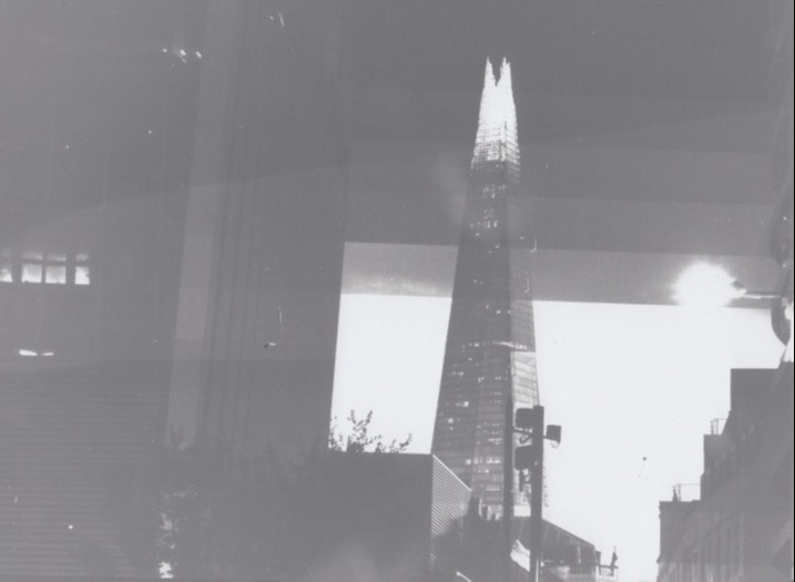
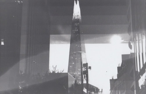
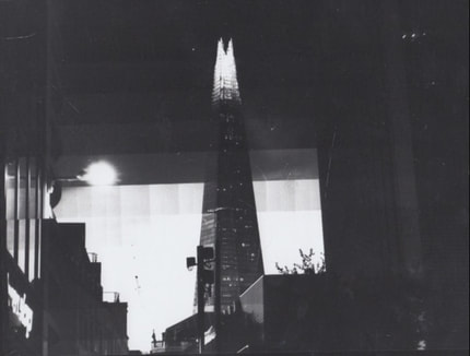
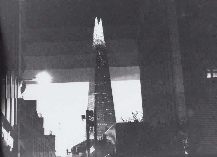
Fourth Response:
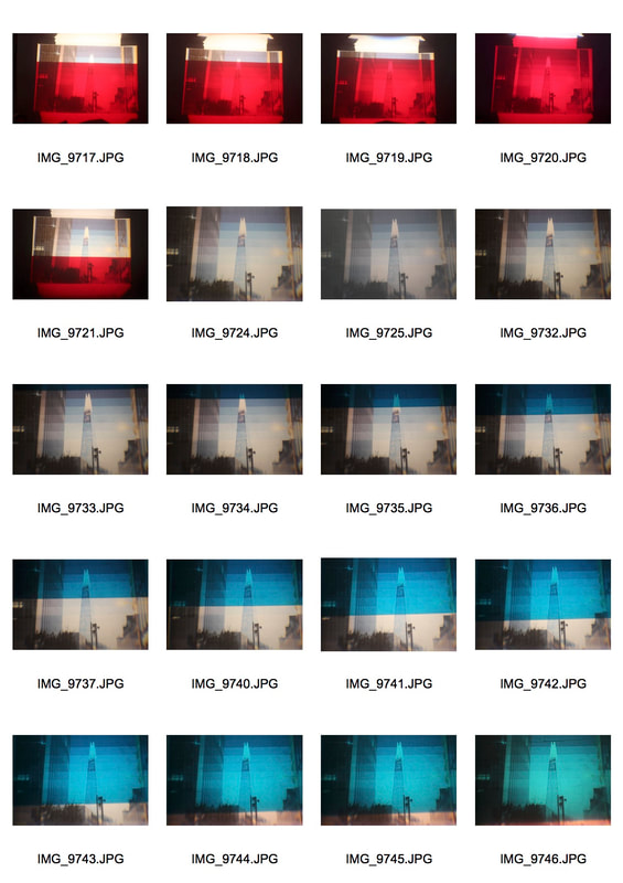
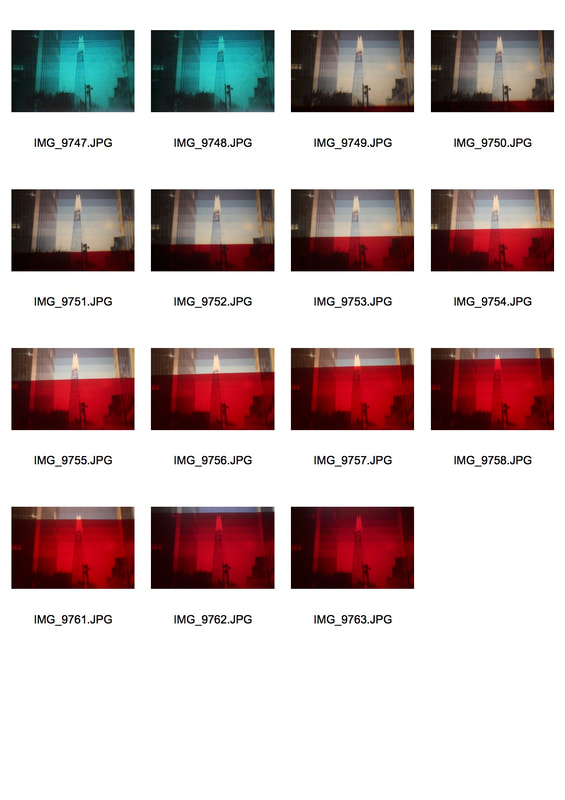
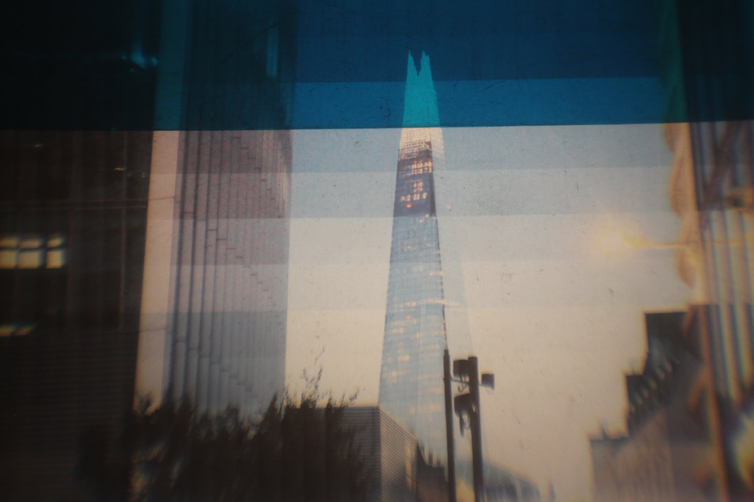
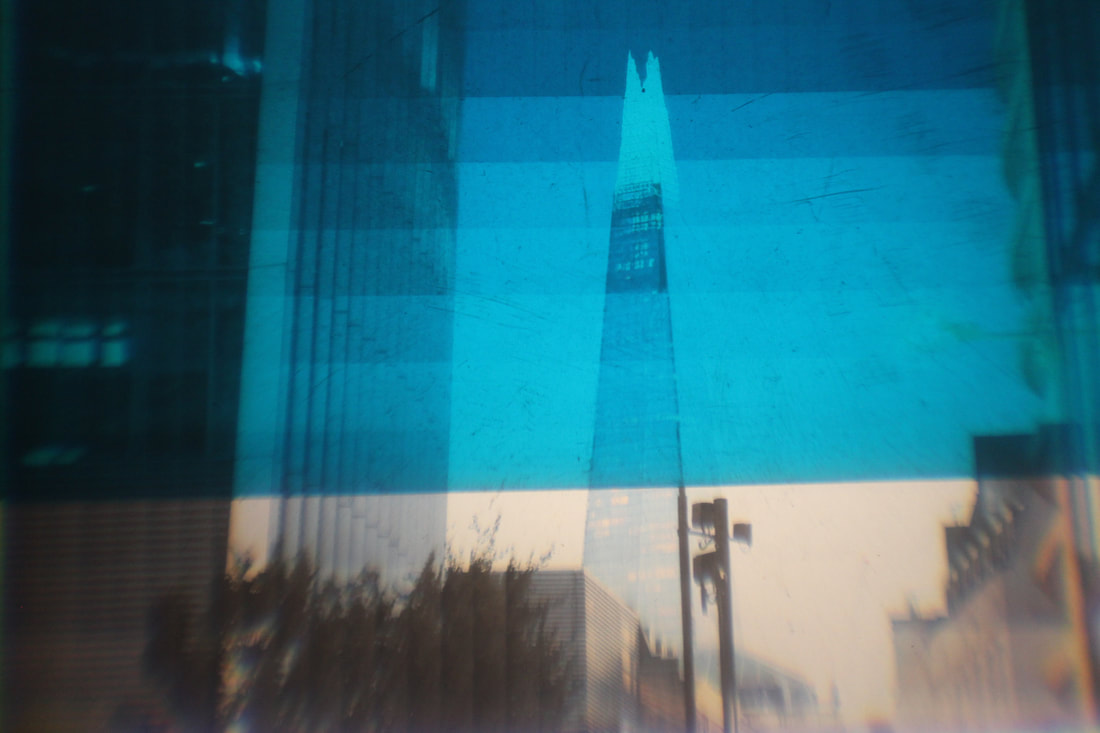
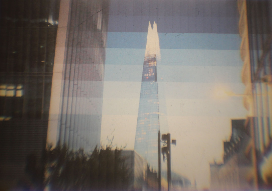
For my fourth response to Wei's work, I decided to focus on closer shots of famous buildings with slices of time going from top to bottom. I went to ...and captured the Shard keeping my tripod in the same position for 2 hours capturing the change in light. I decided to to start from night at the top getting lighter as you go down as more lights were able to be seen from the Shard the higher up you went, especially the lit up white lights at the top. I also chose this as you can see how bright the sky was in the day from the bottom slices so it is more visible capturing the top at night.However I still managed to make sure the top of the image was not too dark by using a higher ISO which worked well. I executed the slices accurately making sure each slice were the same size all the way down but I could improve the image by focusing only on the Shard rather than having the two buildings beside it distract the viewer from only focusing on the Shard. So to further improve, I would need to choose a different place to capture my images. For my next response I want to look at how GIF's could work showing different slices of time as Wei has done well in his work.
Contact Sheet:
|
|
|
Original Images:
|
|
|
|
|
|
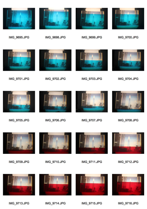
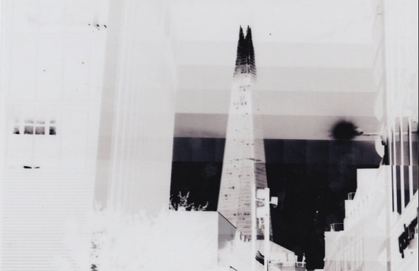
Fifth Response:
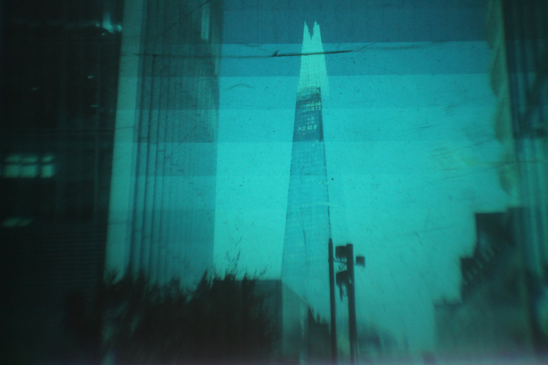
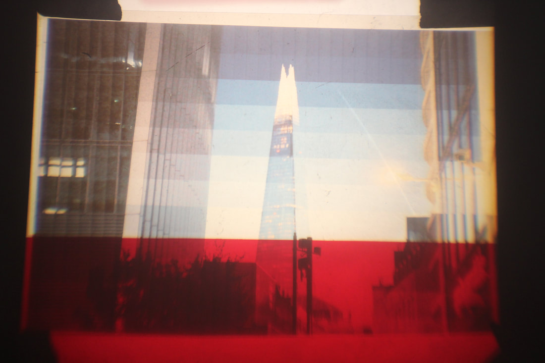
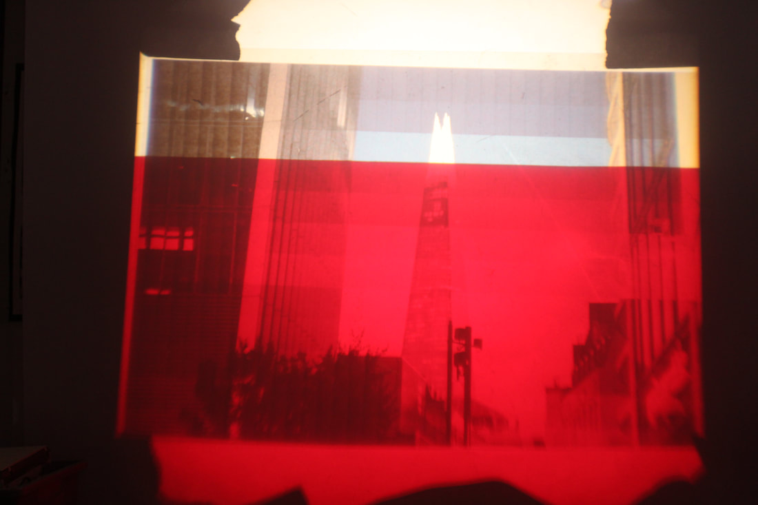
For my fifth response I wanted to look at GIF's as Wei did, but instead of each seperate slice changing, I printed my Shard image onto acetate and projected it onto a projector screen. With that in place, I wanted to use different coloured sheets and place them on each slice and take mulitple still images until the whole sheet covered my original image. At first I only used a blue sheet, but I decided to experiment with different colours and it worked effectively. My GIF worked due to the two different colours coming up and down which added more to the execution. The sheets were clear enough to see the original image through it allowing a very slick colour change while having each slice very clear to the viewer. However, the GIF did have too much movement and it was not as smooth as it could have been. To improve this next time I would need to use a tripod so no movement occurs. As I still have the acetate, as a further development of the Shard image, I want to experiment with using the darkroom and create images using photographic paper and see if that is effective.

Sixth Response:
Original Images (Acetate)
|
|
Photogram:
Process of creating a Photogram:
1. First step is to set up your enlarger to be at F11 or F8 and make sure your filter is on 3.
2. Second step is to raise or lower your enlarger lamp to dimensions of 5x4 paper and focus it.
3. Third step is to set your timer to 3 seconds, so the light is not exposed for too long or too little of time.
4. Fourth step is to make sure your lamp is turned off.
5. Fifth step is to grab a piece of photo-paper and make sure it is centered under your 5x4 light.
6. Sixth step is to place the desired objects you would like to use according to your design.
7. Seventh step is to hold a piece of cardboard above 2/3rd of your paper with objects and press your timer light. Then when the timers done, cover the second 3rd of your paper and press the timer light. Then when the timers done, remove the cardboard and expose your whole paper to the light and press the timer for the third time. Now your test strip is ready to develop.
8. Eighth step is to repeat these steps with a new paper knowing how many seconds is best to expose the light on your paper and place your objects on to your new paper and start the timer. Now you are ready to develop your final print.
Test Strip:
For my first test strip, I set the timer to one second and sectioned out a slice of the paper every second for five seconds. As a result, the best time to use for a not over or underexposed photogram was 3 seconds.
I then experimented using 3 seconds on a full size photographic paper but it still was over exposed. So I decided to increase the the time to 4 seconds and it still came out over exposed. I then realised that the filter number was too low which was causing the photograms to become over exposed, so I changed the filter from a 3 to a 4 with a 4 second timer and it came out just darker than perfect. Finally, I changed the timer to 3 seconds and it came out with the right level of exposure.
|
|
|
|
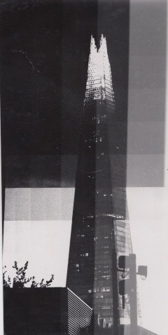
Final Response
Using the right time and filter, I created my photogram of the Shard which I really like as it shows each slice of time from the original image making sure there are strong black colours so it is not over exposed and strong white colours so it is no under exposed. However, there are still parts that have been over exposed like the bottom half. It was hard to keep a balance of making sure each slice was clearly visible while the bottom half remains to be not over exposed. The darker buildings are clear in the image especially in the bottom half so the settings of the enlarger were not incorrect but in the original image that area of the image was slightly overexposed so that is why in the photogram the slices of time are not very visible. But it still creates a strong comparison of colours between the top and bottom half of the image emphasising the difference of light and day. To further improve the image, I would need to fix the over exposed areas by changing the shutter speed to a quicker number so less light goes through the lense. For my second shoot, I want to experiment with creating distortion through a reflection. For example, through puddles of water, mirrors or shop windows and see how effective that technique is.
Development So Far
|
First shoot in Coldfall Woods
after researching the work of Fong Qui Wei and Stephan Wilkes. 
|
|
Started experimenting with using different shapes
and variations to create responses to the work of Fong Qui Wei. This response being multiple squares places in different positions. 
|
|
Once experimenting with horizontal lines, I then experimented with lines in landscape still following the work of Fong Qui Wei.

I then experimented with using physical filters using coloured paper and a projector to display my work on a white backdrop and made a GIF.
|
|
Further development of experimenting with different variations of shapes, this time being straight lines going horizontal still following the work of Fong Qui Wei.

As my last piece for this shoot, I printed my image onto acetate and used the darkroom to create my photogram.
|

|
|

|
Slava Semeniuta
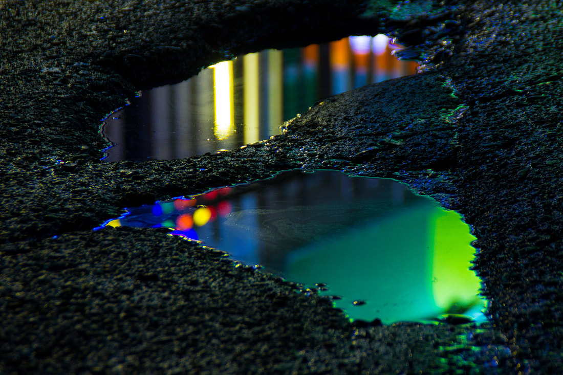
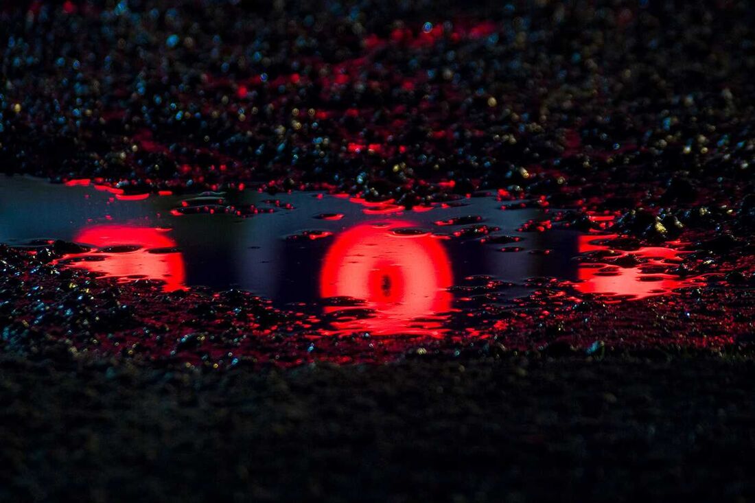
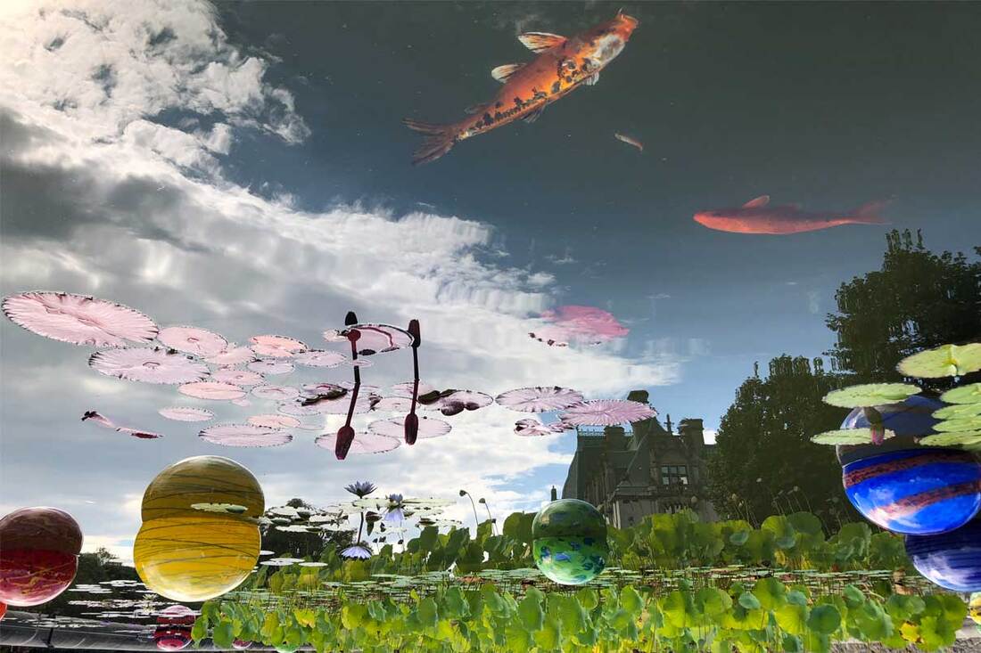
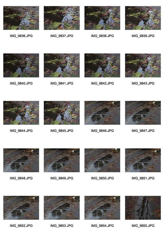
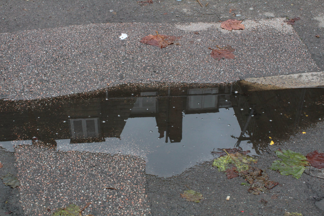
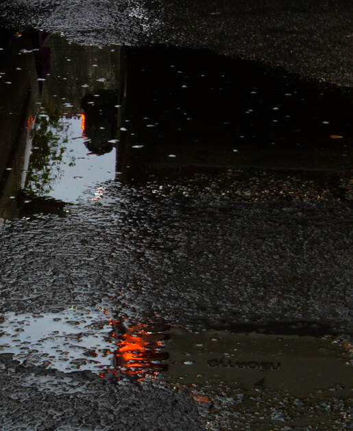
Moving away from distorted landscapes, I decided to look into capturing reflections through wet puddles. Doing so, I was captivated by the work of Slava Semeniuta. Semeniuta is a Siberia born artist who lived most of his life in Minsk, Belarus but now currently lives in Sochi, Russia. The photographer was fascinated with neon lights due to it being very rarely found in nature. With this facination, he created the series 'Wet Neon' where he would take images of puddles in the ground and capture the neon reflection coming from it from the lights. This work is creative as he is taking very normal and average details of the street and creating life within something that is not recognised on a day to day basis. He manages to alter something that does not catch the eye into an image that makes you want to see more. This is evident in his pieces below. Both images have a centre point of life circles by darkness of the surface. He creates this smart contrast within one area that creates a new meaning for it. I am really inspired by his work as it presents a clear representation of how you can make something from nothing. For my response, I am going to be photographing puddles that seem lifeless making sure there is light in the reflection and using Semeniuta methods to edit the image to create a neon effect. I will also experiment with using inverted effects on Photoshop to see how effective I can make the puddle be.
|
|
Chris Carr
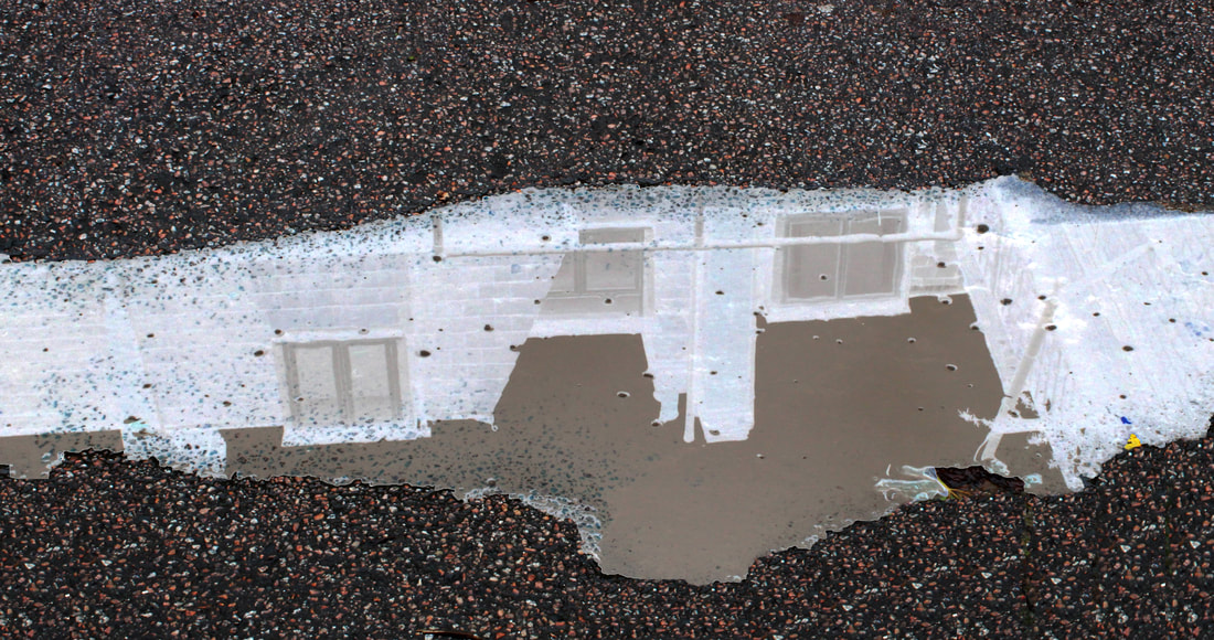
The North Carolina born photographer who currently lives in Orlando Chris Carr is known for his very abstract imagery creating illusions that may not be a true depiction of what you would actually see. With his passion to create, Carr reveals new perspectives of the natural environment by capturing reflections through puddles/water. He does not edit or alter them or digitally manipulate his work but rather focuses on creating an idea of as he states "two worlds colliding in one small, fleeting view." Both images below present similar techniques that portray how an abstract piece can fool the viewer into thinking something is there however leaving the viewer confused as it is something they would encounter on a day to day basis.
In this piece, Carr cleverly composes each part to confuses the mind. He combines different things that would not usually be next to each other with things that would regular be in their position such as having the fish in sky which is unnatural but then having the building next to trees which is normal. Having the picture shot in such an angle where the water is dominant with barely any reality creates a distortion wherethe audeinece will continue to keep uncovering new parts of the image. I really like the image technique as it is very unusual. It is not clear cut and obvious and allows the audience to partake in picking out the image. Going forward with my work, I want to experiment with shooting buildings through reflections and creating a similar distortion.
|
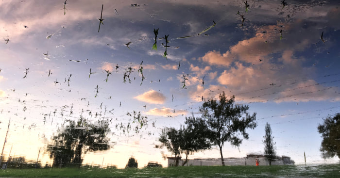
This image originally shows a field with multiple trees and one white building with little leaves/twigs in random places of the image. As a viewer that is what you would assume the image is about, however that is the reason why this is my favourite piece by him as he manages to blend the line between reflection of the water and the normal scenery so well you would not even realise it was a reflection. Carr effectively uses a flipped angle to show to make it seem as though this is real. He also uses the twigs/leaves to his advantage as there are other areas of the image such as the black lines running through the clouds on the right side that make it seem more like a reflection, but the twigs/leaves beside it makes it seem as though it is just smaller twigs. The fact that he did not even use photoshop to digitally manipulate it makes it more naturally distorted. I will use a similar technique in terms of making the image seem as though there is no puddle to make the audience continuously unpick the image apart.
|
Comparison
Both artists are similar in terms of creating an image by using the reflection to distort the natural environment, however one focuses on the use of light distortion while the other uses perspective distortion. Semeniuta is known for taking something that is always unrecognised such as an ordinary puddle, but cleverly uses the rule of thirds and places the lit up puddle directly in the middle so it catches the eye of the audience. This with the addition of neon bright lights with the rest of the image almost black with darkness makes the reflection recognised and is a very effective way of adding life to something that is unrecognised. This differs to Carr as he uses only perspective without any digital help to make his piece whereas Semeniuta heavily uses Photoshop. Carr manages to select the angle to perfection that makes one area seem as though there is two completely different landscapes combining into one. This differs to Semeniuta as Carr focuses on gradually revealing the truth of the bigger picture whereas Semeniuta gives it straight away. Carr allows the viewer to unpick small details of the image suprising themselves with new perspectives when looking at different areas of the picture. I believe both artists have their own effective ways of portraying a reflection, however I want to focus on using different lights and inverting techniques to to create strong comparisons of the surroundings and the reflections. I will also be using the rule of thirds to make sure the focus of the image is in the correct place as Semeniuta does.
Second Shoot
Avenue Mews
Contact Sheet:
|
|
|
|
|
Original images:
|
|
|
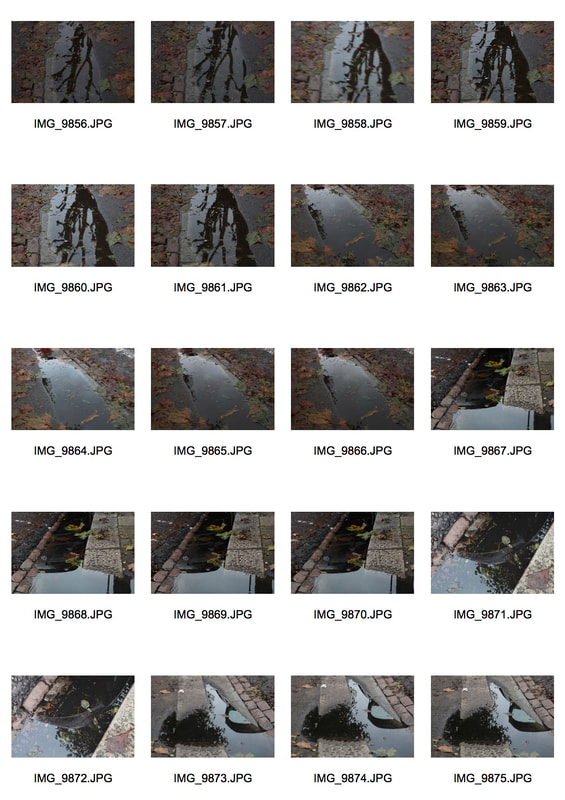
First Response:
For this shoot I wanted to focus on how Slava Semeniuta look at light through reflections. However, instead of just focusing on light, I experimented with inverted reflections, reflection of buildings, and light reflections.
For this piece, I decided to create two of the same images reflected next to each other while one is inverted. This creates an effect of not only distortion through the reflection, but also seems as though it is two different places all together due to the invert effect. Having two seperate puddles in one image also adds more emphasise on the distortion as both puddles portray light in the water. However, I feel as though the image would be much more effective if it was taken at a darker time with more lights. As a result, the inverted reflection would be more distored without just the white colour dominating the image.
|
|
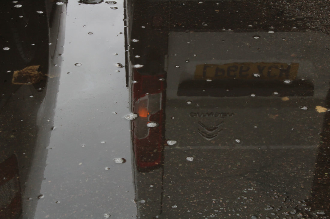
In this piece, I searched for puddles with reflections of buildings to create a distortion of reality as it seems as though the building is on the floor. This worked really well as you get strong contrasts of the black and white from the inverted puddle. When using Photoshop, I carefully selected the puddle which was the most important part because if it was over selected or under selected, the invert would not look as realistic. Instead of getting an almost side low angle like Semeniuta does, I decided to get an above shot so that all of the building is clear to see. The use of the darker surface compliments the reflections as it makes it stand out even more so the viewers attention is drawn to that first. To further develop this piece, I will look at adding the non inverted image to add it above it like my previous example, to add more distortion to the overall image.
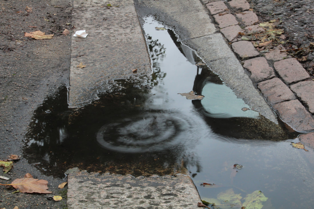
For this piece, I wanted to use the low side angle and capture it like Semeniuta does. Doing so, I created a strong image of distortion again because of the accuracy of editing in the inverted reflection. I managed to carefully construct a very clear distortion with a nice effect in the puddle. The use of the discreet reflection of the car combined with the water ripples adds an element of more distortion which I think worked very well. Having the puddle directly in the middle blocking out two pavements blocks out the sense of normality of the surface again adding more distortion to the natural landscape. However, to further develop a good way to add evenmore distortion would be to make the surface around the puddle darker so the reflection stands out and becomes more visible to the audience. For my next shoot I want to experiment with using a see through glass infront of famous areas in london and adding an unnatural element of distortion by using water, soap, and even ink to the glass so the landscape becomes not a reality.

Third Shoot
Glass Distortion
Michael Lee
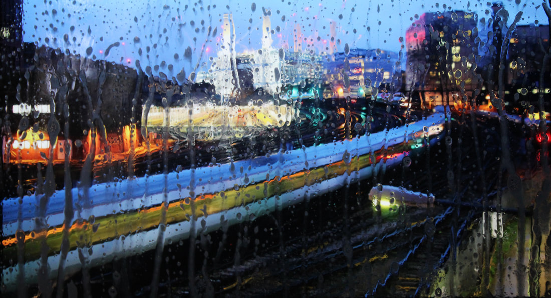
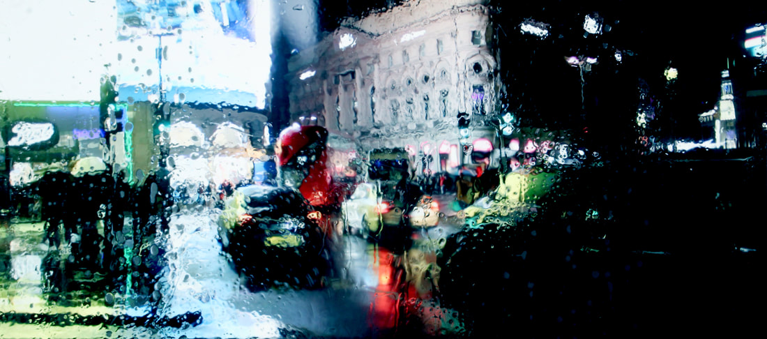
Looking away from reflections, I wanted to experiment with creating images that seem like paintings using effective methods to create this work. Going into research, I came across an artist called Michael Lee. UK based artist Michael Lee is a commercial and event photographer with a background in fine art. He is also known for his different photographic techniques and also his previous love for paintings. Combing all of this together, He created the series 'HDR' where he took images mostly in London and other places around the world. Once his images were captured, he would heavily use an HDR technique which produces greater dynamic range of luminosity than what is possible with standard digital imaging or photographic techniques. Doing so, he would finalise images. As evident below, the images are so heavily edited that the buses and cars and even people become blurry . This makes the image seem painted as most parts of it have a round lines and everything is foggy, fuzzy and unclear creating an idea that a paint brush was used. Having the image like this then distorts the reality and questions the viewer as to if this image was either taken on a camera or painted. For my response I want to experiment with capturing my initial images, then instead of using Photoshop to edit it, I will use a large mirror shape glass and place it into a small open container in front of the image that will be projected onto a computer. I then want to use water, soap, and ink to create different types of distortion trying to make an effective painting like image.
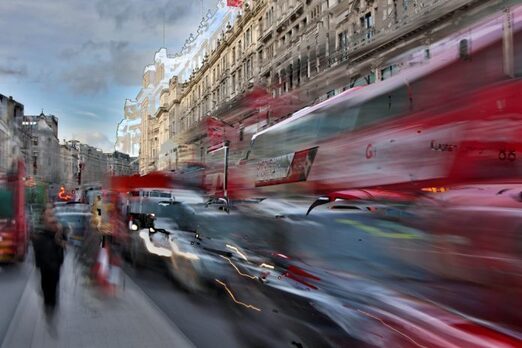
In this image, I really like his choice of surroundings. He cleverly uses an image with a bus in it so when he uses his HDR method, the red from the bus can move to different areas of the image so it is not just dull black and grey colours. Standing in the middle of he road also means he can capture both sides of the road and with it's heavy traffic, it helped incorporate more of the distorted cars giving it a wave like motion as if it has been painted. I will use this as inspiration in my work by choosing a good location such as Piccadilly Circus that will present me with many opportunities for cars to be in the image.
|
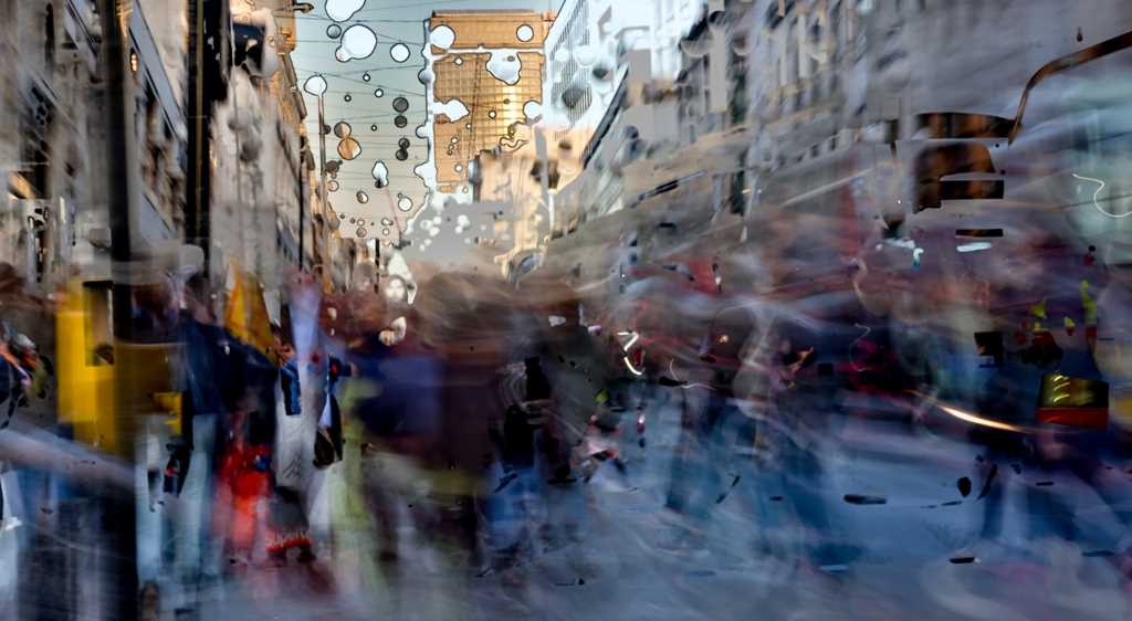
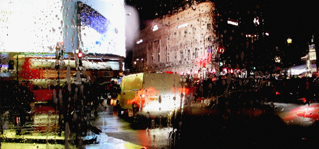
In this image, similar to the last example except with people now, he effectivly uses the movement of the people crossing the road to get more of that wave movement instead of them standing still which is needed to create a painting like image. The use of the HDR specifically in this works well and what I like most about the image, is how there are dots and circles in the background in different colours. This makes it seem as though they are paint drops placed onto the image either purposely or by accident. This adds further detail and accuracy in trying to get a paint like feel to the image and is my main inspiration of the image as I will be experimenting with this to add more of that feel to it.
|
First Response:
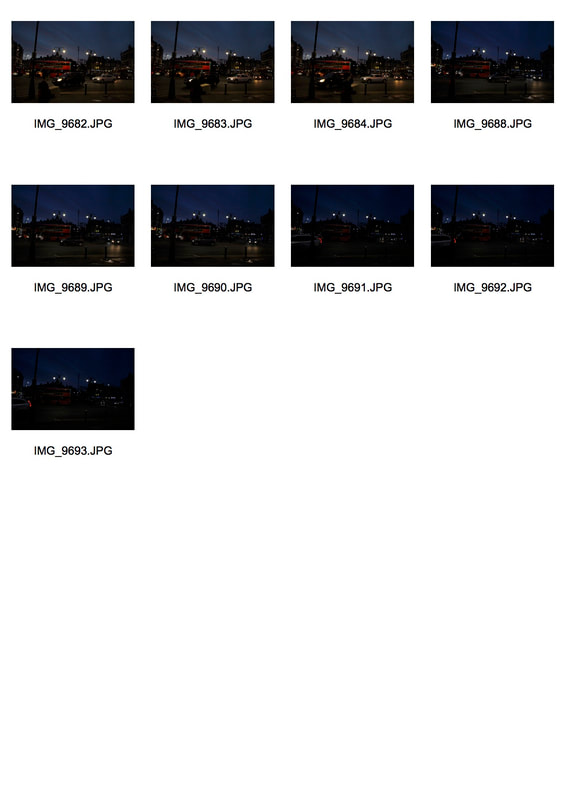
For this shoot I captured images of four different locations at night. This being Ebury Bridge from one angle and Westminster Bridge from three different angles. My aim was to photograph an area with a high amount of light which I executed well. I then did the following steps:
1) Once I captured my pictures, upload them onto the computer then place it full screen.
2) Place a glass in a small open container in front of the image.
3) Get the equipment you will use to spray on the glass ( Water/Soap).
4) Create different distortion images using the items.
2) Place a glass in a small open container in front of the image.
3) Get the equipment you will use to spray on the glass ( Water/Soap).
4) Create different distortion images using the items.
Ebury Bridge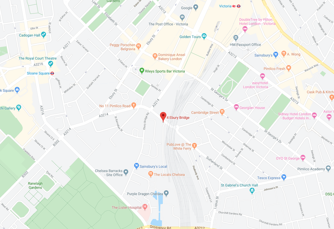
|
Westminster Bridge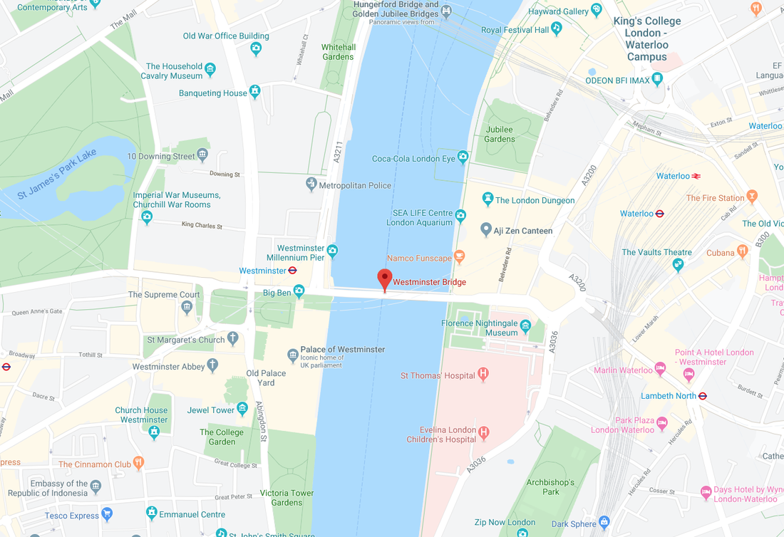
|
|
|
|
|
|
|
|
Original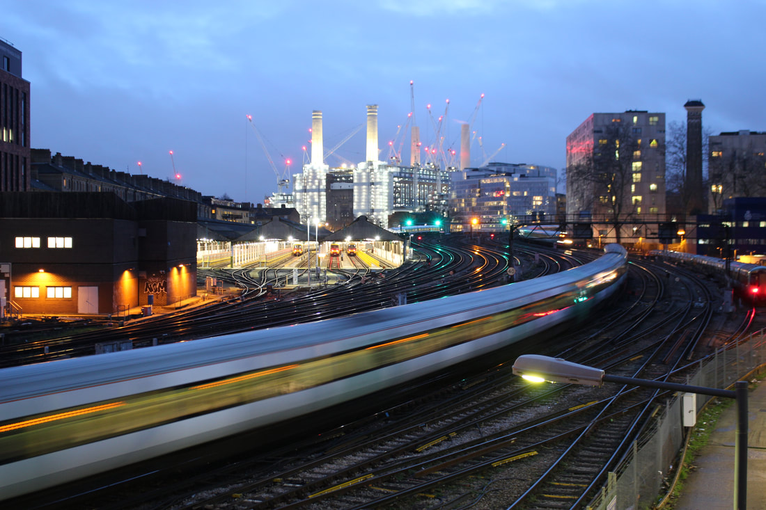
|
|
Edited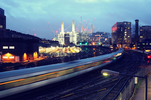
|
Original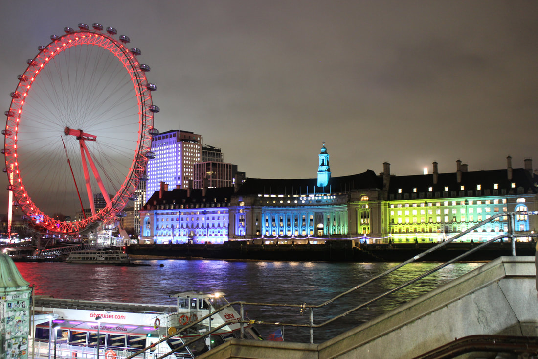
|
|
Edited
|
Original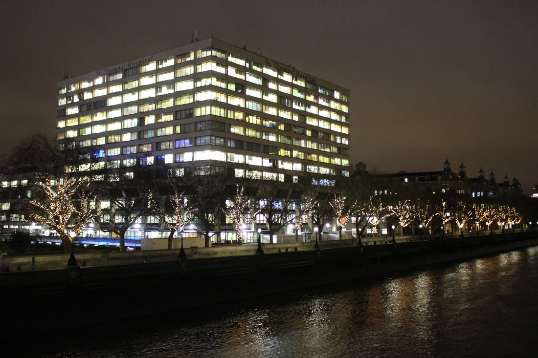
|
|
Edited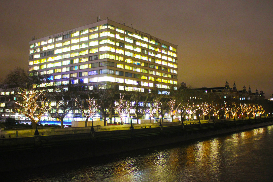
|
Original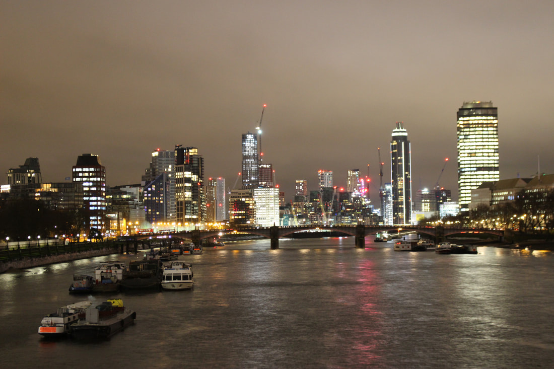
|
|
Edited
|
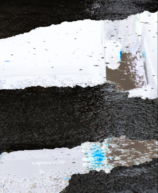
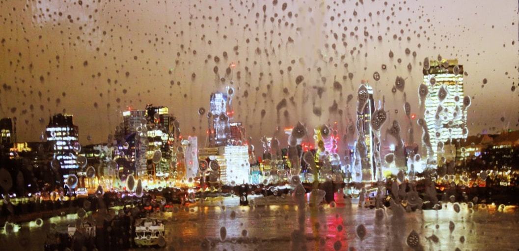
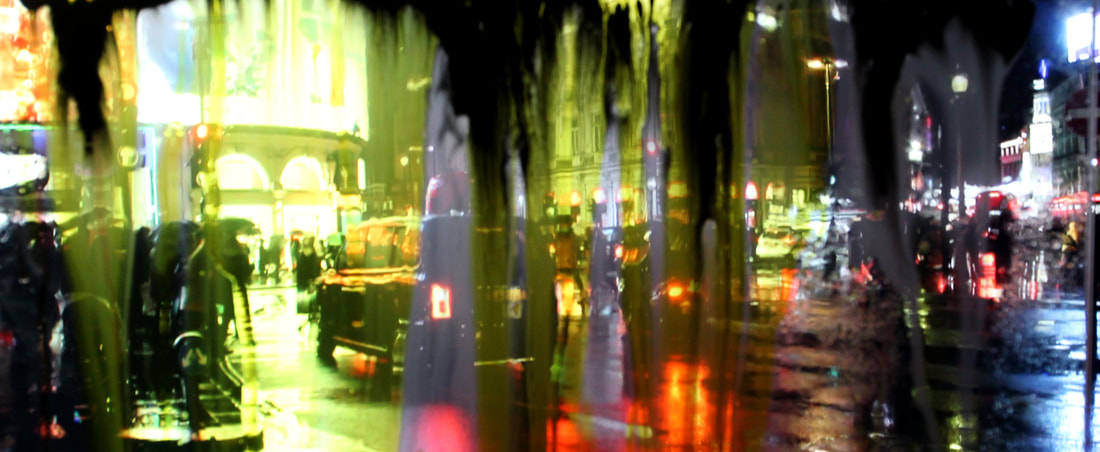
This piece worked the best due to the location choice, how it was composed, and the level of detail. I managed to capture a range of different sized buildings that were all lit up in different ways, some at the bottom of the building, some at the top and some throughout. This played to my advantage as it meant the water and soap combined with the light to make it seem more painting like. The lights are also positioned right infront of the camera with the smallest light from the lamppost getting larger and larger until you reach the big white light furthest away. This adds to the effect as it seems as though there are different levels to the light. Furthermore, adding the soap and water to the image created the distortion of the image. I wanted to use more soap this time so it distorts it evenmore as less of the actual picture would be seen. I believe taking the pictures with this amount of daylight was perfect as it was not bright enough for the lights to not stand out but it was also no dark enough to lose the effect the of surroundings that are not lit up. However, I do believe to further improve I would need to steady my tripod more. It was a very windy day so the top left side of the image is slightly blurry which loses the effect. I also need to use more water instead of soap to make it seem more like a painting.

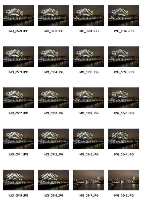
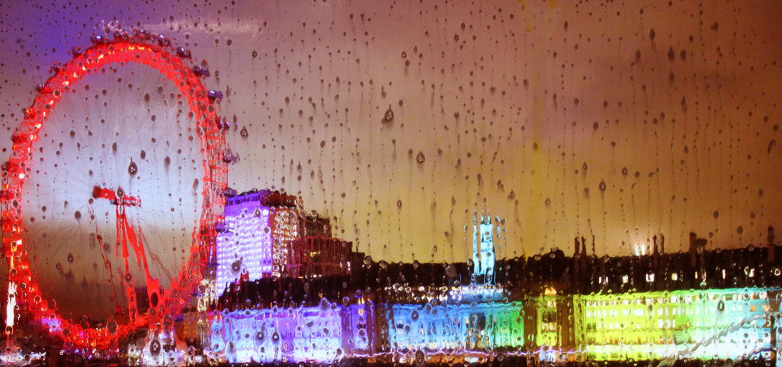
For my next image I wanted to experiment with the lights of the London Eye and the lights from the building next to it. Doing so, I placed my tripod on some stairs next to the bridge and captured my image. However this time I wanted to experiment with more soap and less water, so I only put one layer of water on the glass and sprayed the whole surface with soap. I believe this worked very well as it gives an effect as if it was water droplets slowly falling down a window as though you are in a car. In addition, the range of vibrant colours compliments the sky's also vibrant colours almost making it seem as though the sky looks fake. This then adds to the level of distortion not just by the physical editing but the technological editing of Photoshop. Overall the image was effective but to improve further I will take a wider angle shot as it seems too zoomed not allowing more varieties of buildings to be involved to create a stronger distortion. I also need to use more water instead of soap to make it seem more like a painting.
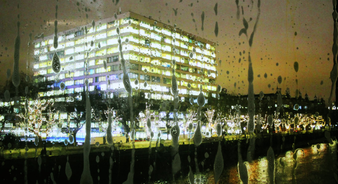
For my third image I wanted to get a wider shot, so I captured the St Thomas' Hospital. Although the lights were lit up on the building, what added more effectiveness was the trees. How the lights were wrapped around each tree allowed there to also be a reflection of it so the River Thames was then shining bright yellow. Similar to the first image, this then added different levels of distortion to occur. The soap sprayed all over the glass specifically the building, trees, and river caused a triple distortion of light, at the same time as keeping the painting like element to the image. I feel as though this imitated the work of Michael Lee thoroughly as his work had many levels of distortion to it. However I do believe the size of each part of soap was too large and would have worked better smaller so more of the lights specifically from the trees were visible around the mid section of the piece. To further improve I will use more watered down soap so it does not come out in big chunks blocking the main areas of the image out.
For my final image, I wanted to capture an ultra wide angle having a various amount of buildings included. So on the same bridge, facing Lambeth bridge I took the image. The image worked best due to the location chosen. Having the background with many lights made it very effective, although the image was slightly blurry due to how windy the day was, the lights took away the focus of that. However the blur makes it seem as though it is the water and soap that is distorting the image which then works well. I do feel as though if I added more water to the image it would have worked better as too much soap loses the paint like feel to the image, so to further improve it, next time I will add more water and use less soap.
Fourth Shoot
City- Scape Distortion
Stephanie Jung
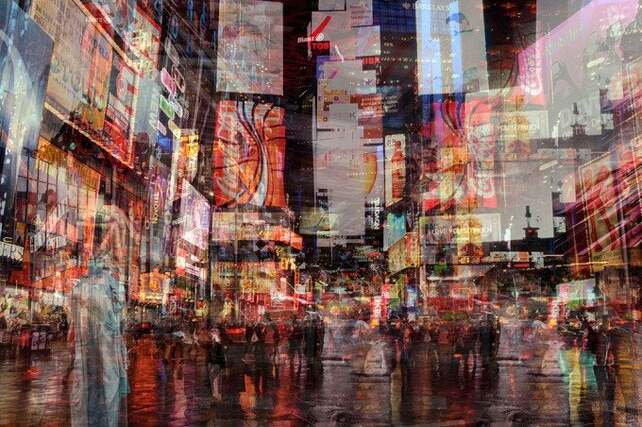
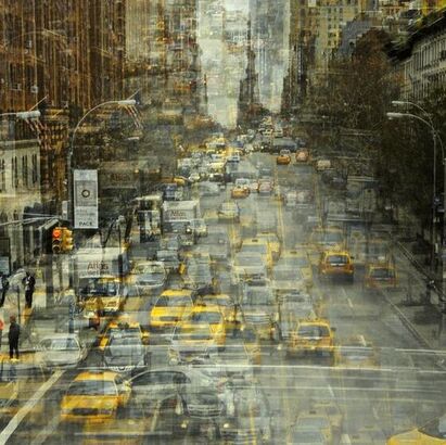
After multiple responses to the painting type images, I have decided to look into creating images with multiple layers of the same thing but put in slightly different areas to make it seem as if there is more things in the image then there actually is. Looking into this, I researched the artist Stephanie Jung who created these types of images very effectively. The German based photographer focuses her work on city-life, time and caducity, and capturing special moments getting lost in time. Which is very evident in her portrait images below where she manages to explain what the original surrounds is like through her use of vibrant colours and how she can make it seem hectic. In both images she creates a theme of everything being busy and overwhelming by having either so many buildings, people or vehicles. Although it may seem harder to create during the daytime as there is less different lights and colours to add to this sense of too much going on, she uses things to her advantage. For example, in the daytime picture, she uses so many layers to distort the road and makes it seem as if it is closing in making an end the road and buildings. The repetition of cars also makes it seem as though you would not even be able to walk across the street adding to this effective distortion technique. For my response, I will experimenting with capturing images of different landscapes and really finding what area is in London is best to use for this layering technique.
|
|
Pep Ventosa
Pep Ventosa was born in Catalan in 1957 in Vilafranca del Penedès, near Barcelona but currently lives in the San Francisco Bay Area in California. Ventosa is known for his unique multi-layer images. His love for photography stemmed from when he got his first camera at the age of 10 then from then on it became his passion for the rest of his life. During his school life, he learnt the mechanics of the darkroom at Spain's Escola d’Arts i Oficis Artístics de l’Alt Penedès and further along his life he taught himself the possibilities of the new digital darkroom. Similar to Wei's work, Ventosa work focuses on an exploration of the medium itself. He looks at "deconstructing and reconstructing photographic images to create new visual experiences". Below are some of his examples:
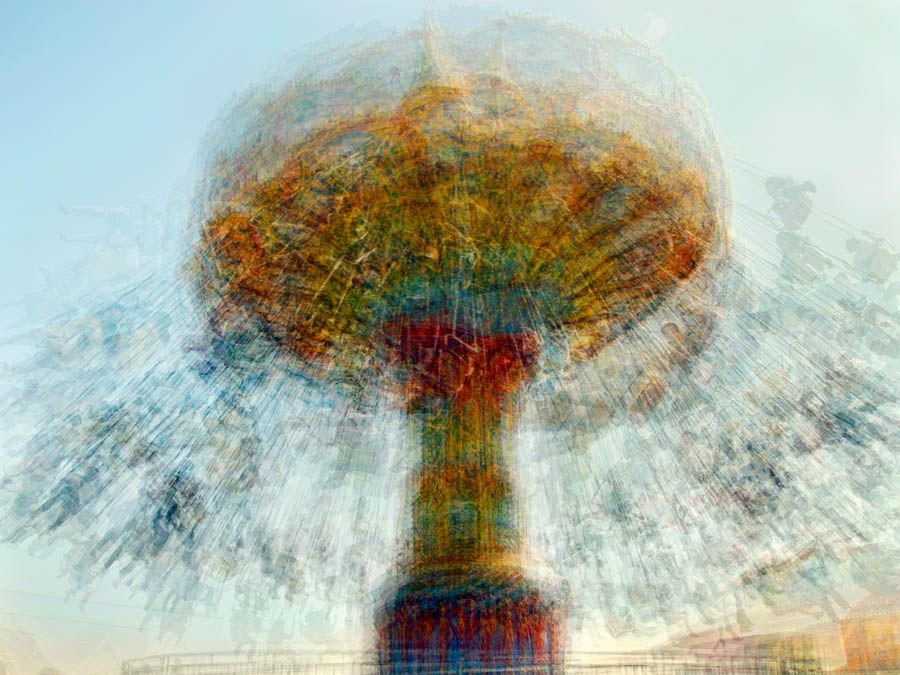
In this series, "Carousels, In the Round" Ventosa focused on capturing multiple shots of the carousels while circling around it then blending them together to "discover what became of the orbit". What worked the best in this image is how the angle he took the image in. Ventosa cleverly chose a low angle shot of the carousel making sure only the carousel was in the shot and small parts of other buildings. This played to his benefit as it meant that nothing in the background was available to be layered. It left him with a clear blue sky which meant he could layer the people swinging and the carousel allowing it to stand out to its full effect. Having this blank background is very effective as you can get a clear contrast between the two areas of the image allowing you to single out and make it clear to the audience what is being captured. I believe this technique is very useful so for my work I will experiment with singling out what I want to be captured.
|
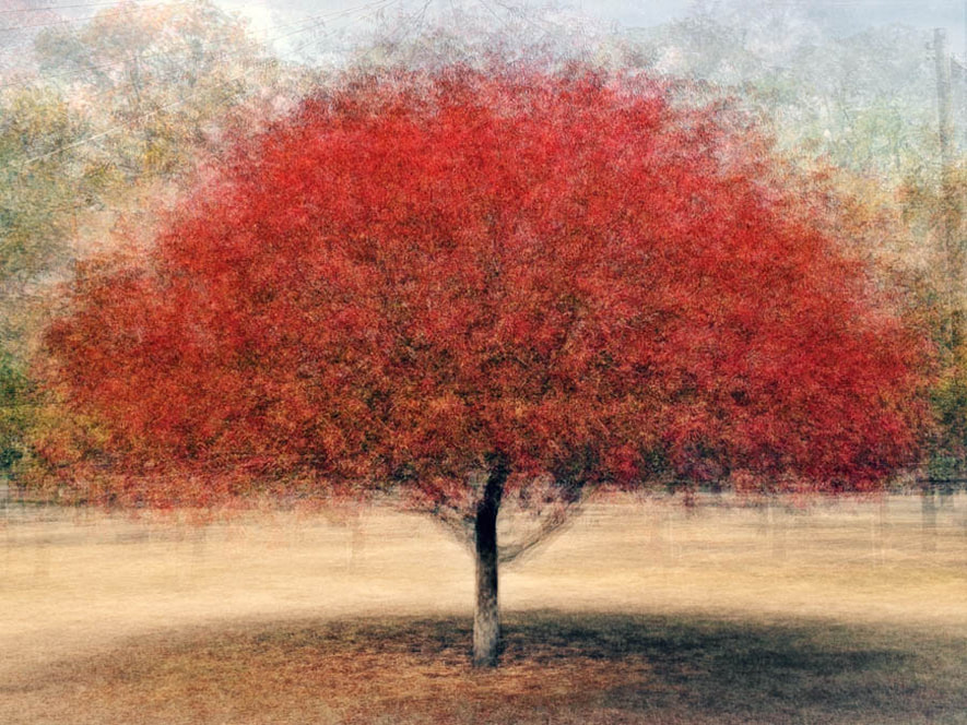
In this series ,"Trees, In the Round", Ventosa focused on capturing multiple shots of the tree while circling around it. After capturing each image, he would edit it and put them together and "discover what became of the orbit". This image is very effective as he uses the main part of the image to single it out from the backgound. Although there are trees behind the red one, as a viewer you are drawn into what takes up most of the image. I really like how he singles out one part of the image from the rest of the image as it can make something as normal as a tree, more interesting and more visible. The use of colours is also key to the composition of the image as the excess of red distracts you from the underlying colours of the greens and yellows and blues in the background where if it was not layered, would be very in your face as much as the main tree as it seems faded away. The bottom half of the image is not as layered as the top half due to there being less things to be layered so having emptiness in areas of the image allows the tree to stand out even more which is very effective. I will use this as inspiration for my work specifically the use of colours. Having dull and bright colours in the right area of the image will allow the viewer to focus in on the main areas of the image.
|
Comparison
With Jung and Ventosa, they are very similar through the work they produce. Jung is known for her city-scape multi-layer images and how she uses her range of colours effectively to create her wide shots of heavily congested areas filled with cars, buildings and humans. Ventosa is known for his multi-layer images also but how he tends to focus on on part of the image for example a tree, picture, or lamppost etc and how he makes it stand out. Overall, their work is very similar as they create a picture of a normal everyday landscape and digitally edit it through Photoshop to make many layers to alter the reality of our world creating a very effective distortion. However, I do believe Ventosa uses a wider variety of types of locations and tends to capture more ordinary landscapes than Jung. For example, Ventosa has series of works of trees and lampposts which are very ordinary, wheres Jung is mostly city-scapes. I am very inspired by both of the artists work such as how Jung alters famous city-scapes such as Times Square and makes it seem so unrealistic, and also how Ventosa singles out things that are so ordinary with the clever use of empty backgrounds to give the focus point more attention to the audience. Due to my inspiration, I willbe using both techniques in my experimentation for my responses.
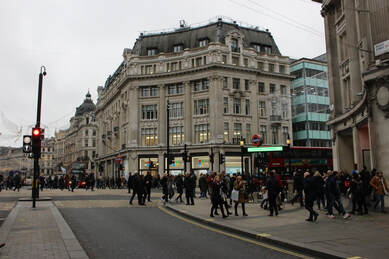
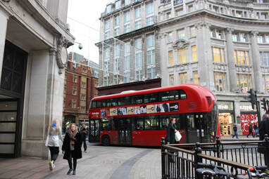
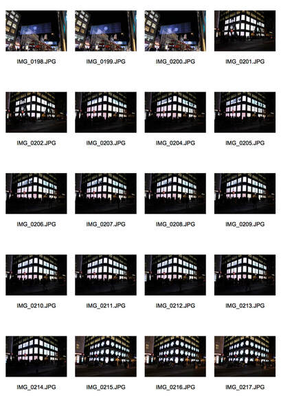
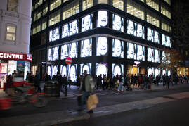
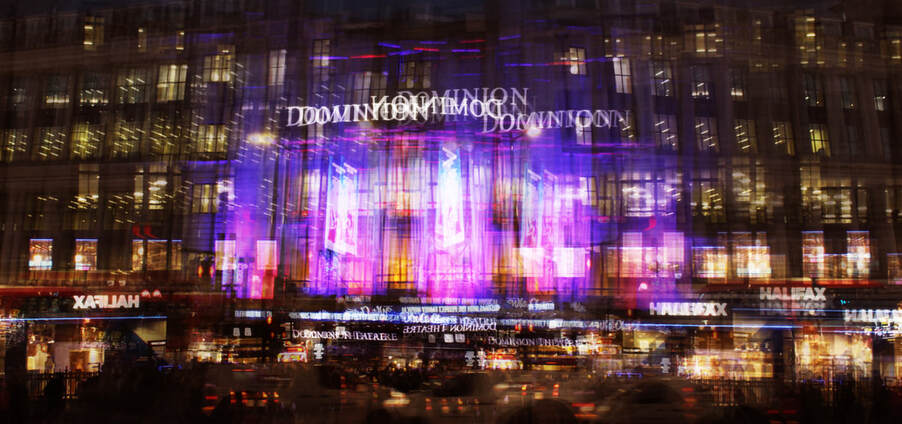
Oxford Street
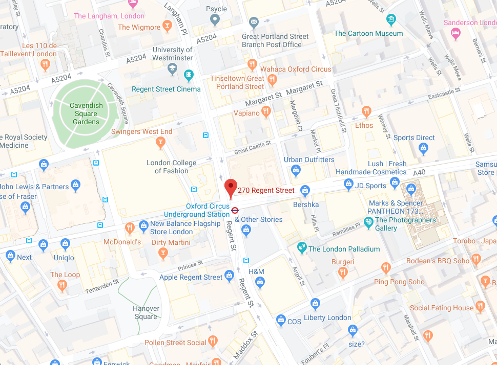
Original Images:
|
|
First Response:
Following my research on the two photographers above, I experimented with achieving this distortion in London. I went to Oxford Street and focused on capturing buildings and vehicles. The image of the building worked more effectively as it resembled Ventosa's work more than the bus image resembled Jung's work. This was due to the composition of the image. How the camera was placed directly infront of the main building so when edited, more small details in the original image can be moved either side of the building. For example, how there are buses on either side combined with the mist of all the people allows the viewer to not only focus on thing. However, what would make the images more effective is if they were taken at night so I can capture all the lights creating light distortion also, just like Ventosa does.
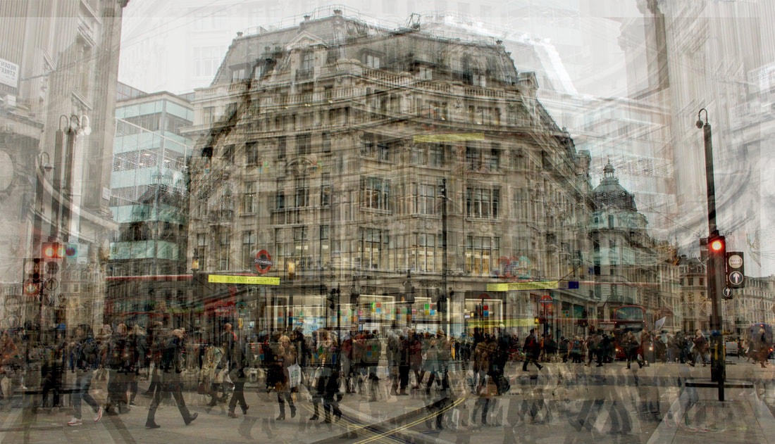
In this image I focused more on Ventosa's technique of work as I wanted to single out one thing from the image away from the rest of it to see how an audience can be distracted by one thing and blind to other things. That is why I do think this image works very well because this bus has been layered in so many different positions, it shocks the viewer and grabs the attention. I purposely chose a bus as the rest of the image is mostly just dull whites, greys, and blacks, so having something bright red captures the eye the most. However, I do believe to improve I need to capture an image of one thing with an empty background and layer it many times just like Jung has as you can pick out each layer as an audience instead of being distracted by other things in the background creating more focus on the distortion itself. For my next response, I want to experiment with shooting at night as I will be able to get more strong colours to add to the element of distortion.
Tottenham Court Road
|
Piccadilly Circus
|
Oxford Street
|
Contact Sheet:
|
|
|
Original Images: |
|
|
|
|
|
|
Second Response:
For this response I went to the following locations:
1)Tottenham Court Road
2) Oxford Street
3) Piccadilly Circus
I have decided to list the images from best to worst in the order you see it in.
1)Tottenham Court Road
2) Oxford Street
3) Piccadilly Circus
I have decided to list the images from best to worst in the order you see it in.
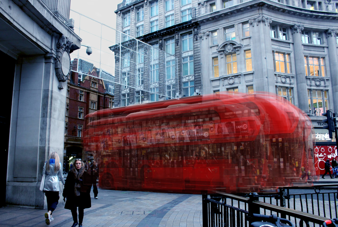
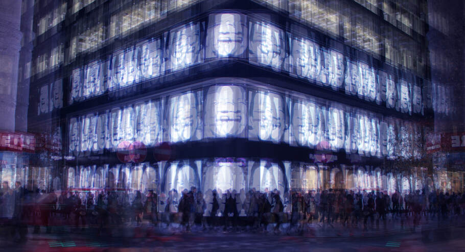
Out of all the images, I feel as though the first one portrays the best detail to display distortion. This is because of how the lights work with the multiple layers plus the way the people are placed. I composed the image to make sure I was facing the corner of the building. This was so the image seems as thought it is facing/coming towards the viewer. That plus all the layered images makes it seem almost 3D like creating a new type of distortion to the viewer. Shooting at night played to my benefit as each screen is lit up and creates a weird distorted mind frame feeling as each face is laughing at you in different ways.
With each other image, they all worked very well using light as its main feature to portray distortion. To improve my last three images, I would need to focus on using people as a main feature as well as light. I believe one of the reasons the first image worked good was because of the excessive amounts of people as well as the lights. Having more than one strong element distorted makes the picture more effective and using excessive amounts of people is one way to go about it. For my final pieces, I want to focus back on creating painting like images as I believe that worked best and was most effective. To do so I will be visiting places like Ebury Bridge and South bank and capture strong images for which I can distort with.
With each other image, they all worked very well using light as its main feature to portray distortion. To improve my last three images, I would need to focus on using people as a main feature as well as light. I believe one of the reasons the first image worked good was because of the excessive amounts of people as well as the lights. Having more than one strong element distorted makes the picture more effective and using excessive amounts of people is one way to go about it. For my final pieces, I want to focus back on creating painting like images as I believe that worked best and was most effective. To do so I will be visiting places like Ebury Bridge and South bank and capture strong images for which I can distort with.
Development so far
|
First shoot in Muswell Hill experimenting
work of Slava Semeniuta and Chris Carr. 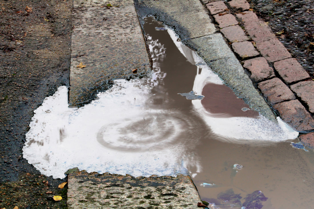
|
|
Then Michael Lee researched and experimented with creating painting like images using a large piece of glass infront of a computer and spraying different liquids to create the effect.
Then researched Stephanie Jung and Pep Ventosa and experimented with multiplying the landscape image creating many of lays and slightly moving them in different directions.
|

|
Final Shoot
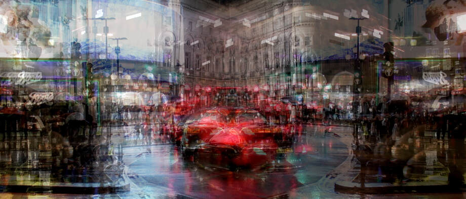
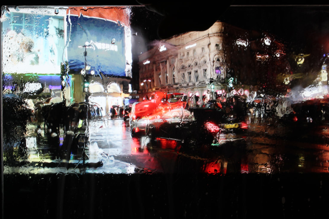
For my final shoot I wanted to focus back on my third shoot looking at glass distortion to create painting like images. Doing so, I went to Piccadilly Circus capturing six separate images. From my previous response of this type of shoot, what worked the best was combining both lights and heavy use of water to execute a painting type image just like Lee which I feel like are the main components to create a painting type photo. However, I also wanted to experiment using coloured ink to see what effect it could create, and based off my second shoot I used inverted reflections as that was an effective technique to create distortion. I also wanted to improve the images by choosing better locations to use to make a more effective image. Because of this, I carefully chose my locations which provide the features I need. I went to Piccadilly Circus as it provided me with large amounts of light from the big screens and cars as there was a lot of traffic.
The following steps were used to create my images:
1) Once I captured my pictures, upload them onto the computer then place it full screen.
2) Place a glass in a small open container in front of the image.
3) Get the equipment you will use to spray on the glass ( Water/Soap/Ink).
4) Create different distortion images using the items.
1) Once I captured my pictures, upload them onto the computer then place it full screen.
2) Place a glass in a small open container in front of the image.
3) Get the equipment you will use to spray on the glass ( Water/Soap/Ink).
4) Create different distortion images using the items.
Piccadilly Circus
Contact Sheet:
|
|
Original Images:
|
|
|
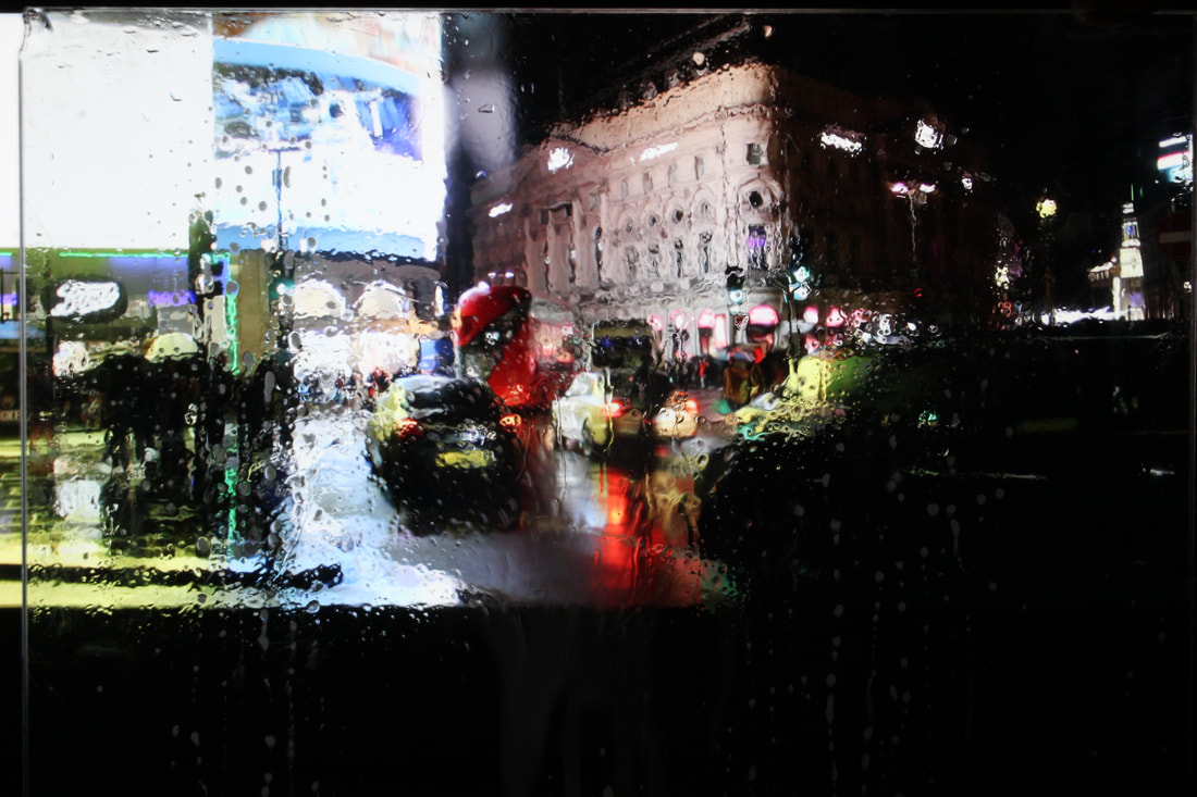
First response:
Coloured Ink
For this response, I wanted to experiment with a different type of distortion, so I applied yellow, red and blue ink to the glass as an addition to the water. Although it looked less like a painting, it was still effective because of the heavy amounts of ink as it still did not seem like a normal landscape. To improve the images, if I was to add an element of Lee's technique to it like how he takes some parts of buildings out and makes it invisible leaving only the outline of the buildings in then it would work even better. To further develop, I want to experiment with inverted reflections as it did work well in my previous responses.
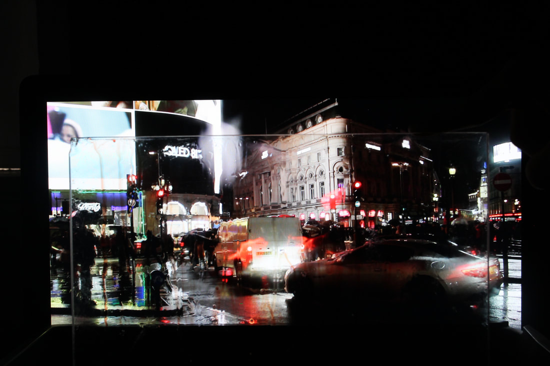
Second Response:
Inverted Reflection
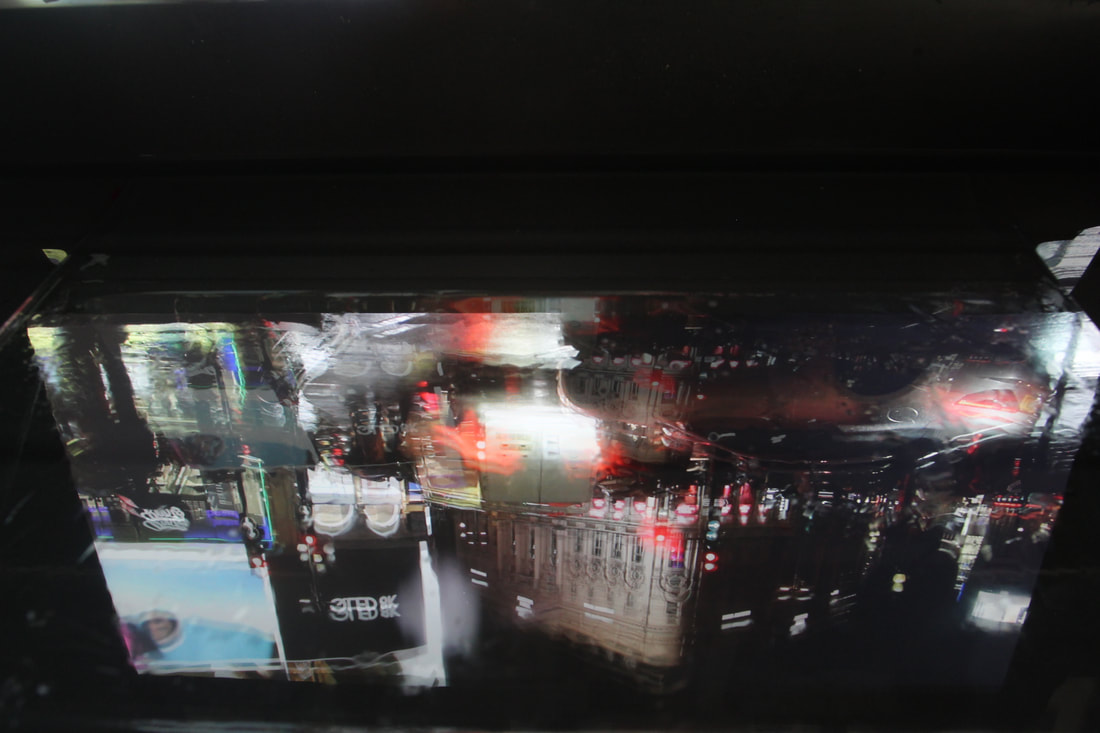
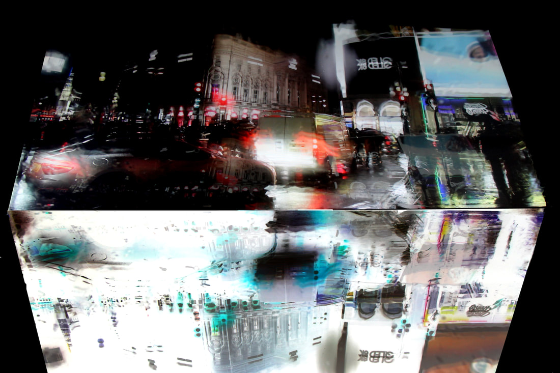
For this response, instead of having the glass directly in front of the image, I decided to place it into the container and photograph the image of the reflection through the glass. I wanted to do this as it looked naturally distorted on its own without any physical distortion at all. But I then wanted to add even more of an element of distortion, so after I photographed the reflection, I went into Photoshop and selected it, copied and pasted it, reversed the image and inverted it so it creates a double reflection from the original image. I believe this worked very well as not only is it distorted on its own, but the inverted reflection combined with the completely black background makes it seem as though it is a 3D shape almost like a box creating this idea to the viewer that the image might not even be real but drawn adding an even further element of distortion. To further develop I could create a whole 3D shape like a cube with a black background to make it seem as though it is floating. For my next development I want to experiment more with using heavy amounts of water as that creates a painting like image in the clearest way.
MOCK EXAM
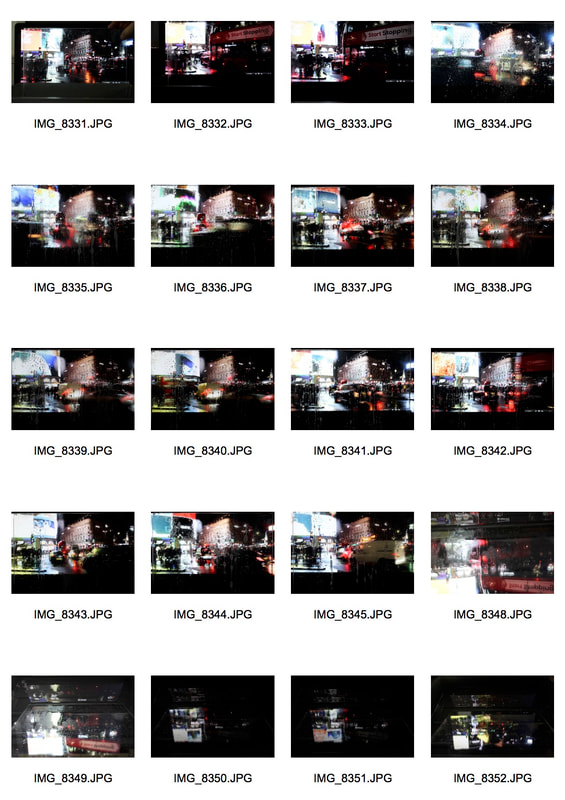
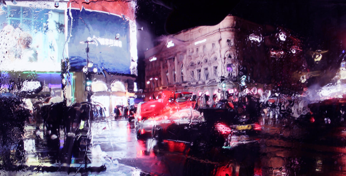
Piccadilly Circus

Contact Sheet:

|

|
Original Images:
|
|
|
Water
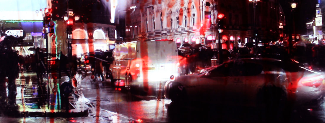
These three sets of images were my best due to how they resembled the work of Lee but in my own way. Instead of using Photoshop I managed to create an image that looks similar to a painting in physical form just like a real painting. I really like how the water distorts the image, especially the lights in a sort of way that pulls it away from its original position. However, on Photoshop I did alter the filter in the image to focus more on one colour, for example, the first is red, the second is blue/green, and the last is yellow. I wanted to use soap as an addition to water in the last two examples which added even more distortion to it especially how it almost blurs the big screen taking away the natural element to the original image. What I have learnt from this is using heavy amounts of water with a very small amount of soap works best in creating this painting like image I was trying to execute. To further develop, I would need to use this water technique as it is more effective, but instead use a more different locations that portray large amounts of light in London.
All Developments:
|
First shoot in Coldfall Woods after researching the work of Fong Qui Wei and Stephan Wilkes.
|
|
Started experimenting with using different shapes and variations to create responses to the work of Fong Qui Wei. This response being multiple squares places in different positions.
|
|
Once experimenting with horizontal lines, I then experimented with lines in landscape still following the work of Fong Qui Wei.
|
|
Further development of experimenting with different variations of shapes, this time being straight lines going horizontal still following the work of Fong Qui Wei.
|
|
|
|
I then experimented with using physical filters using coloured paper and a projector to display my work on a white backdrop and made a GIF.
|
|
As my last piece for this shoot, I printed my image onto acetate and used the darkroom to create my photogram.
|
|
I then researched Michael Lee and experimented with creating paintings like images using a large piece of glass in front of a computer and spraying different liquids to create the effect.
|
|
First shoot in Muswell Hill experimenting
work of Slava Semeniuta and Chris Carr.
|
|
I then researched Stephanie Jung and Pep Ventosa and experimented with multiplying the landscape image creating many of lays and slightly moving them in different directions.
|
|
I then went back to my Michael Lee research and did a further development based on the work I did previously with a large piece of glass in front of a computer and spraying different liquids to create the effect.

For my final piece, I perfected the technique of Michael Lee and created a painting like image using a large piece of glass in front of a computer and spraying different liquids to create the effect.

|
