STRUCTURE IN ARCHITECTURE
First Response
For our first task, we needed to capture architecture from the outside and inside of two buildings in Muswell Hill. We had to capture St James' Church and the Everyman Cinema which are located opposite each other.
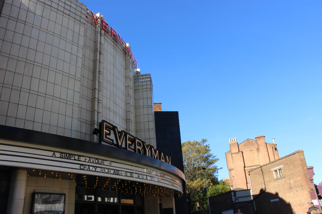
The Everyman Cinema :
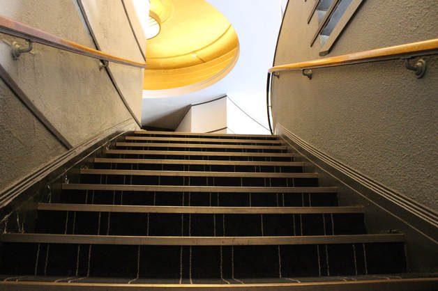
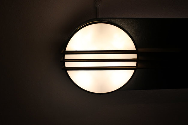
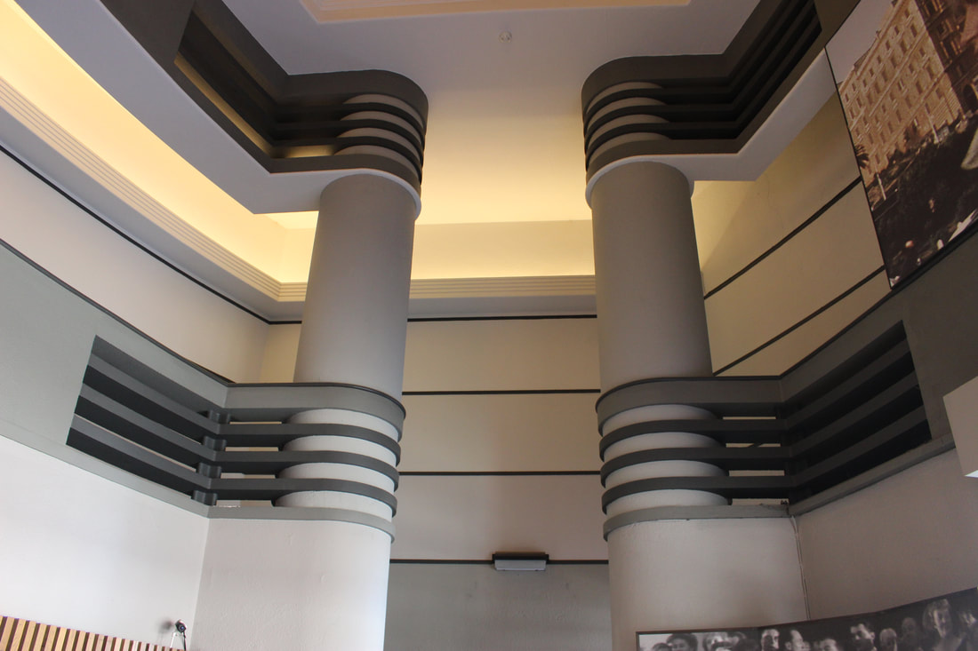
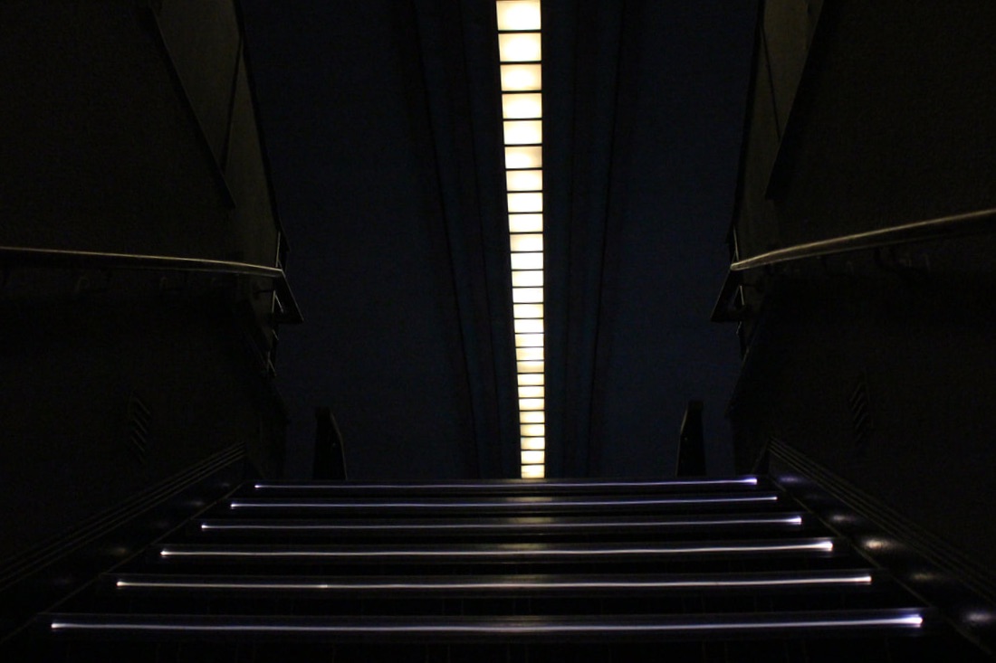
Before the cinema was the Everyman, it was originally called The Odeon Theatre. It opened on 9th September 1936 and seating was originally provided for 1,827. For this task, I focused on capturing the detail in architecture mostly inside the building, especially with the specific lines of the building such as stairs, walls, lights. I did this by getting close up shots and wide shots of the larger and smaller architecture inside the building. I feel like it was much easier to capture shots inside of the cinema as there was much more to capture as from the outside its only really the front entrance that stands out. But to further expand my variety of photos, I could capture wide shots of the cinema from the back of it.
|
|
|
|
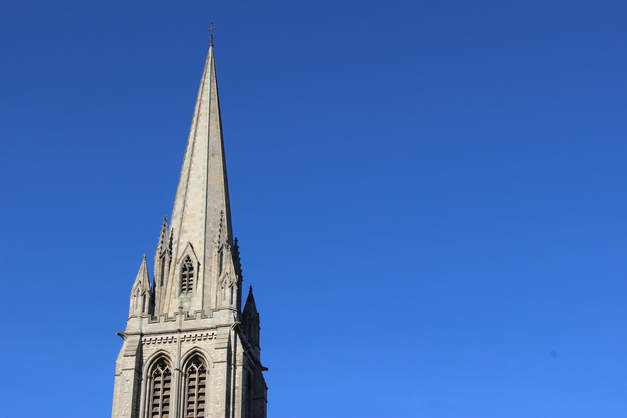
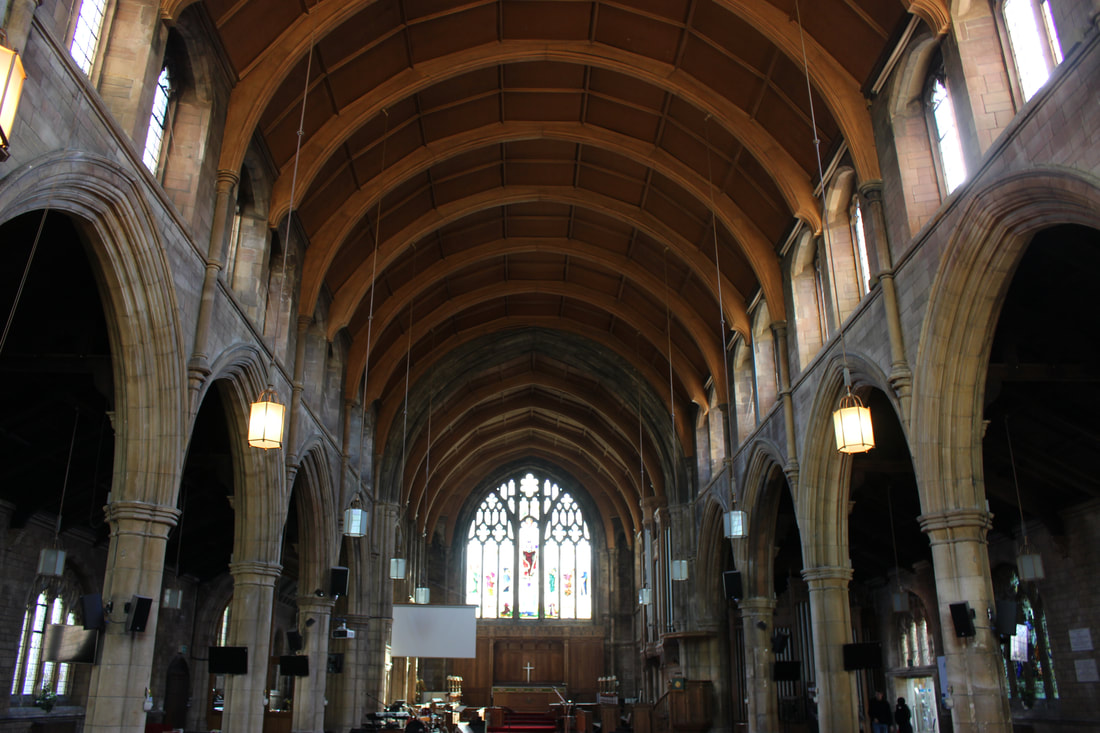
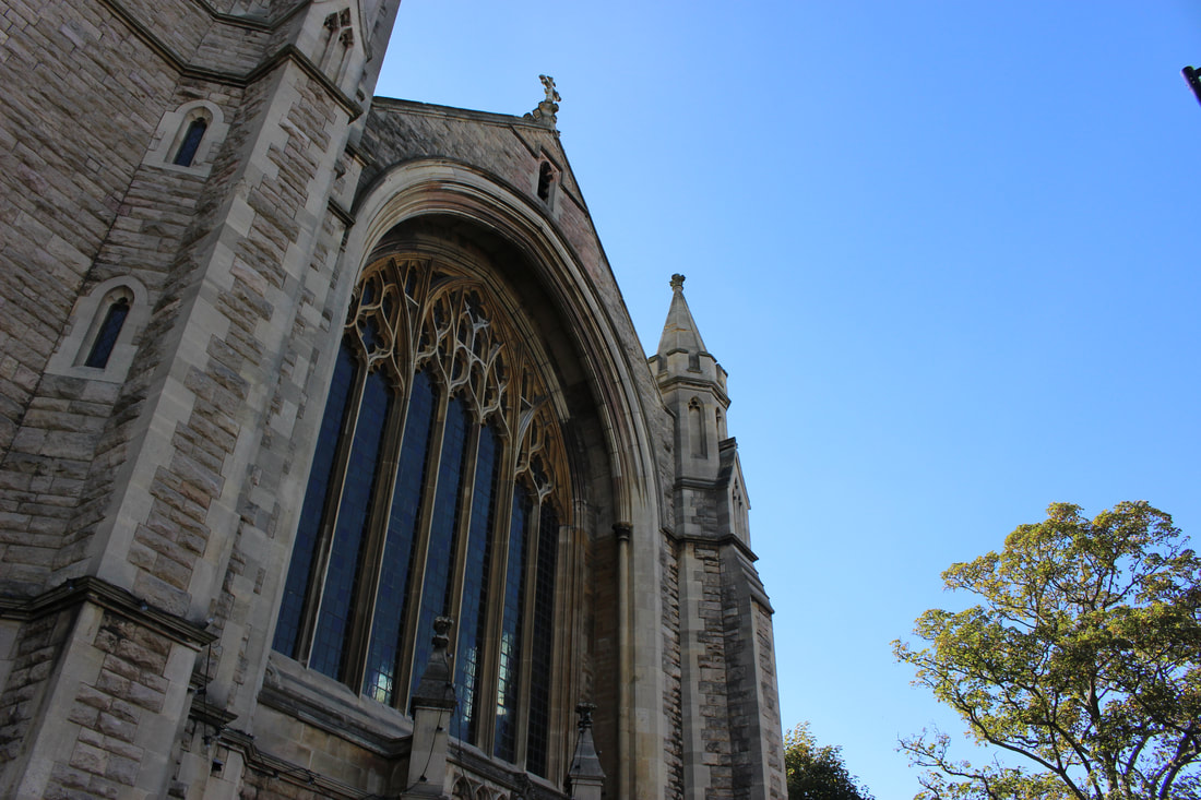
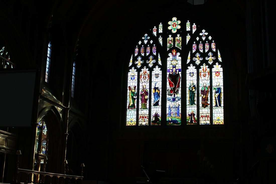
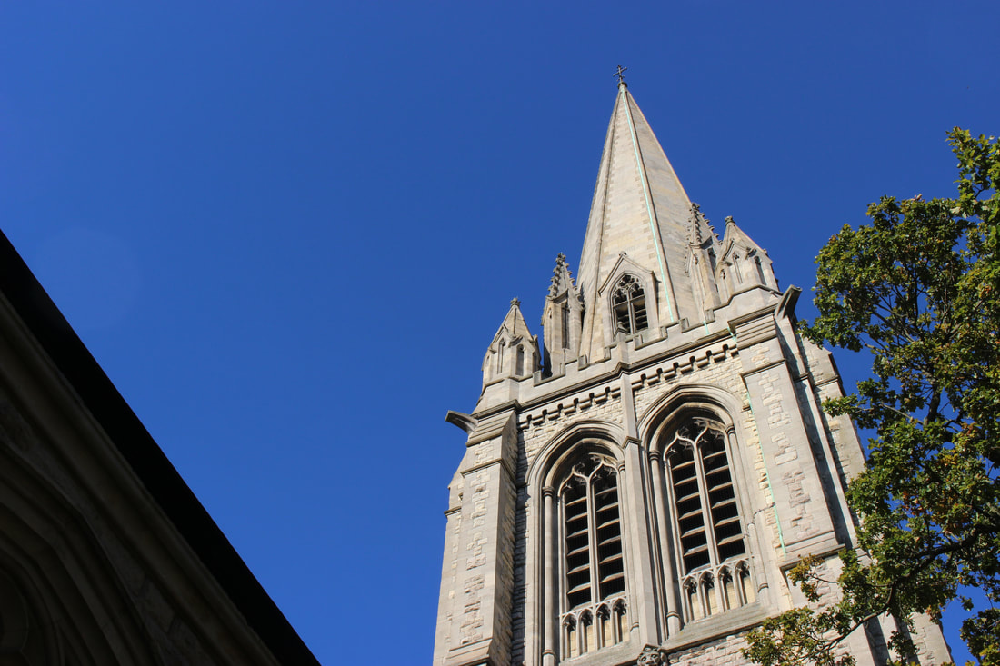
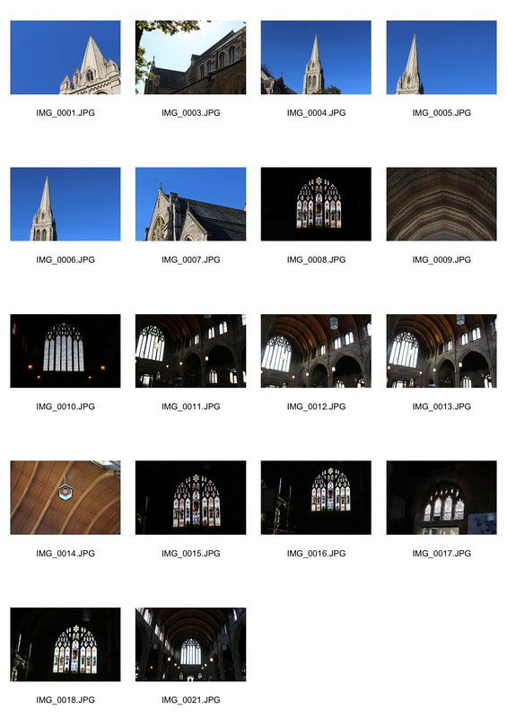
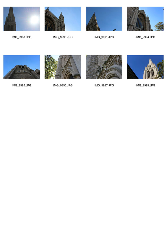
St James' Church:
The original building was consecrated in 1842, and the church was extended in 1874. For this task, I focused on capturing mostly the outside of the building by getting wide shots from many different angles. But I also captured good photos of the architecture inside of the building. It was much harder to capture images of the church from the inside as there was not that much light being let into it so to get the right focus with the right light, you needed to be distant from what you needed to capture, that's why I focused on more wide shots. But to fix this problem I would need to use a much slower shutter speed to allow much more light to be exposed as it was very under exposed. Next time, I need to get better close up photos of the church from the outside by choosing better angles to capture it from.
|
|
|
|
|
|
Second Response
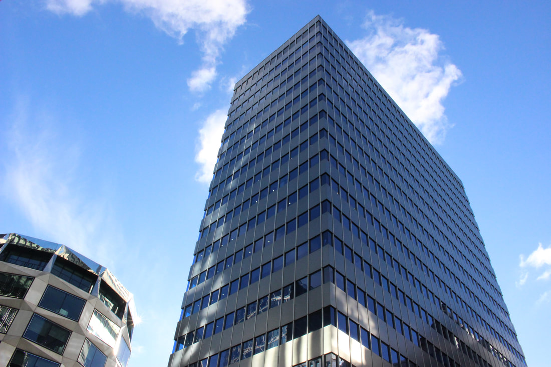
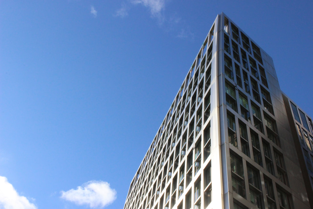
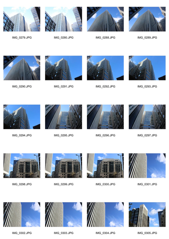
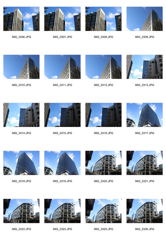
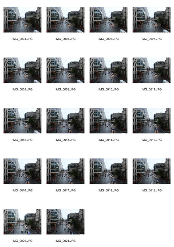
Following the structure in architecture task, to further develop the my idea of structure in architecture I decided to head into central london to capture some of the stand out structures. I focused on making sure sun was not facing the camera, not over exposing the image, and getting strong focused images of large structures. For the task the images created were very strong but to further develop it I would need to make sure I was only capturing the main structure that's in focus without having any other buildings in shot.
|
|
|
|
Structure In Nature
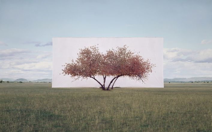
Myoung Ho Lee
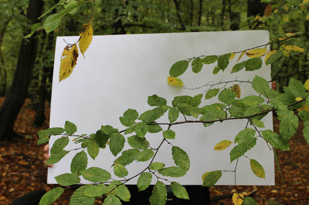
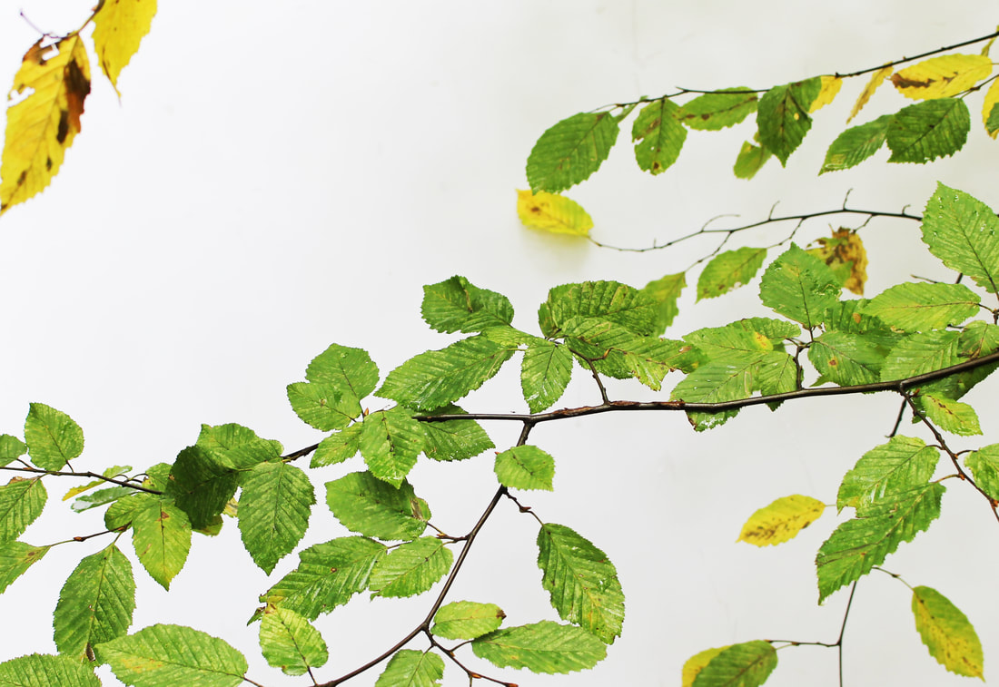
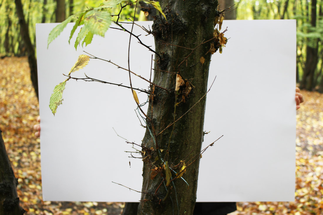
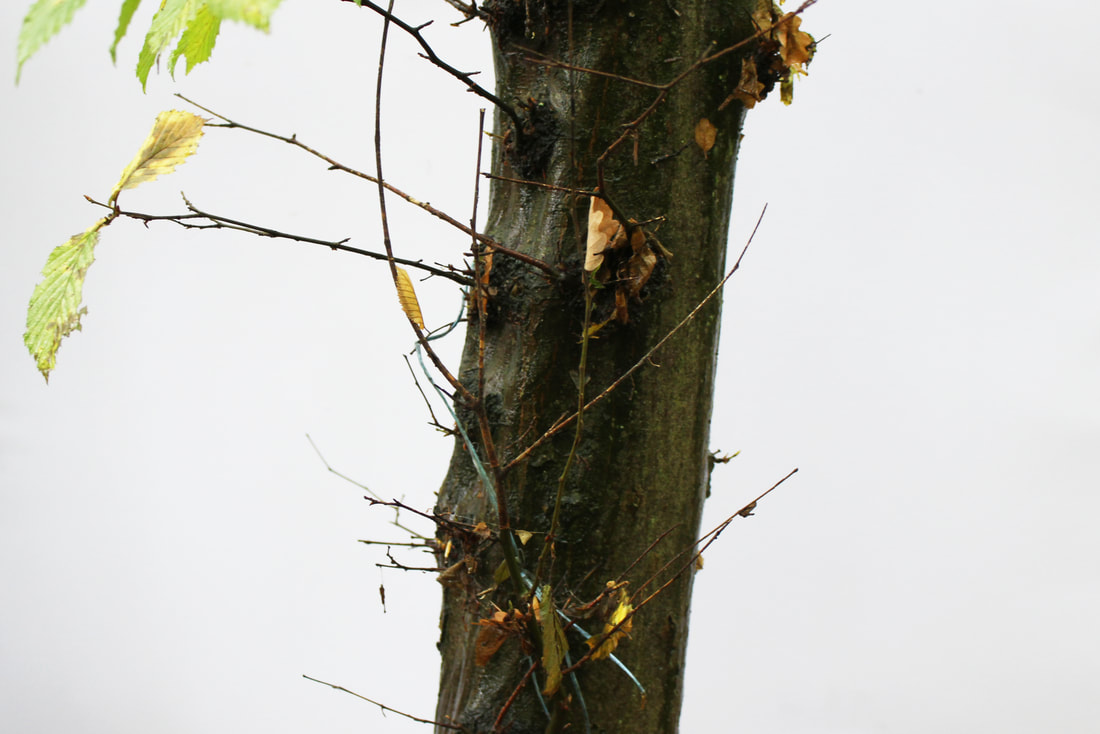
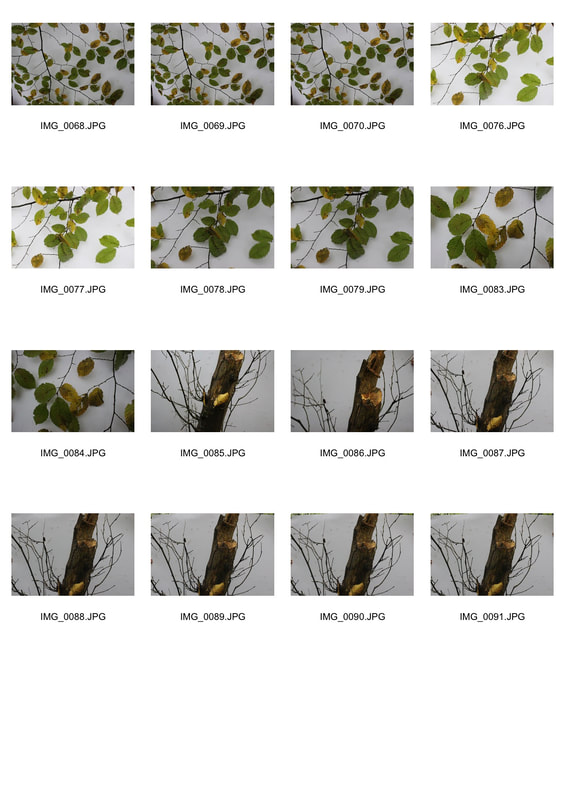
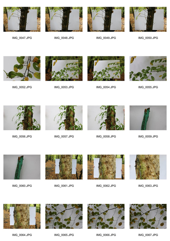
For this task I was was required to use Myoung Ho Lee's pieces of work to inspire me to produce similar responses. Myoung Ho Lee mixed nature with human used materials by going out into the countrysides and producing massive white backgrounds using fabric materials and placing them vertically behind trees. He does this to separate the tree from the wildlife it is in and making it appear indifferent to its normal surroundings. I think the artists work is very effective as it uses two different types of photography and puts them together to make another type of photography. As my favorite type of photography is nature, It grips me to capture large colorful trees as he has done.
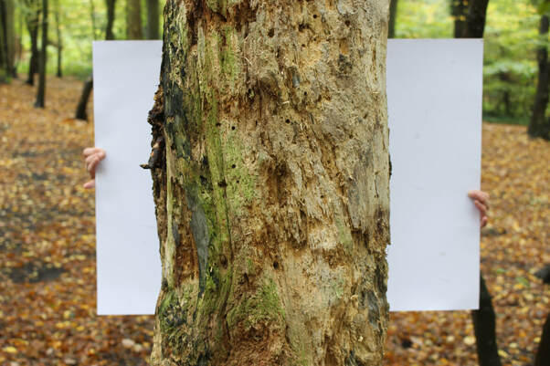
First Response
In this task, I used a white piece of card and went into the natural environment of the woods and look for places in nature such as trees and plants that I could photograph against the white background. I completed this task with having the white page fill the frame and also showing the context around where the photograph is taken. For my sets of images looking closely into Ho Lee's work, I managed to pick out my three strongest images that managed to fill the frame and show context around where the photograph was taken which represented his work very clearly. Although not all the original images were placed correctly, using Photoshop I cropped the right amount out and changed the brightness to create effective responses.
|
|
|
|
|
|
|
|
Sanna kannisto - Field works
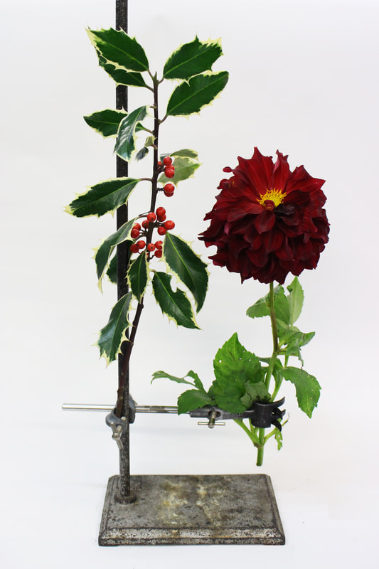
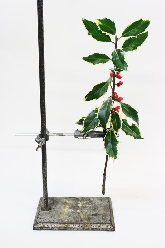
For this task I was required to explore Sanna Kannisto work and present my images similarly to hers. Kannisto mixed scientific objects and the natural wildlife and explored the focus of the characteristics in the animal by taking away it's usual habitat and placing a completely white background to apply the spotlight on it. I liked this type of work as it allows you to place your piece of nature exactly how you would want to see it creating a more personal piece. For example, you could add your favorite flower and place it in any order you would like.
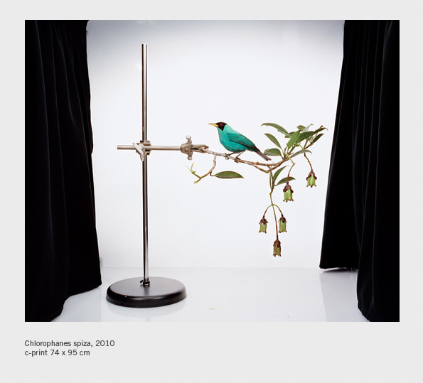
First Response
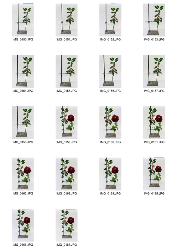
In this task, we brought in our own plants to replicate Kannisto's work by using the white backdrops and the scientific apparatus (clamp) provided. I chose flowers that would bring out a more suitable vibrant feel to get a strong scientific/nature contrast to create an artistic representation of my natural structure to show the natural beauty of the plant and also the context behind the image creation. By doing this, my final pieces really created similarities between my work and Kannisto's with good representations of her vision.
|
|
Brutalist Structure
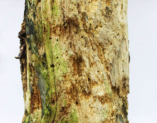
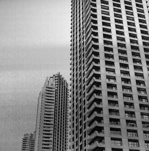
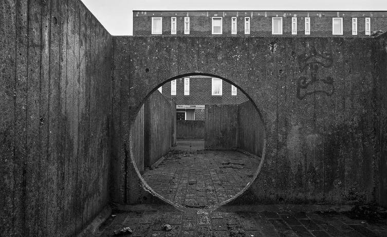
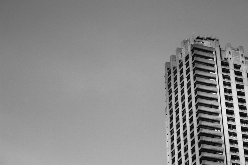
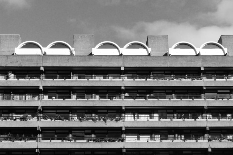
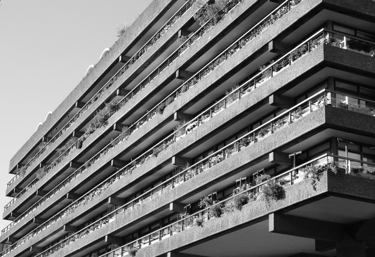
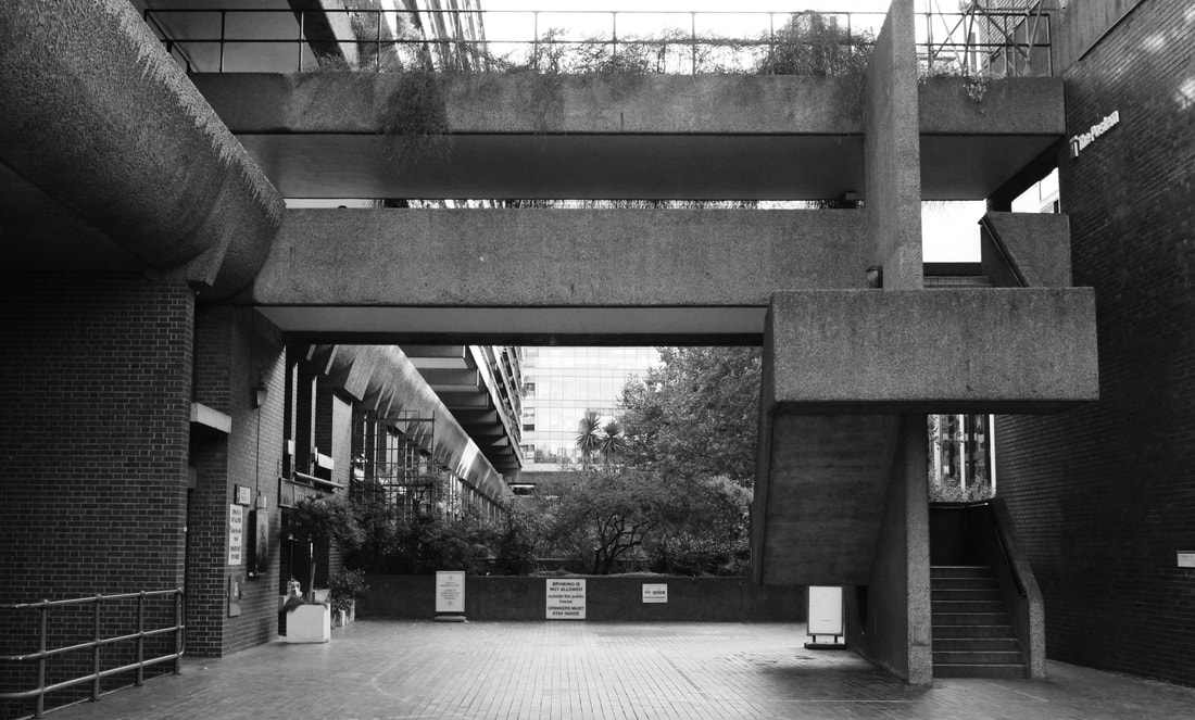
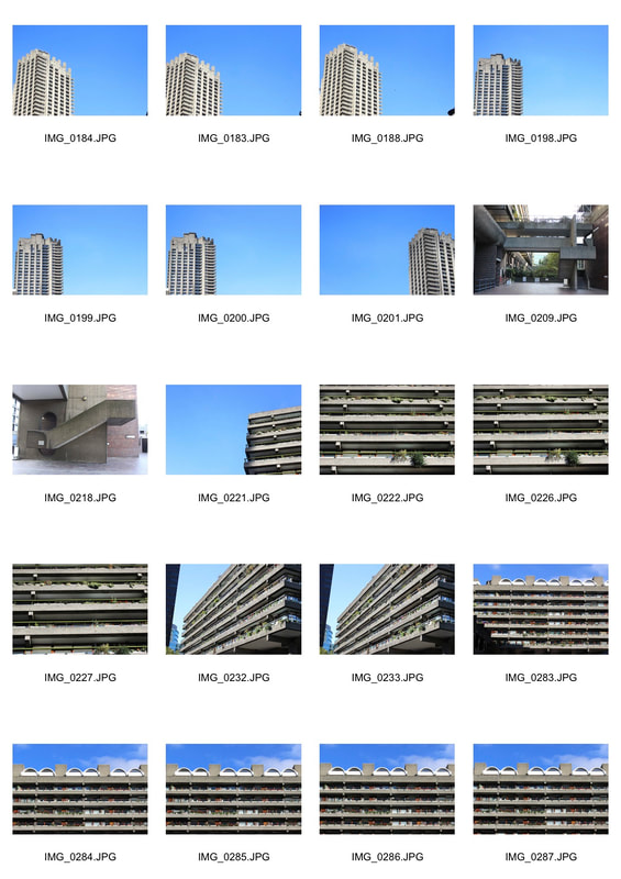
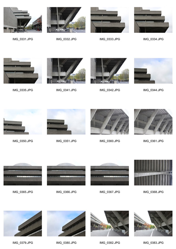
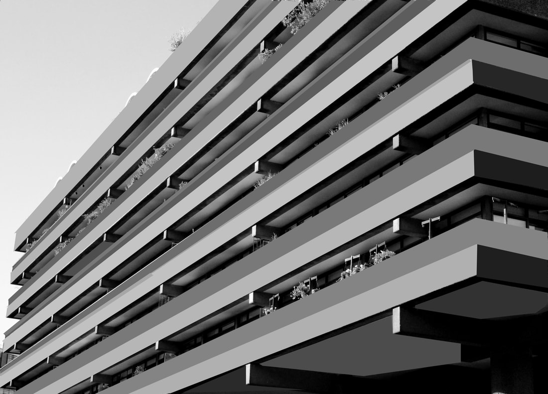
For this task I was required to go out and capture images of brutalist structures. Structures of this type tend to be such things like concrete (most commonly recognized building material of Brutalist architecture),brick, glass, and steel. Knowing this, I was given a sheet of the most common areas which had such buildings around. I first visited the Barbican as it is most famous for its brutalist structures, then the south bank, and lastly the National Theatre. In this task I was basing my focus on capturing the different structures of brutalism responding specifically to the work of Simon Phipps that have a strong emphasis on line, perspective, and angle. Although the task does not involve nature, I still like it as it can make a modern day picture look very old fashioned by simply just making it black and white as these types of buildings were made a century ago. For example, Simon Phipps first piece of work below seems as though it was taken several years ago.
Simon Phipps
The photography by Simon Phipps provides a unique perspective and portrays Brutalist architecture in a sensitive, realistic and distinctive manner. Phipps has spent the last 15 years photographing and documenting Brutalist and buildings in the UK, creating a survey of photographic images that demonstrate the breadth of this contentious architectural style.
First Response
The Barbican
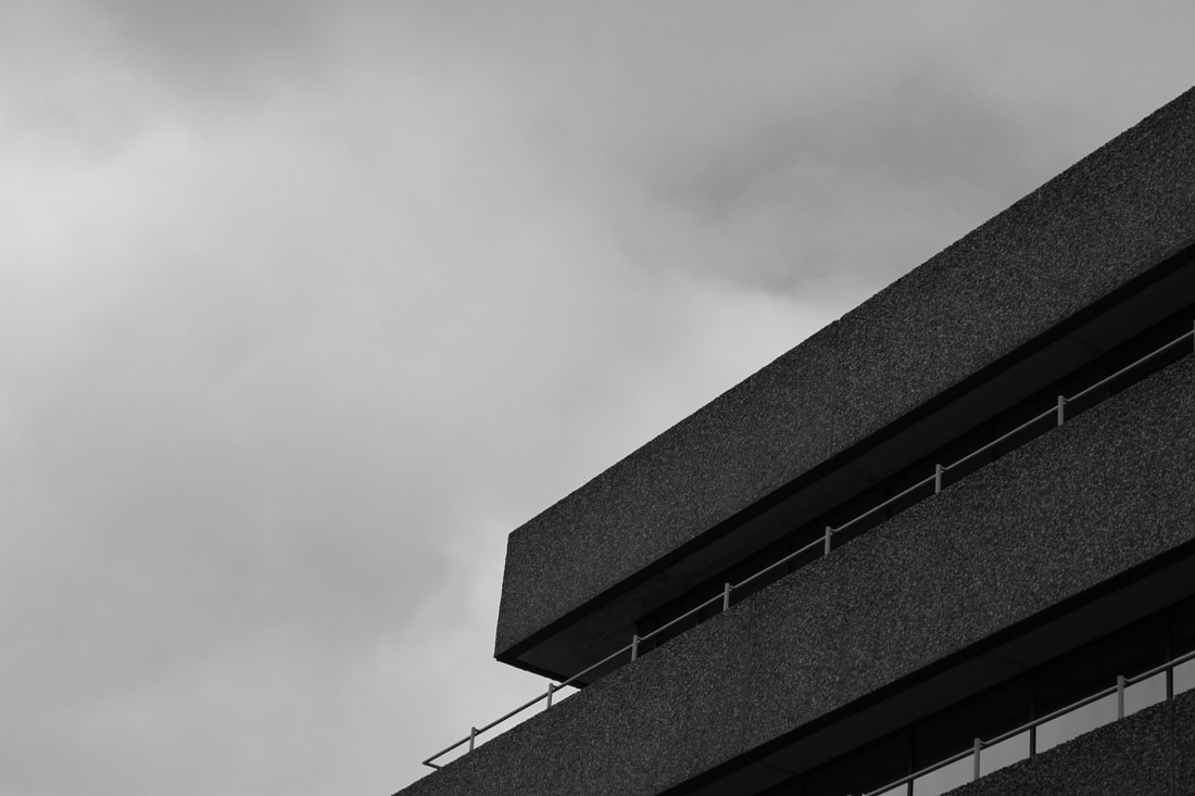
Negative space :
For my negative space image, what made the image work for me was the balance between the amount of negative space and the amount of structure there was in the image making sure the negative space took up most of the image. I did this by considering the overall balance of the picture composing the shapes that surrounded the focal point.
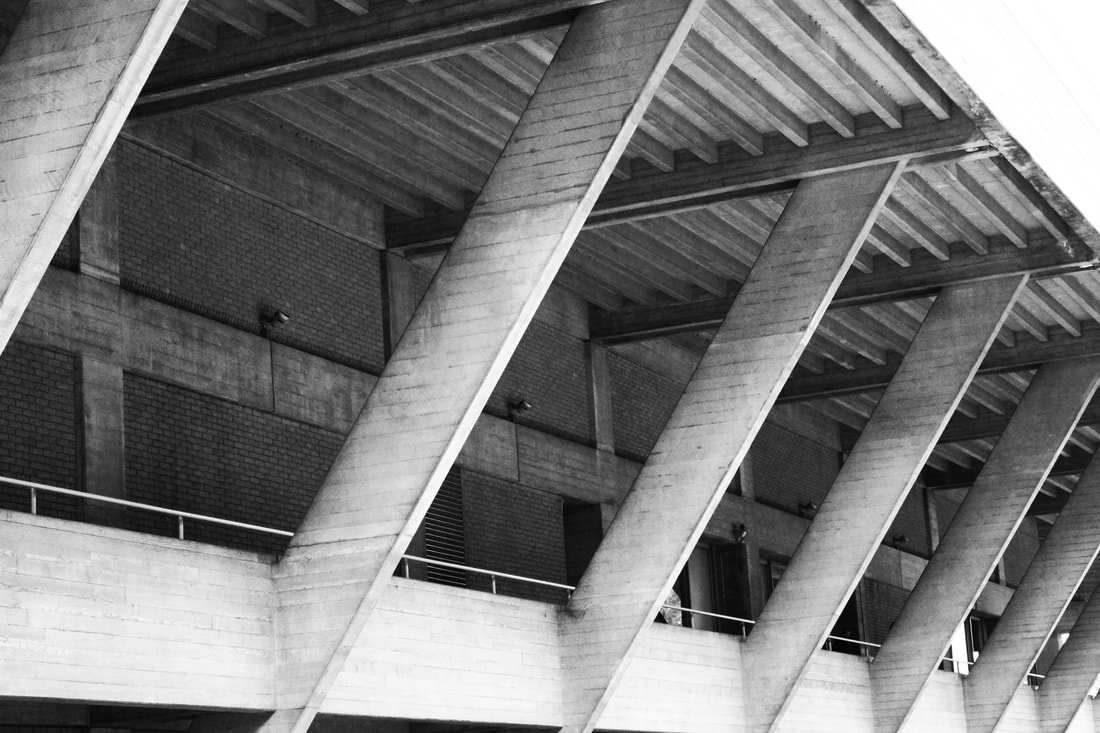
Lines and Perspective :
For my lines and perspective images, I had to consider the angle I was photographing from using the lines of the building to draw the viewer to a specific focal point. I did this by using this particular building as it had many repetitive lines as well as having the unusual lines at the top of the building which automatically draws the viewers attention to that specific focal point. Although the image works, the white parts of the image seem to be over exposed so next time I need to lower my shutter speed number so less light is exposed.
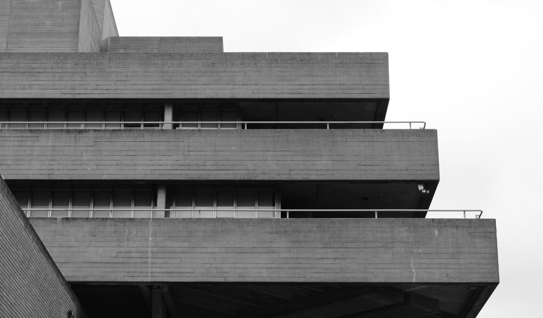
Form/Shape :
For my form/shape images, I focused on the objects of the image being broken down into series of basic shapes. This particularly worked with stairs and walkways as they had the most range of different forms and shapes as shown in the image below. To bring out a more effective image, next time I would need to capture a similar structure but try and have the background of the image clear so the focal point for the viewer is just the different forms and shapes.
|
|
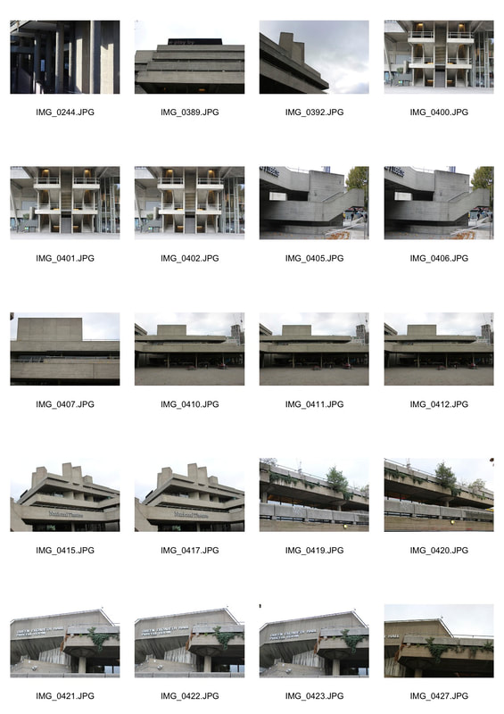
Southbank Centre and National Theatre
Negative Space :
For my negative space image, what made the image work for me was the balance between the amount of negative space and the amount of structure there was in the image making sure the negative space took up most of the image. I did this by considering the overall balance of the picture composing the shapes that surrounded the focal point. To make it more effective, I could of had more of the building in shot while still keeping the negative space amount more than the structure.
Lines and Perspective :
For my lines and perspective images, I had to consider the angle I was photographing from using the lines of the building to draw the viewer to a specific focal point. I did this by using this particular building as it had many repetitive lines as well as having the unusual lines at the top of the building which automatically draws the viewers attention to that specific focal point. There are still over exposed white areas of the image so next time I need to alter my shutter speed to smaller number so less light is let in.
Form/Shape :
For my form/shape images, I focused on the objects of the image being broken down into series of basic shapes. I found that a walkway was best to capture these images as many basic shapes were visible. To improve my image, I would need to come on a day that is less cloudy and has more blue skies so the image does not easily become over exposed.
|
|
Extension Part 1
In this task I was required to use one of my original Brutalist images and transform it into a simplified version of the image. I did this by using Photoshop and using a blur filter to create a less complicated brutalist image, following from Thomas Danthony work.
Although the image has been simplified, to create a similar piece of work to Danthony, I would need to create more simpleness in the image by having a completely black background. I would also need to simplify the little details in the images such as plants that are just sticking out of the photo.
Although the image has been simplified, to create a similar piece of work to Danthony, I would need to create more simpleness in the image by having a completely black background. I would also need to simplify the little details in the images such as plants that are just sticking out of the photo.
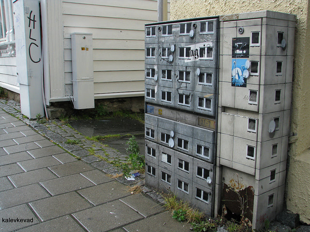
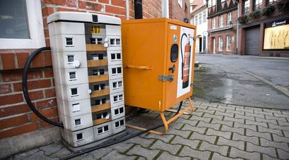
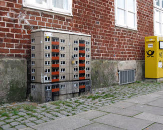
Evol
Evol is a German artist who creates a sense the city within a city by using different sorts of materials, putting them together and placing them on a canvas. These canvases are built to look like small structures with many windows on them to imitate the real world and making it miniature. He then places them next to small places like a fire extinguisher box as shown below and creates a structure. The use of this type of work is inspiring as it allows a dull area in a city to be uplifted with creativity. Having a type of artwork that's very unusual will allow kids to try and add more creativity into the area's that surrounds them.
|
|
|
The use of this specific artwork below is very effective as it is eye catching. It allows a sense of seeing something new that you may of never seen before which could allow young people to take inspiration an come up with something similar to make and add more creativity too as the picture without Evol's work would be very boring. For example, the use of having windows on the objects presents a clear image of a building to create more life to the area. Having it repeated on many of the objects makes it feel more realistic and easy to understand that it is seen as a block of buildings. It also allows you to take the most uneventful part of the area and change it into something you'd want to visit again. Based on that, for my examples, I will follow his idea and make a similar art form and try and place it in an uneventful/boring place in my area to try and add a sense of creativity towards it.
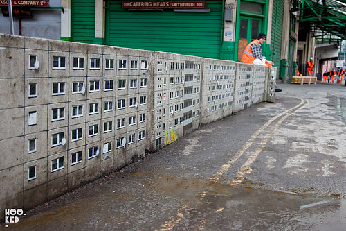
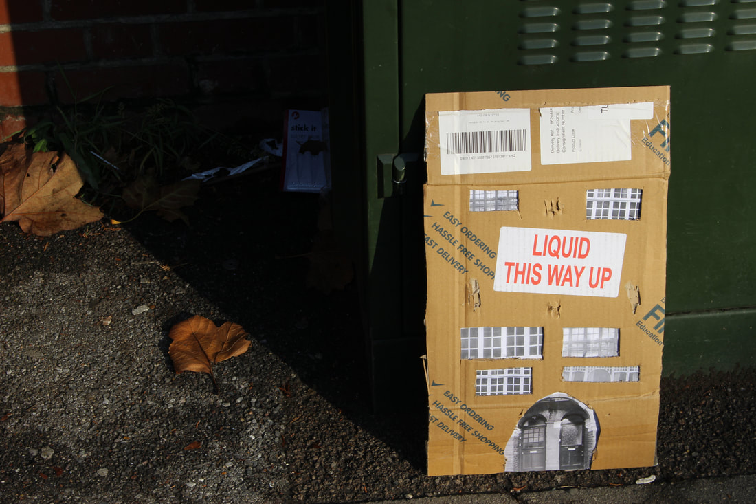
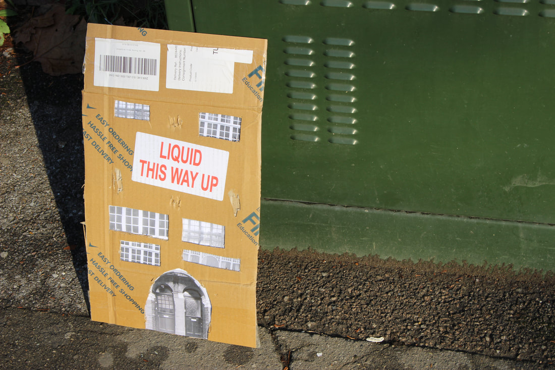
In this task I were required to create a replica type art form following Evol's pieces of work. I first headed out into our local area of Muswell hill, and captured specific buildings with interesting and unique structures such as the windows and doors. Following this, I printed out the structures I captured and placed it onto a piece of used cardboard and brought it to life by putting doors and windows onto it creating a miniature building. After this, with out small building created, I headed back out to those areas we captured from or different areas, and using Evol's work, I decided to place our buildings into uneventful/boring locations in order to bring more life to it.
|
|
|
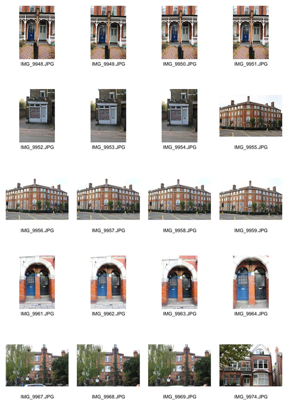
|
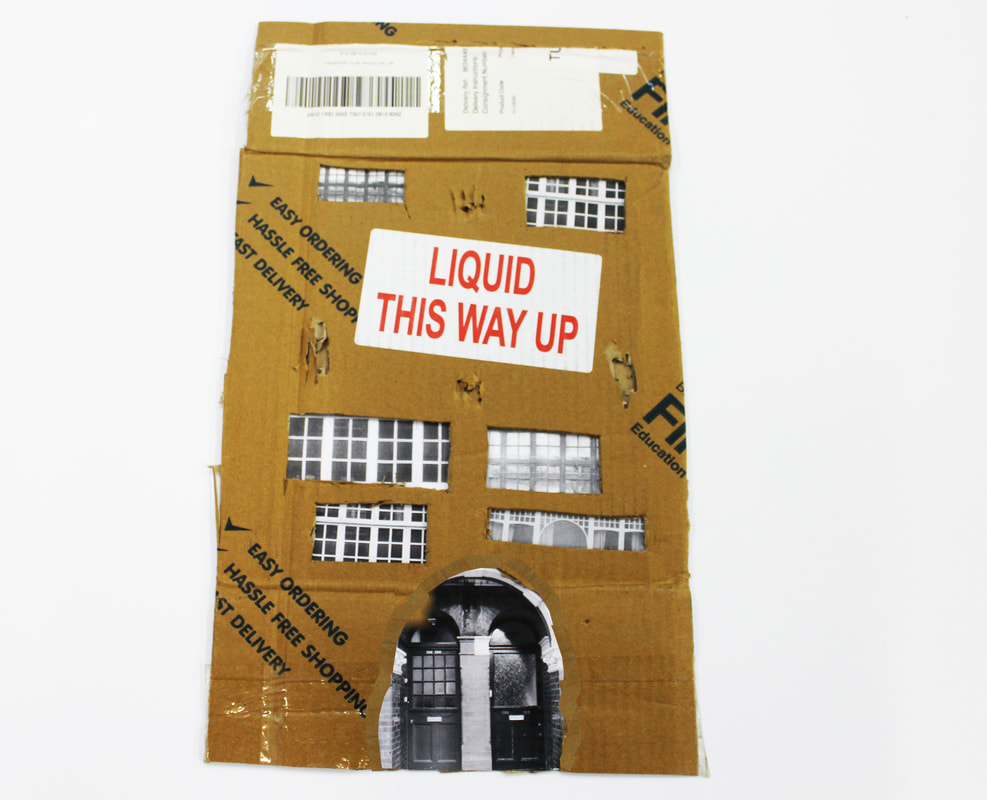
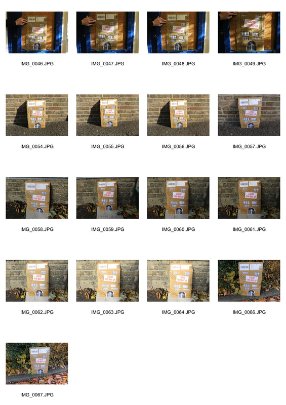
What worked well was the building I created, although it was not completely cleanly created, it still brought out a similar art form as Evol. The locations I used to place my building in were also well chosen and created strong similarities between our work. To further improve my work, I would need to create a more detailed building and be more specific in where i'm placing each window and door to get a more effective piece of work similar to the work of Evol.
Structure of the body
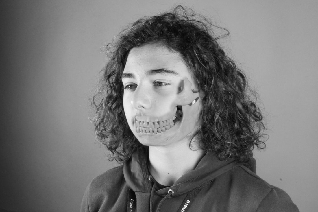
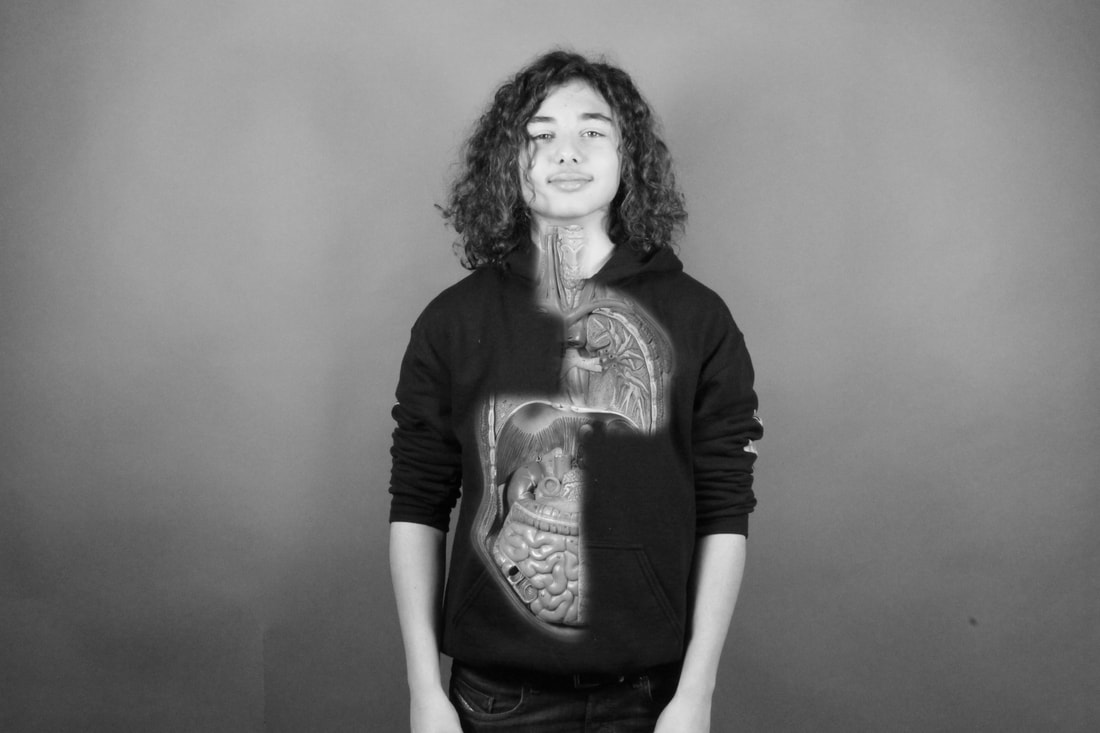
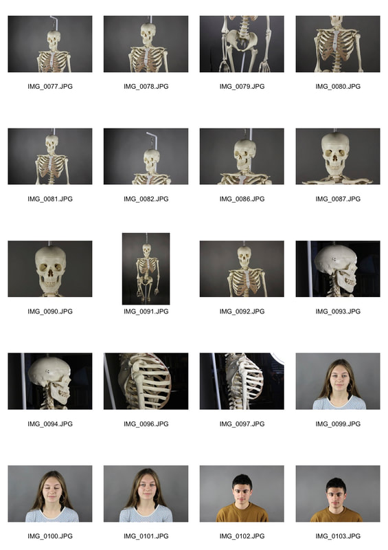
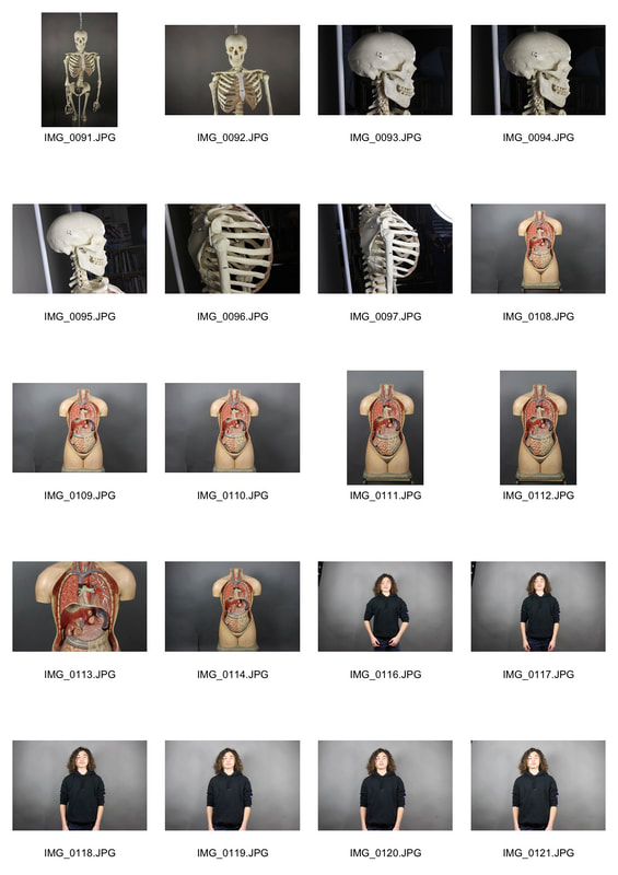
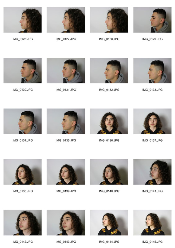
For this task, I focused on comparing the structure of an alive human and a skeleton. I set out to do this by having a large white background and first taking images of the skeleton from a variety of viewpoints including the front full body, close up of the face, and a side angle. I then used an alive human and captured images from the exact same viewpoints. I did this so I can then play around on Photoshop and try and find the best viewpoint to merge the two objects together. Using Photoshop, I then put the human image on top of the skeleton, placed it in the right position and rubbed out any human areas that seemed right for the skeleton to reveal itself. From seeing ideas from photographers, I concluded that the side and front angle worked best when merging the two objects together. Both images worked well and were placed well to reveal strong details of the skeleton as well as the human, but to further improve the images, when it comes to rubbing out the human, I would need to make the hardness of the rubber much lower so there is a nice blend from the human to the skeleton to create a better image.
First response :
|
|
|
|
Abstract Structure
Task 1 - The white paper test
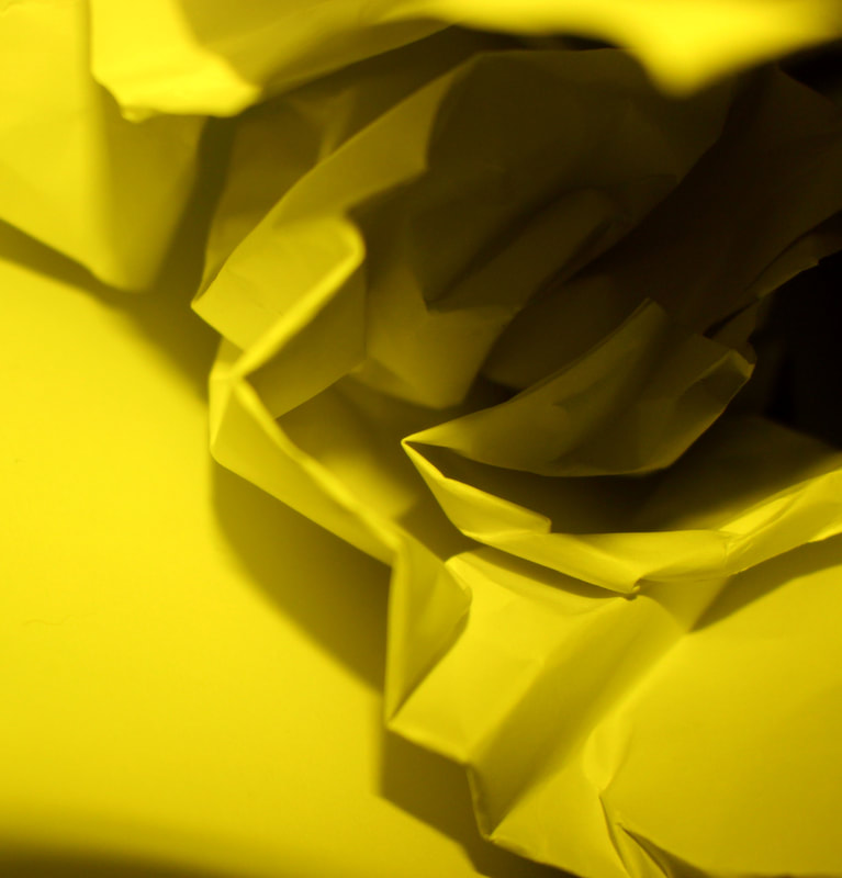
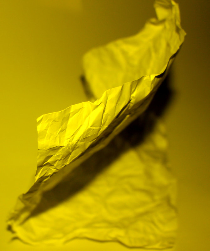
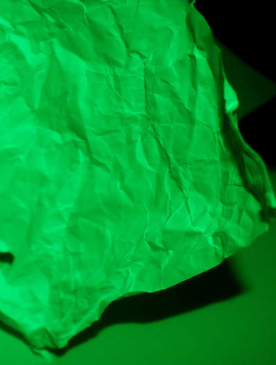
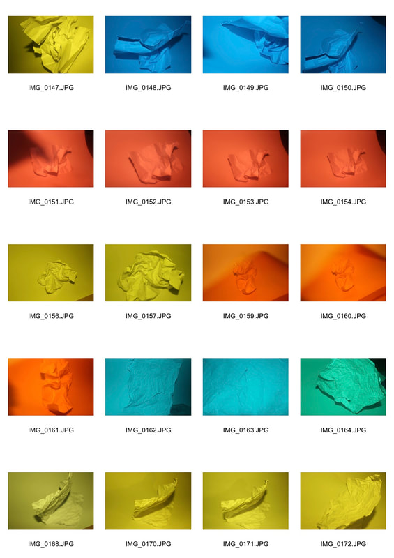
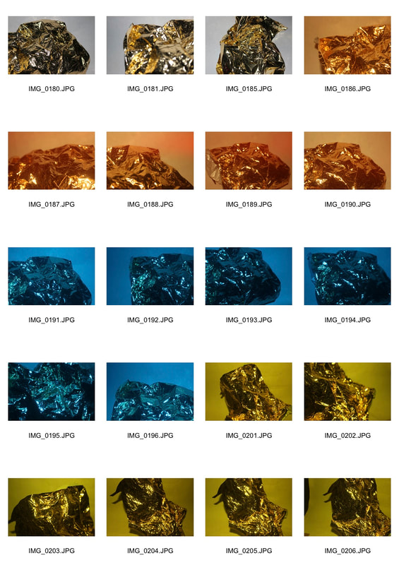
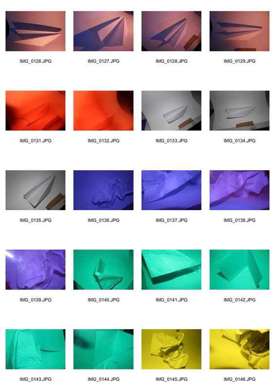
For this task I used abstract structures as a means of depicting a visual image that does not have an immediate association with the object world and that has been created through the use of photographic equipment, processes or materials. First I was required to shoot with white paper using different coloured filters, spotlights, and soft lights while either crumpling, folding or rolling the piece of paper, to create an abstract image.
First Response :
|
|
Task 2 - Abstract development
For this task, using a list of artists, I was required to choose two of them to respond to and create a set of images using their ideas.
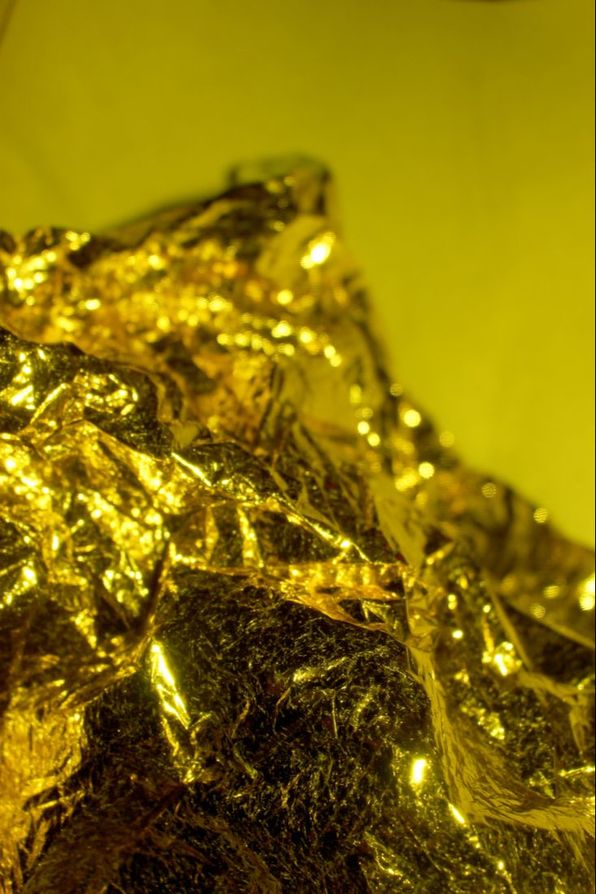
Brendan Austin
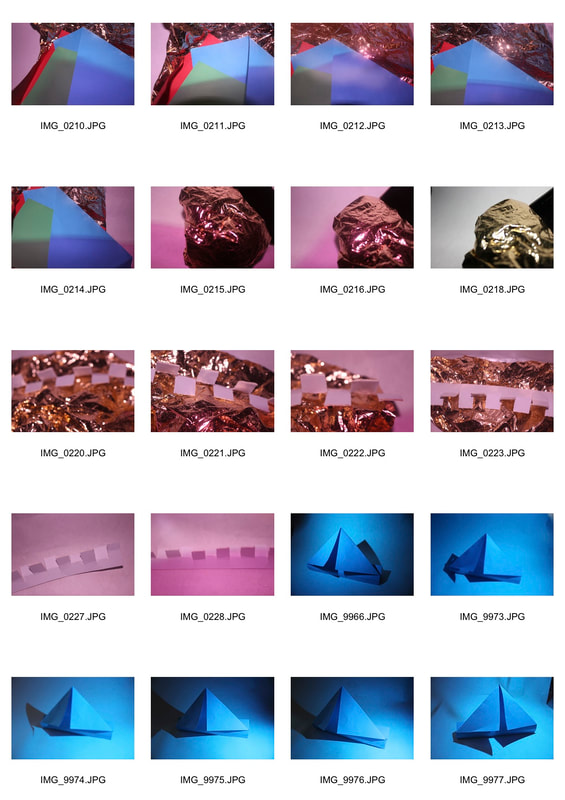
For my first artist, I chose Brendan Austin who photographs reality and fiction, blurring the lines between the photograph and nature. He makes landscapes by crumpling up pieces of paper and creating them into realistic art forms that replicate in the real world such as his idea of Paper Mountains. For my first response, I followed Austin's idea of mountainous landscapes, and using gold paper and a coloured filter, I created similar images to his. The images worked well as they replicate his artwork exactly but an example of just the paper with not filters involved could have brought a more realistic approach to it.
|
|
Jaroslav Rössler
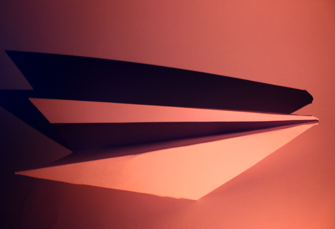
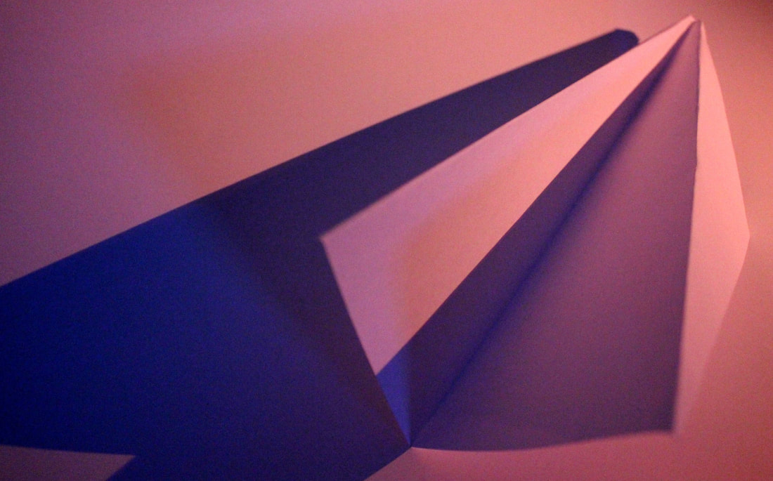
For my second artist I chose Jaroslav Rössler who focused on capturing a variety of different forms such as lines, shapes, lights and shade. Following his idea I focused on these specific details by capturing an abnormal shape and mixing it with sharp lines. I also made sure the shade was captured from different angles using a specific pink light to bring a different colour to the image.
For my images, I created strong images that follow Rössler's criteria but to create a more effective image, I would need to focus on adding small amounts of light in different areas instead of having just one pink light across the whole image.
For my images, I created strong images that follow Rössler's criteria but to create a more effective image, I would need to focus on adding small amounts of light in different areas instead of having just one pink light across the whole image.
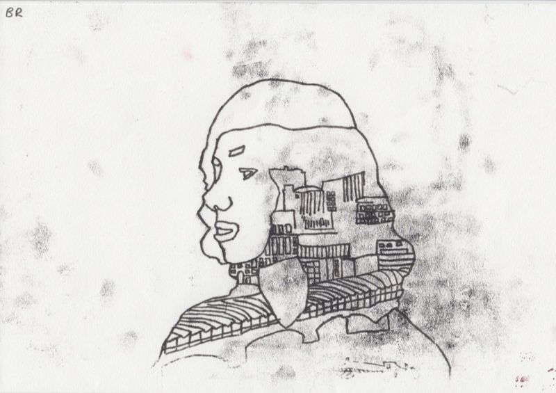
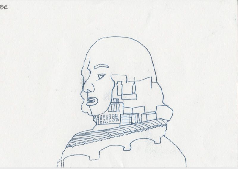
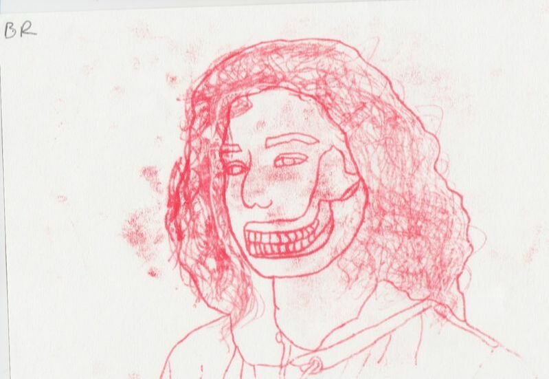
Monoprint
For this task I was required to monoprint my previous images taken of my choice that could have already edited or not. We needed paint, sheets of large paper for blotting, small paper for the actual monoprint, a surface for spreading out the ink, a roller for the paint and a separate clean roller. Firstly, I put some of my paint onto my large paper and started blotting the paint using my roller to spread out the paint across the paper making sure there was not too much ink on different areas. Once the paint was spread, I then placed the image that I was going to use for my monoprint onto the ink with the image faced flat onto it. From this I used my separate clean roller and started rubbing the image onto the paint to make sure all of the paint was being absorbed by the image. When I felt like enough paint was on the image, I then took another piece of clean large paper and placed my image which now has paint on it, flat onto the paper. After this I used my clean roller again and started rolling it onto the clean paper to make sure any excess paint was off of the image. I did this many times on different parts of the paper until there was not a lot of paint left on the clean paper after being rolled. Once this was done, I placed my image onto a smaller piece of paper where my final monoprint was going to be placed. To make sure the image was placed accurately, I used sellotape and placed the image onto the small piece of paper so nothing was able to move. Using a pen or pencil, I then carefully drew onto the image necessary to how I wanted my monoprint to look like making sure I was not leaning on the paper to avoid any smudges. When this was done, I carefully removed the sellotape and took the image off the paper and my monoprint was created.
First response
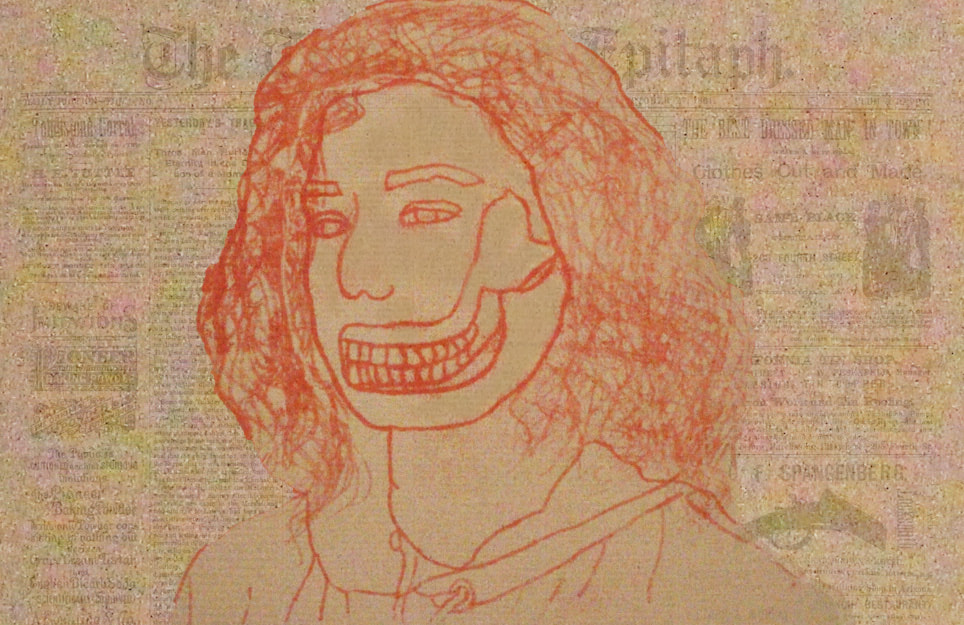
For my first response I decided to use a double exposure picture I previously created from my weebly and followed the steps mentioned above. Doing so, I created a monoprint version of it and managed to make a strong outline with most details in the inside of the person. When outlining the image I made sure there was not any movement which reulted in all the lines being neat and not all over the place. But what made the print worse was all the smudges included. I focused only on making sure the lines were not messy so I was leaning all on it which caused many lots of black ink, To further improve this I would not only need to avoid smudges, but make sure every line is followed through to the end of the paper.
Second Response
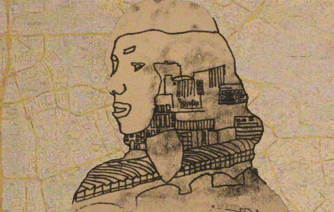
Following my first response, I decided to focus on simplicity and neatness. In this case by following what I envisioned the monoprint worked well as the outlining was still neat and no smudges were created this time. I did not have enough time to finish the print resulting in not all the buildings being finished. To further improve this, for my next response I should try a different image to monoprint on as the multiple buildings made it hard to create an effective monoprint. Therefore I will focus on using an image with just a human instead of many buildings being involved in it.
Third Response
Following my second response, I decided to choose a different image to monoprint and following the method I decided to use an image I previously made during the structure of the body task. This monoprint was very effective as now all the details were much easier to include and create. The lines were followed all the way through to the end of the pages and all the lines were neat when necessary and messy when necessary. To further improve and perfect this monoprint I need to focus on being more neat, I got too caught up in adding every part of the hair and caused smudges all around the face resulting in the monoprint not being as effective as it could have been. Next time I will try and use a different type of monoprint for example using a black piece of paper next.
Fourth Response
Following my third response, I decided to try a new monoprint using a black piece of paper. In the scanned image you can't really see the ink but in real life it is more visible. This is due to what I should improve next time which is using a much lighter colour on a dark background so everything is seen. Other than that, the image was the same as the first two responses and I managed to produce more detail in the buildings and less smudges around the face which resulted in a more effective print compared to the first two responses. Next time I will experiment with using more detailed backgrounds like a newspaper so there is even more too look at in the image.
Experimentation
To further experiment with my monoprints, I decided that instead of altering the colour of the background, I wanted to add a background using a newspaper and a map. I also chose these backgrounds rather than just colour as it had more to do with the topic structure as it is more effective to use structure through words and buildings from the map rather than colour. I did this by using a quick selection tool and cutting out the subject from the monoprints, then copy and pasting it onto newspaper/map. I then selected the inverse layer and copy and pasted the background from the original monoprint onto the subject layer. I then moved the subject layer on top of the monoprint background layer so it was in front of it, then changed the opacity of the monoprint layer so the newspaper/map was seen. This worked effectively as both of the backgrounds blend in with the subject and both look like old fashioned newspapers/maps. To further improve it I would need to try and blend the subject layer more by rubbing out the edges of it using a low opacity and hardness rubber.
|
|
Three Strands
Strand 1 - Fong Qi Wei (Time Paintings)
"This series of images are mostly landscapes, seascapes and cityscapes, and they are a single composite made from sequences that span 2-4 hours, mostly of sunrises and sunsets. The basic structure of a landscape is present in every piece. But each panel or concentric layer shows a different slice of time, which is related to the adjacent panel/layer. The transition from daytime to night is gradual and noticeable in every piece, but would not be something you expect to see in a still image".
First Response
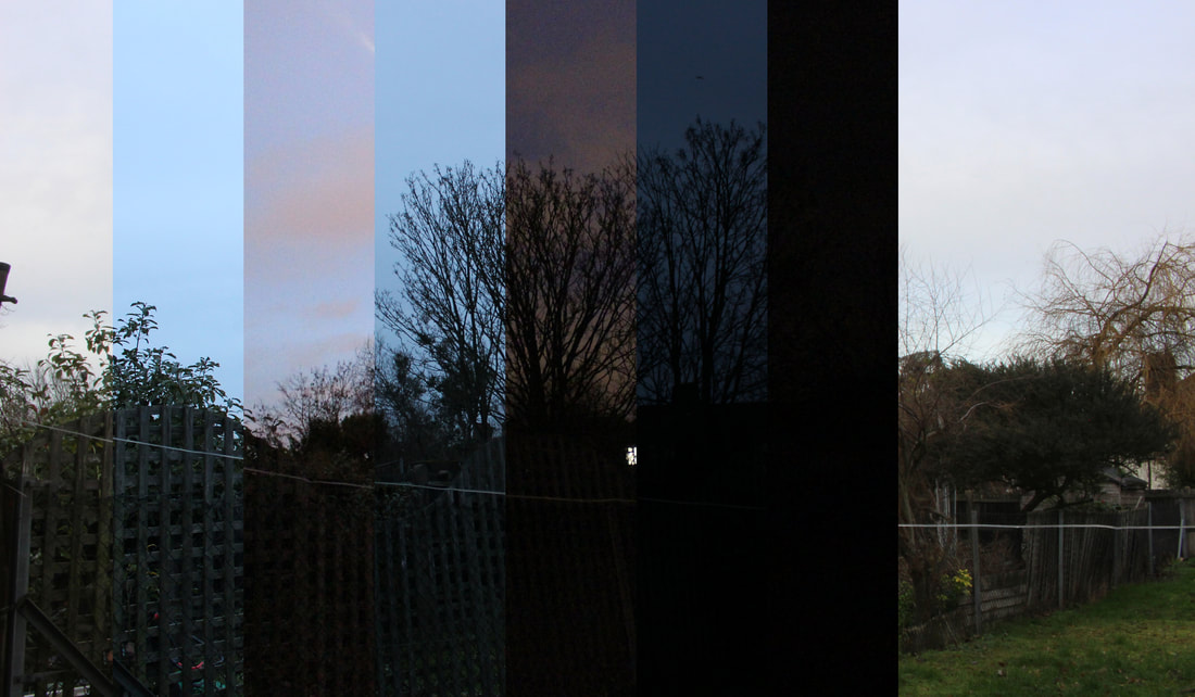
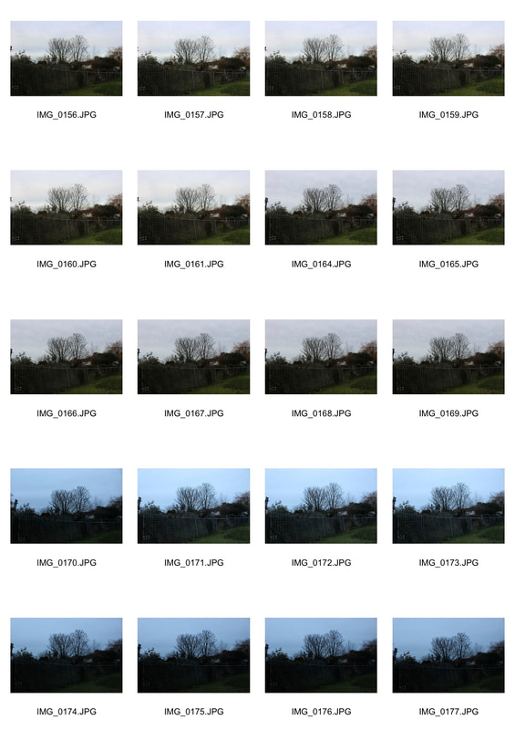
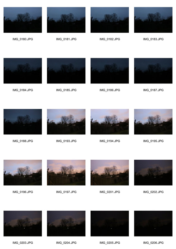
Following Fong Qi Wei's work, I decided to take her approach but for my first response I decided to capture nature structures instead of structures of buildings. I went into Coldfall Woods and stayed on the field for 2-4 hours to get a comparison of the day and night. Using photoshop, I then cut out main parts of each image taken and placed them next to each other. This was very effective as it followed Fong Qi Wei's work well and kept true to the topic of structure. I also decided to use lines instead of circles which made it more personal and still worked effectively. Next time I would need to take more pictures o there is enough to fit the whole image.
|
|
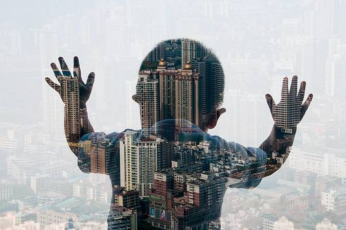
Strand 2 - Jasper James (Double Exposures)
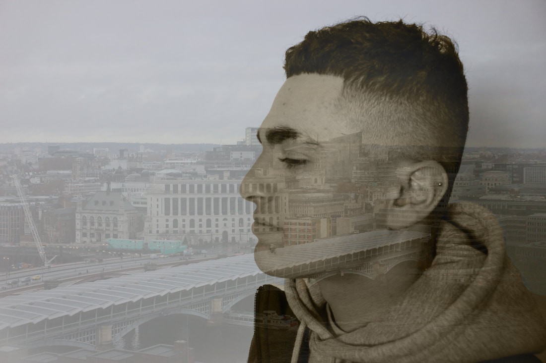
Jasper James uses technique of shooting multiple exposures using light and reflections from glass and illustrates a picture of the city through the person viewing it, creating a familiar silhouette with good results. James traveled through China where the inspiration for this series took place, and gave us bird’s eye views with an unusual perspective which I also did but instead use bird's eye views of structures in London.
First Response
For my first response I looked into Jasper James double exposure work and took his approach to making my images. I went out into Central London, to the Tate Modern as it was a high rise building and a good place to capture good views with many buildings. Similar to James, I caught an area with multiple structures next to each other and took pictures of them. In my example of James' work above, he uses more of a mid shot point of view so I decided to differ my examples and use more of a close up point of view. Using photoshop I made sure there was a haze to the background making sure it was still visible. I also wanted to change James' typical images and add a sepia filter to it but still making sure it is more visible than the background.
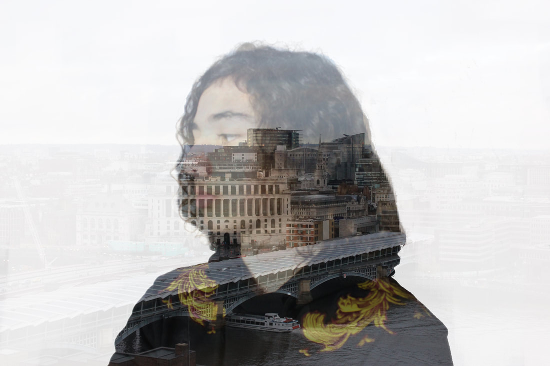
Second Response
Following my first response, I decided to try and replicate my example of James' work by having an opaque background with the subject directly in the middle with an opacity lower than the background. I did this by layering the subject image on top of the background image, make a copy of the subject, and cut out the original subject image. I made sure the cut out subject image had a white background to give it that opaque factor to background as it was layered on top of the background. With the copied image on top of both the cut out subject and the background, I then selected the copy and changed the opacity to about 35 so you can see through it just enough that you can see both the original background and the subject. This was effective as the image
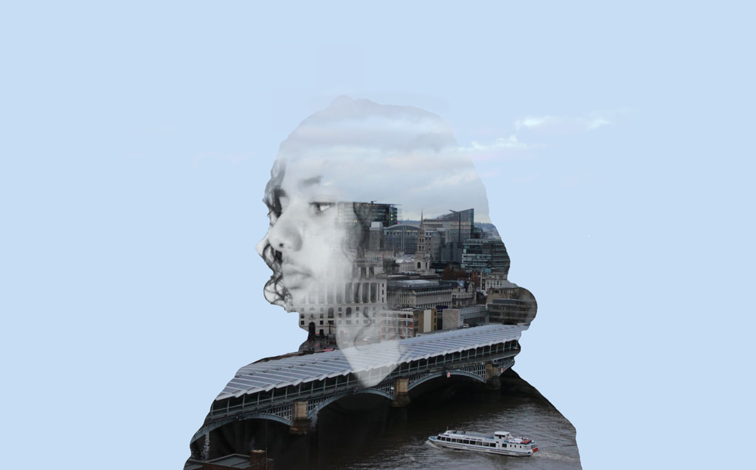
Final Response
For my final response, I decided to look up different sort of double exposure techniques to differ from my first two responses. Having done this, I found a youtube walkthrough guide on how to make this specific type of double exposure and I decided to do this as this technique to me was my favourite double exposure technique. I then followed the tutorial and managed to create one. What went well is that the finished image is similar but has its own features like the colour change which worked effectively as it brought more emphasise on the double exposure. What could have been better is the outline of the subject, if it was more blended in with the background then the image would have been more effective.
|
|
Strand 3 - Yin Yang (Distortion)
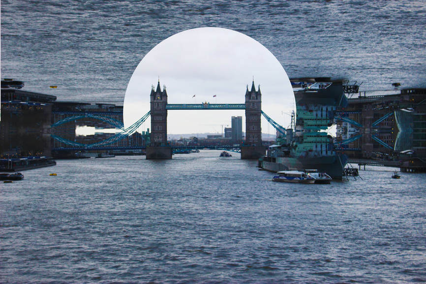
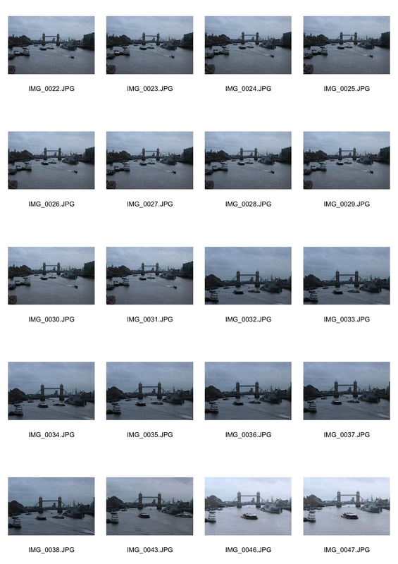
I looked into the work of Yin Yang who took wide shots of the landscape and turned a section upside down. Using that idea, I took wide shots of the landscape I was in, then mirrored half of the image to match each other, then took a fragment of the mirrored image out to portray the original image to have multiple contrasts of one image. For my first response I had my original image, and on photoshop I grabbed half of my image (In this case the bottom half), copied it and pasted it then placed it accurately onto the top of the image. I then cut out a circle shape from the reflected side of the image then made sure just the Tower Bridge was visible so the main focus of the image was on it. What made the image effective is how I did not just completely copy Yin Yang and used my own ideas but still have some of her original creations involved such as the reflections.
Second Response
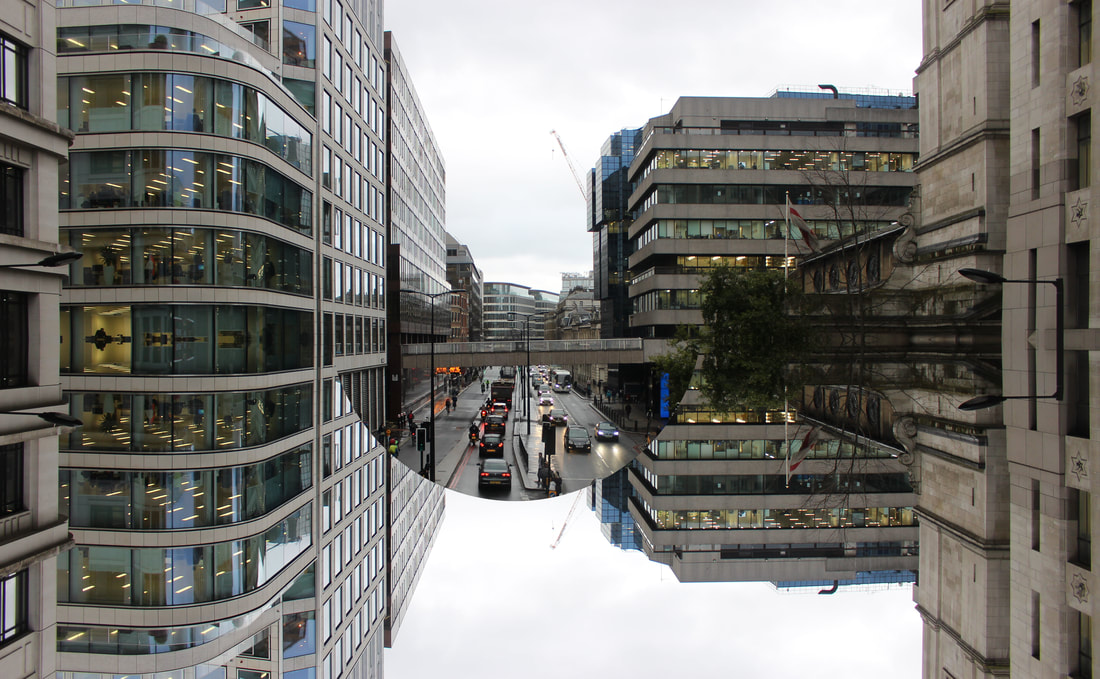
For my second response I had my original image, and on photoshop I grabbed half of my image (In this case the top half), copied it and pasted it then placed it accurately onto the bottom of the image. I then cut out a circle shape from the whole image then made sure just the cars was visible so the main focus of the image was on it. What made the image effective is how it focused mainly on the structure of buildings which most of my ideas have been on. I did not just completely copy Yin Yang and used my own ideas but still have some of her original creations involved such as the reflections. To further improve my piece, I would need to not just use circle shapes and try a range of different shapes to have a contrasts in my images.
Developed Strand
Final Pieces
Carl-Antonyn Dufault
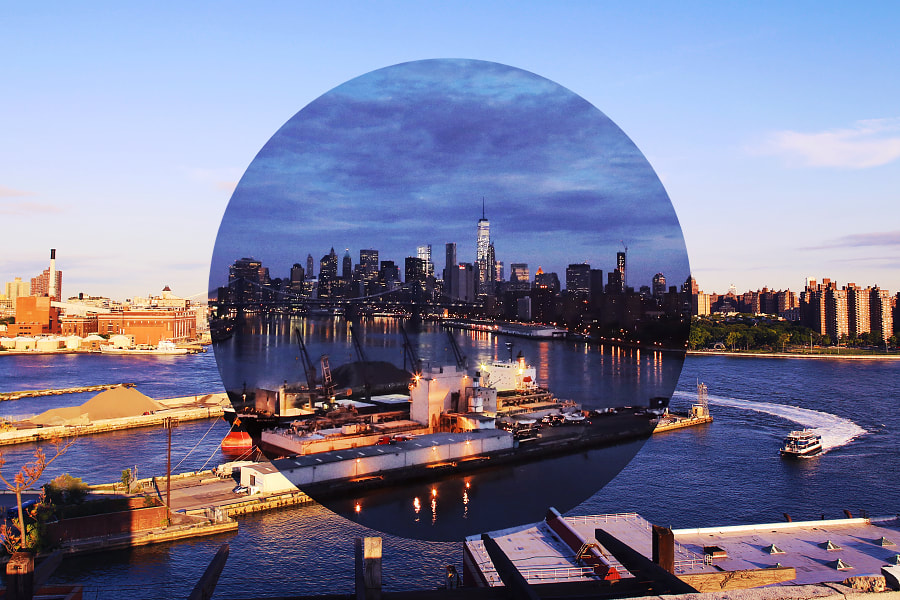
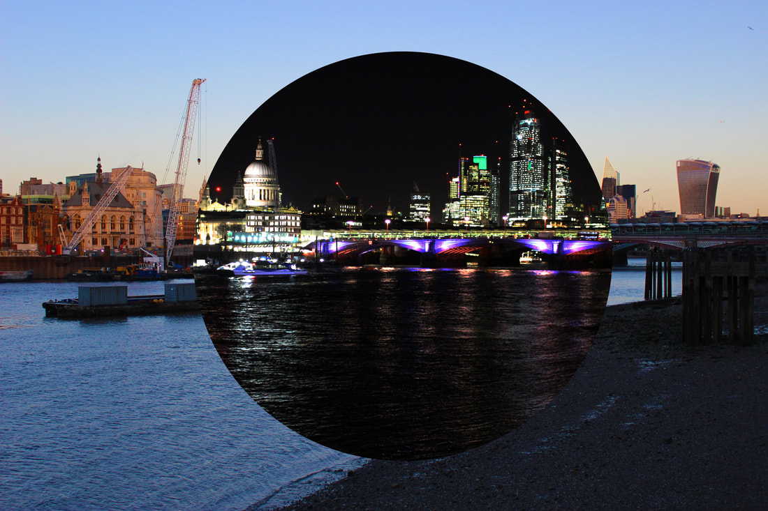
Following my previous work, I decided to combine two of my strands of Fong Qi Wei's (Time Paintings) and Yin Yangs (Distortion) and create something similar to Carl-Antonyn Dufault piece of work shown below. Carl-Antonyn Dufault is a photographer from Quebec, Canada, focusing on urban architecture and human photography. The photographer took a photo of a set of creative urban architectures this being two different time cities in the same photo. The main body of the middle circular area and the surrounding background creates a wonderfully beautiful scene. The morning and the faint, the night and the night, and even the summer and winter are used for a full tension contrast.
First Response:
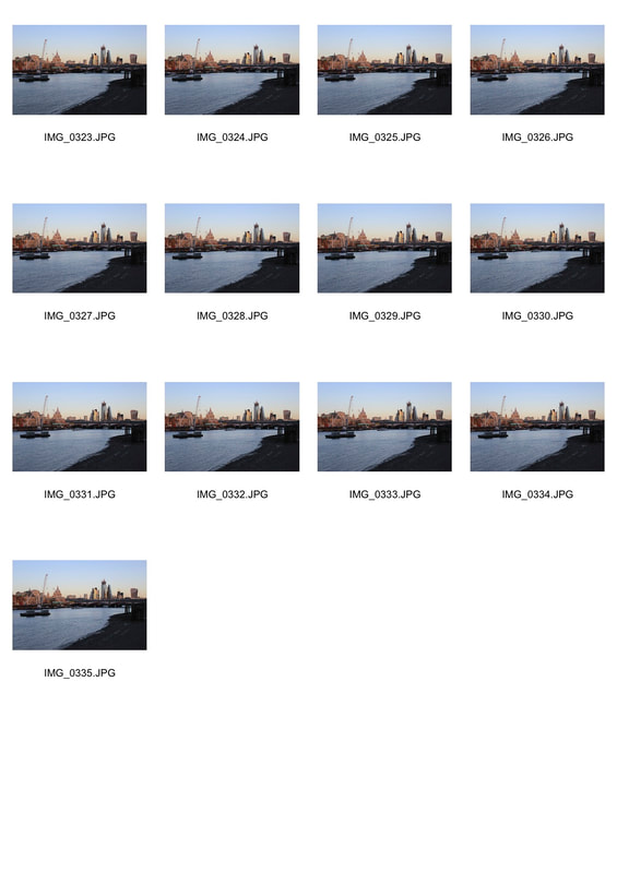
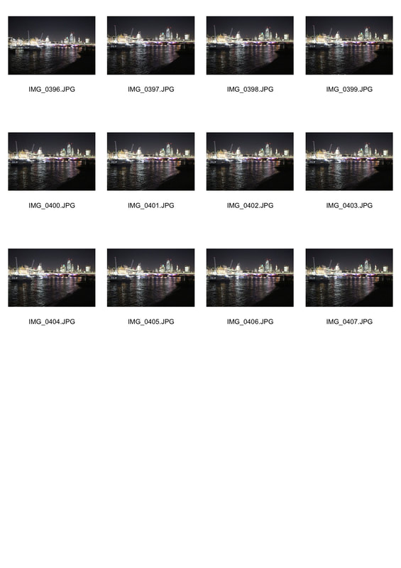
For my first response, I went out to central London and visited the Tate Modern as it allowed me to reach a high vantage point with many structures in the background. I arrived at around midday so I could have a variety of sun and darkness. I stayed there for around 3-5 hours allowing myself to capture the brightest and darkest hours to get a strong contrast. I then compiled my images and grouped them up together on Photoshop. On Photoshop I used the elliptical marquee tool and I circled the night photo in the middle of the page making sure I get the most important area. I then copied and pasted it onto the day photo. After pasting the image on, I altered any little areas that were not in the right place by clicking command T. What worked very well is the accuracy of my work. I took images at the right levels of light and dark to get the right variety which resulted in a very similar piece of work compared to Carl-Antonyn Dufault. What could have worked better is making sure each photo was taken in the exact same place. At the Tate Modern they did not allow a tripod to be used which resulted in more difficult free handed photos.
|
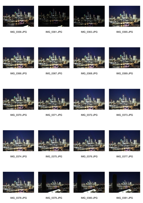
|
Second Response:
Following my first response, for my second response I went into central London close by the Tate Modern and stayed for 3-5 hours in the same location to keep the accuracy, and again I managed to capture the brightest and darkest hours. I then compiled my images and grouped them up together on Photoshop. On Photoshop I uploaded each image and used an elliptical marquee tool and started cutting out a circle from the night image. I then copied and pasted the circle and put it on top of the day image showing the contrast of shade in each image. This image worked even better as it was more accurately lined up. This was because I was able to use a tripod allowing me to be much more accurate, still with some minor differences in the placing of the images but overall it improved resulting in a much more precise photo. One problem with the photo is the boats on the day image compared to the night image. The boat stayed in that position for a while and was not there when it became darker leaving the photo with a gap as to where the boat is meaning the photo was not as effective as it could have been. Next time I would need to find a time where not many boats are in the water in that specific area.
|
|
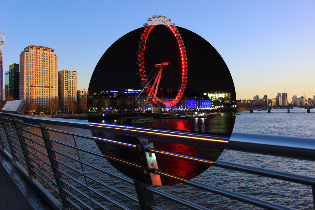
Third Response:
Following my second response, I decided to try a different area of central London and managed to create a response by using a an iconic structure of the London eye. I arrived at around midday so I could have a variety of sun and darkness. I stayed there for around 3-5 hours allowing myself to capture the brightest and darkest hours to get a strong contrast. I then compiled my images and grouped them up together on Photoshop. On Photoshop I used the elliptical marquee tool and I circled the night photo in the middle of the page making sure I get the most important area. I then copied and pasted it onto the day photo. After pasting the image on, I altered any little areas that were not in the right place by clicking command T. I managed to use a Tripod again and overall the pictures were lined up very well. Only problem was the bottom of the imaged as the railings did not line up as well as they could have, this was due to the pictures not being in the very exact same place mainly because of the tripod placement. To further improve this I would need to make a way of remembering exactly where the I placed the tripod by marking the area so it is much easier to produce a more effective photo. But overall there is a song contrast of colours between both the sky and the lights on both the buildings and the London Eye
|
|
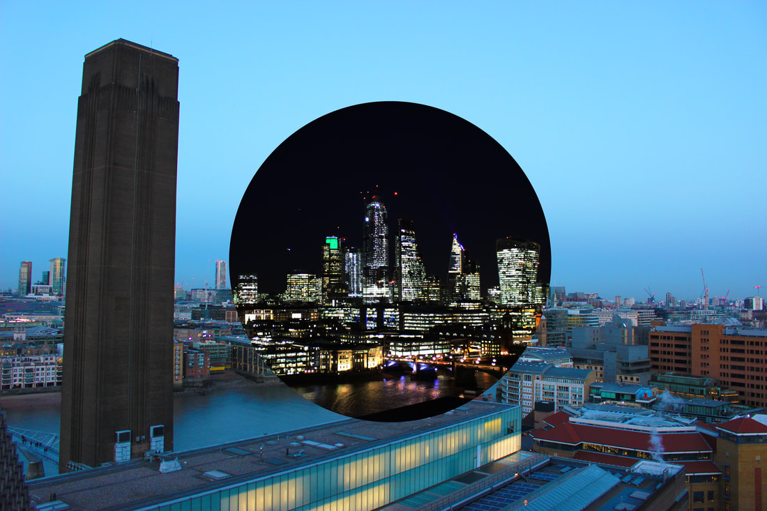
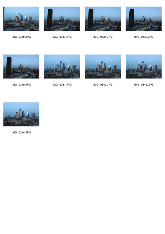
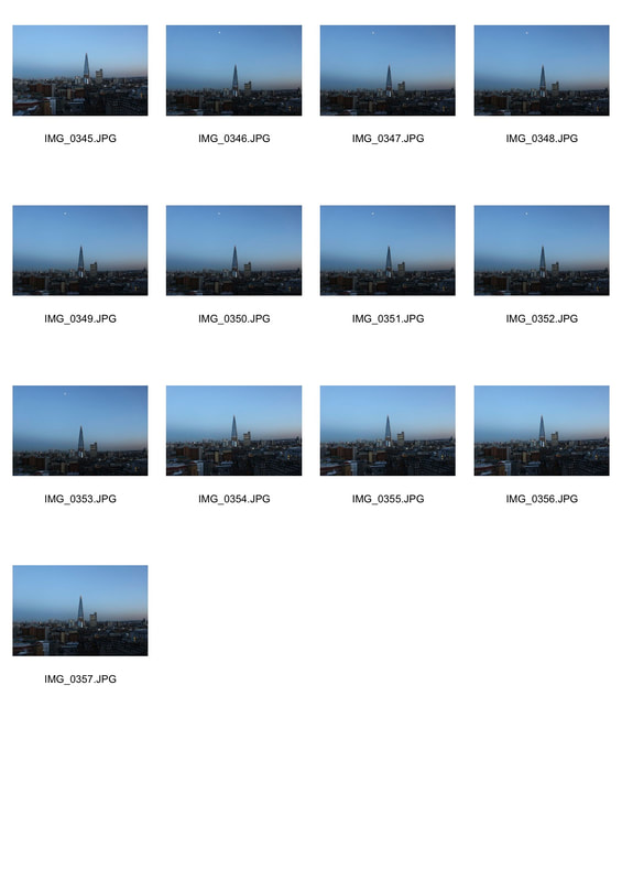
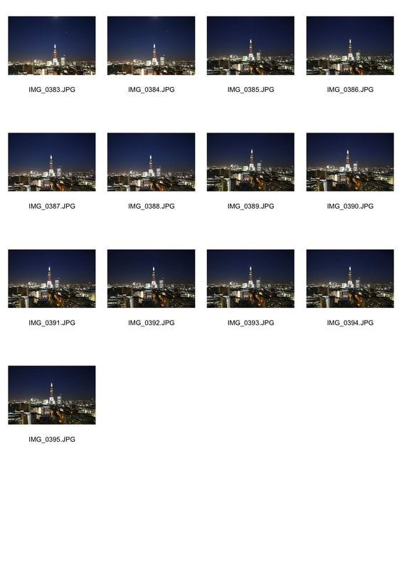
Final Response:
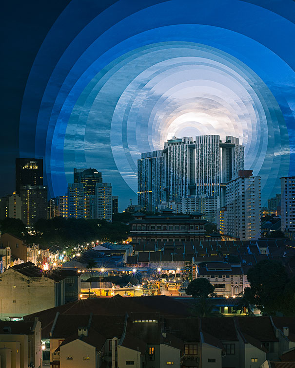
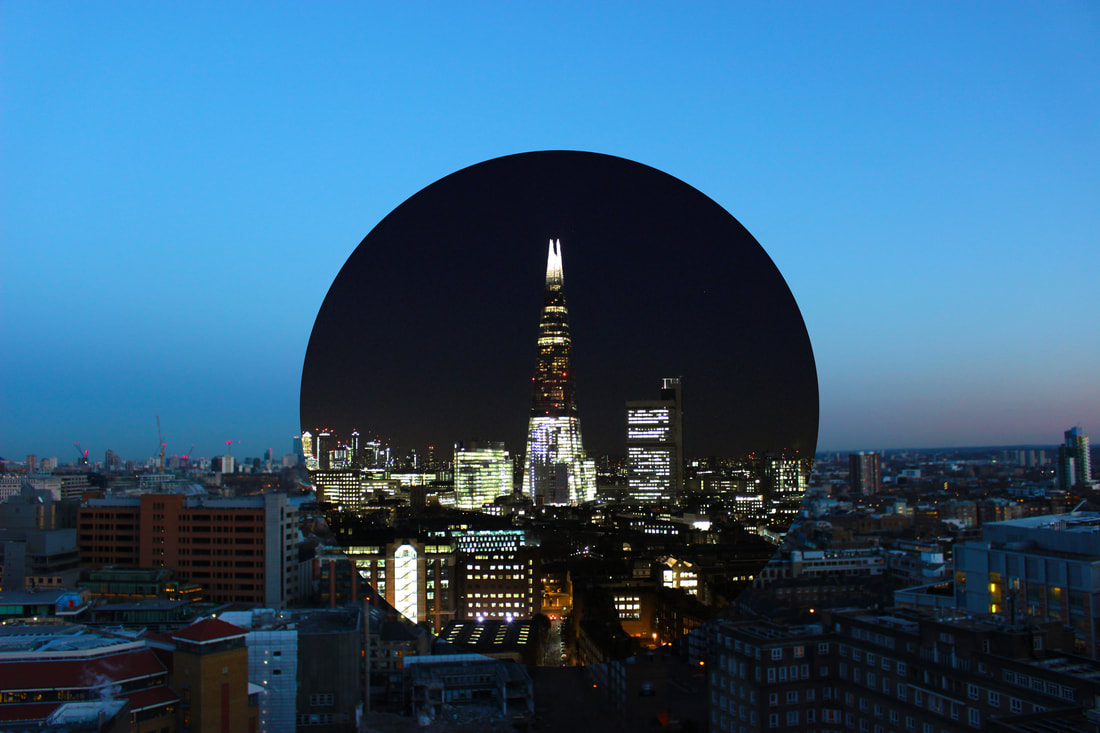
For my final response I wanted to capture the most iconic building in London and the tallest. I did this by heading out to central London and visiting the Tate Modern for the final time as it allowed me to reach a high vantage point to capture the Shard. I arrived at around midday so I could have a variety of sun and darkness. I stayed there for around 3-5 hours allowing myself to capture the brightest and darkest hours to get a strong contrast. This time I managed to secretly use my tripod to make sure my final response was the most accurate. I then compiled my images and grouped them up together on Photoshop. On Photoshop I used the elliptical marquee tool and I circled the night photo in the middle of the page making sure I get the most important area. I then copied and pasted it onto the day photo. After pasting the image on, I altered any little areas that were not in the right place by clicking command T. What worked very well was that there was not any major changes I needed to make with the lining up of the images. I manage to place my tripod in the exact same spot resulting in a very accurate and similar piece of work to Carl-Antonyn Dufault. This led to me creating a very effective final image.
|
|
